Surrealism, graphic design and Barney Bubbles

starowieyski.jpg

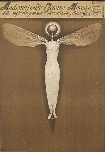
Poster for Mademoiselle (1970) by Franciszek Starowieyski.

Work has cranked into overdrive this week so posting will no doubt be minimal until some semblance of normality is restored. I can however mention two essential exhibitions which will be running through the forthcoming months.

Uncanny: Surrealism and Graphic Design at the Moravian Gallery in Brno, Czech Republic, is curated by design writer Rick Poynor and runs to 24 October, 2010. On display is an intriguing mix of work from familiar names such as Jan Švankmajer and Eva Švankmajerová, poster artist Franciszek Starowieyski, graphic designers Vaughan Oliver and Stefan Sagmeister, and many others.

Uncanny: Surrealism and Graphic Design uncovers the presence of an alternative tradition in graphic design. The Surrealist movement of the 1920s and 1930s focused on literature, painting, photography and the object, and the Surrealists’ publishing activities provided only hints of what a fully conceived Surrealist graphic design or typography might look like. Many of the most suggestive early examples came from Czechoslovakia, where Surrealism would become a lasting influence. Subsequently, Surrealist ideas and images had a profound impact on image-makers in every sphere of art and design, and by the 1960s the effects of Surrealism were widely felt in international graphic communication. Uncanny traces this intermittent line of development up to the present.

There’s further information at the gallery site including a page of related works.

process.jpg

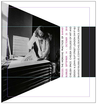
And launching later in the year is Process: The Working Practices of Barney Bubbles, a very timely exhibition of the designer’s work at Chelsea Space, London. Bubbles biographer Paul Gorman is the curator and the event will also see the launch of a second edition of his study of Barney’s life and work, Reasons To Be Cheerful.

The show will contain many never-before-seen items drawn from private collections, including student notebooks, working sketches, original artwork, paintings, books and photography. These were the raw material for videos, record sleeves, t-shirts and posters created by Bubbles for such performers as Ian Dury, Hawkwind, Elvis Costello, The Damned and Billy Bragg (who is contributing a one-off rug with a rendition of the designer’s Masereel-quoting cover for his album Brewing Up With).

Process opens on September 14 and will run to October 23, 2010.

Previously on { feuilleton }
Franciszek Starowieyski, 1930–2009
Jan Svankmajer: The Complete Short Films
Barney Bubbles: artist and designer

Helvetica: the film

helvetica.jpg

Yes, a documentary about a typeface by Gary Hustwit. And why not, say I? More films about typography, please. I paid homage to the ubiquitous Swiss font with my design for Savoy’s A Serious Life which used Helvetica Neue in various weights throughout.

Helvetica is a feature-length independent film about typography, graphic design and global visual culture. It looks at the proliferation of one typeface (which will celebrate its 50th birthday in 2007) as part of a larger conversation about the way type affects our lives. The film is an exploration of urban spaces in major cities and the type that inhabits them, and a fluid discussion with renowned designers about the choices and aesthetics behind their use of type.

Helvetica encompasses the worlds of design, advertising, psychology, and communication, and invites us to take a second look at the thousands of words we see every day.

The film was shot in high-definition on location in the United States, England, the Netherlands, Germany, Switzerland, France and Belgium. It is currently in post-production and is slated to begin screening at film festivals worldwide starting in early 2007.

Interviewees in Helvetica include some of the most illustrious and innovative names in the design world, including Erik Spiekermann, Matthew Carter, Massimo Vignelli, Michael Bierut, Wim Crouwel, Hermann Zapf, Stefan Sagmeister, Jonathan Hoefler, Tobias Frere-Jones, Experimental Jetset, and many more.

Via Typographica.

Designers take a stand

Some of the honourees of America’s National Design Awards tell the President’s wife why they won’t be attending a special gala breakfast at the White House.

Dear Mrs. Bush:

As American designers, we strongly believe our government should support the design profession and applaud the White House sponsorship of the Cooper Hewitt National Design Museum. And as finalists and recipients of the National Design Award in Communication Design we are deeply honored to be selected for this recognition. However, we find ourselves compelled to respectfully decline your invitation to visit the White House on July 10th.

Graphic designers are intimately engaged in the construction of language, both visual and verbal. And while our work often dissects, rearranges, rethinks, questions and plays with language, it is our fundamental belief, and a central tenet of “good” design, that words and images must be used responsibly, especially when the matters articulated are of vital importance to the life of our nation.

We understand that politics often involves high rhetoric and the shading of language for political ends. However it is our belief that the current administration of George W. Bush has used the mass communication of words and images in ways that have seriously harmed the political discourse in America. We therefore feel it would be inconsistent with those values previously stated to accept an award celebrating language and communication, from a representative of an administration that has engaged in a prolonged assault on meaning.

While we have diverse political beliefs, we are united in our rejection of these policies. Through the wide-scale distortion of words (from “Healthy Forests” to “Mission Accomplished”) and both the manipulation of media (the photo op) and its suppression (the hidden war casualties), the Bush administration has demonstrated disdain for the responsible use of mass media, language and the intelligence of the American people.

While it may be an insignificant gesture, we stand against these distortions and for the restoration of a civil political dialogue.

Michael Rock, Susan Sellers, Georgie Stout, Paula Scher and Stefan Sagmeister.

This story is causing some heated debate over at Design Observer, both for and against. For my part I’m glad to see it and would support their decision; the more people taking a principled stand against these despicable wretches, the better. Too often—as Jonathan Barnbrook never tires of pointing out—designers seem happy to take the money (and awards) and run, ignoring any broader context with regard to their work. Maximum respect.