Richard Kühnel.
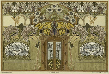
Some of the Art Nouveau plates from Dekorative Vorbilder, a series devoted to the decorative arts published in Germany from 1895 on. The interior design suggestion above has me wondering whether there’s ever been another period of design when it’s seemed quite natural (so to speak) to offer a giant insect and monstrous flowers as wall motifs. Something to bear in mind if anyone tries to argue that Art Nouveau wasn’t a radical form.
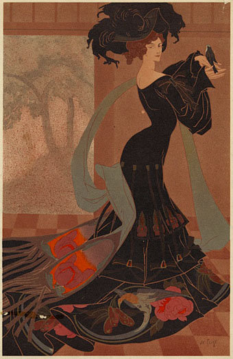
Georges de Feure.
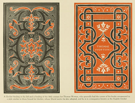
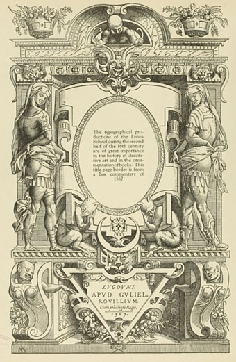
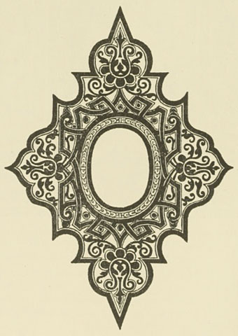
These plates are all from a collection at the NYPL Digital Gallery where the samples available cover a range of styles from the ancient world to the 19th century. The collection there doesn’t seem complete, unfortunately, and much as I’d like to point to a complete set elsewhere that doesn’t seem possible for the time being. If anyone knows otherwise, please leave a comment.
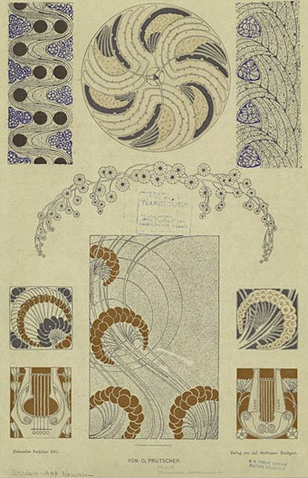
Otto Prutscher.
Previously on { feuilleton }
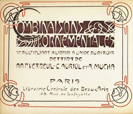
• Combinaisons Ornementales
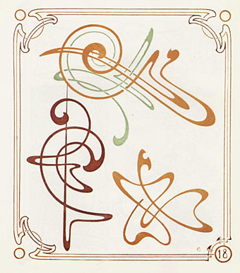
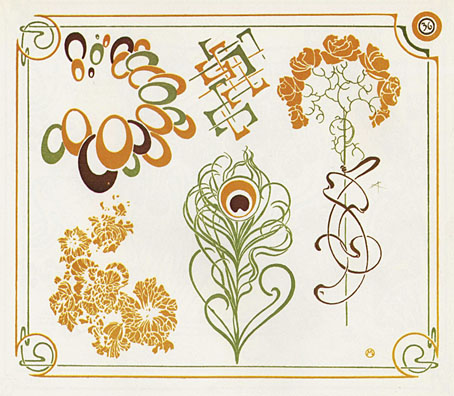
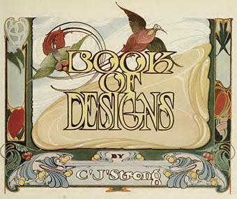
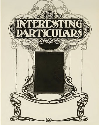
• Charles J Strong’s Book of Designs
• Styles of Ornament
• The Grammar of Ornament by Owen Jones