
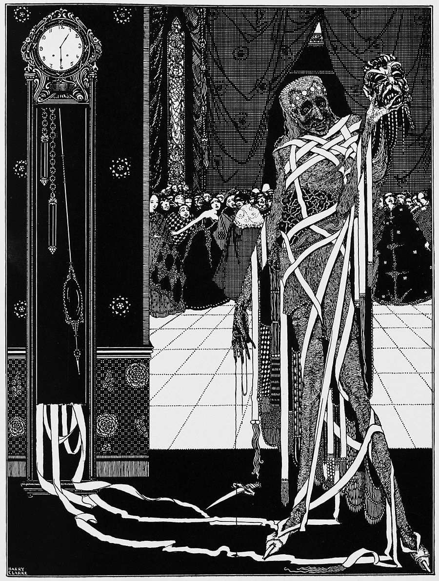
“The dagger dropped gleaming upon the sable carpet.” The Masque of the Red Death illustrated by Harry Clarke, 1919.
• 2020 is the year of enormous pink lady faces on book covers, apparently. As someone who spends little time following cover trends, the identification of a new variety of herd behaviour among designers or their art directors is always fascinating and bizarre.
• Tomoko Sauvage plays her porcelain and glass instruments inside a disused water tank in Berlin for a new album, Fischgeist. The Wire has previews.
• At The Paris Review: Craig Morgan Teicher on the later work of Dorothea Tanning, and Daniel Mendelsohn on the rings of Sebald.
Unlike many of the rapidly forgotten [Nobel] “winners”, and despite the occasional sniffy critic wondering “who still reads it?” Durrell’s Alexandria Quartet has never been out of print since he published it in 1957. The centenary of his birth in 2012 raised a flurry of revived interest in Durrell. Indeed the whole Durrell family has been popping up regularly in reprints of Lawrence’s novels and poetry, in his brother Gerald’s popular tales of his “family and other animals,” and in several TV series about their life in Greece on Corfu island in the late 1930s. A BBC interviewer once asked Lawrence about the difference between his writing and brother Gerald’s. He replied: “I write literature. My brother writes books that people read.”
I’ve read Gerald and I’ve read Lawrence; I prefer Lawrence, thank you. Thomas O’Dwyer examines the chef d’oeuvre of the elder Durrell, The Alexandria Quartet
• Dark Entries shares Patrick Cowley’s cover of Chameleon by Herbie Hancock. The original is here.
• Saunas, sex clubs and street fights: how Sunil Gupta captured global gay life.
• Inside the Grace Jones exhibition at Nottingham Contemporary.
• Rob Walker on how dub reggae’s beats conquered 70s Britain.
• Who invented the newspaper? John Boardley reports.
• Spread The Virus (1981) by Cabaret Voltaire | Cut Virus (2003) by Bill Laswell | The Unexclusive Virus ~even our invincible religion “Technology” cannnot~ (2006) by Kashiwa Daisuke
That first link is of fascinating interest to me. I’ve often wondered how trends in book-art-design take shape. Are they intentional dominos? Or as I often feel, is there some memo I’m forever left off of?
Many of these covers are from different publishers, so how can this many designers have such similarities…in such a short time.
I understand color theory
and how it relates to design/ retail impact, but it makes me flustered when things like this “Pink Lady” trend are pointed out with collages of proof.
Do you have any theories on this?
(Big pink sigh)
I think what often happens is that a particular book with a distinctive cover design becomes a big success and this then prompts the people publishing books with similar content to follow suit, even if the design isn’t such a good fit elsewhere. This happened with Everything Is Illuminated by Jonathan Safran Foer which started a trend for novels with big, hand-lettered titles.
Trend-following of this kind seems especially prevalent in US publishing. Many of the books published in the US in the 1980s are immediately identifiable by their arrangements of coloured bars and chunky, angular typefaces such as Kabel. Likewise, American genre novels from the 1970s often had big title designs with fancy swash lettering. My guess is that this happens when there are greater commercial pressures at work, so more people are having a say in what the covers look like. There’s still room in US publishing for solo designers doing their own thing but they’re in the minority.