
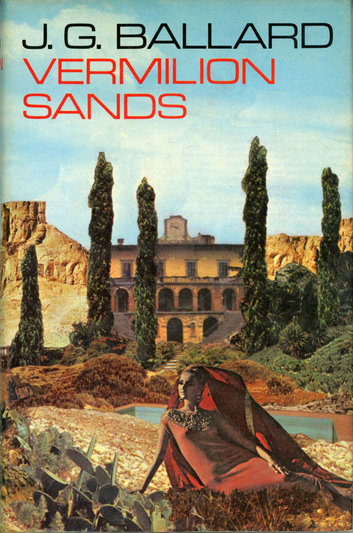
First UK edition, 1971. Art by Brian Knight.
Vermilion Sands (1971) is a story collection by JG Ballard which maintains a cult reputation despite being overshadowed by its author’s more popular novels. Most of the stories were written in the 1960s—a couple of them are among Ballard’s earliest works—but where many of his other short stories can read like the work of a writer with bills to pay, the tales of Vermilion Sands are much closer to Ballard’s core interests, filled with symbolic resonance and literary allusion.
Vermilion Sands, the place, is a near-future resort with a desert climate and an unspecified location; a region where the Côte d’Azur meets Southern California but the ocean is a sea of sand. While each story has a different artistic or cultural theme, all are populated by the idle midde-class types found in the rest of Ballard’s work. Ballard more receptive to visual art than many authors, especially the SF writers of his generation for whom art was less interesting than science and technology. There is science and technology in these stories—some of the latter is now inevitably dated—but it doesn’t dominate the proceedings. The stories derive less from scientific speculation than from Ballard’s desire to create a future he would have been happy to inhabit himself, an alternative to the grim dystopias which proliferate in science fiction. The background furnishings also reflect the author’s ideal, owing much to the Surrealist landscapes of Salvador Dalí and Max Ernst, a pair of artists whose works are often referenced in Ballard’s fiction. Given all of this you’d expect that cover artists might have risen to the challenge more than they have. What follows is a look at the most notable attempts to depict Vermilion Sands or its population, only a few of which are covers for the book itself.
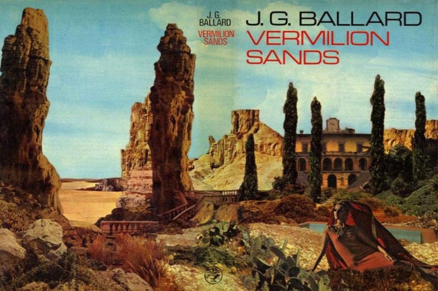
Cover designs have been surprisingly poor for this title. Recent designers (or their art directors) have abandoned attempts to illustrate the book, preferring to play safe with abstraction to avoid scaring away readers for whom the trappings of science fiction remain unpalatable. Ballard’s preface to Vermilion Sands may describe his book as celebrating “the neglected virtues of the glossy, lurid and bizarre” but you won’t find any of his covers offering such qualities today; the Brutalist laureate of Crash, High Rise and Concrete Island has overwhelmed the Symbolist author of Prisoner of the Coral Deep and The Day of Forever. The wraparound cover of the British first edition is a collage by Brian Knight that does at least resemble a painting from Max Ernst’s decalcomania period of the 1940s, and as such may be taken as having authorial approval. The architecture and those rock formations that may be mutated cypresses also suggest the Mediterranean paintings of Arnold Böcklin, an artist whose Isle of the Dead is referred to in The Crystal World. The first editions of that particular novel were wrapped with one of the Ernst models for this cover, The Eye of Silence.
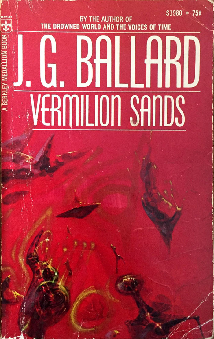
The first US printing, on the other hand, foreshadows future trends, with Richard Powers offering a collection of blobs even more abstracted than his usual standard. The proximity of Powers’ style to Yves Tanguy would have made him a good choice here but on this occasion he offends my general rule that if the cover could very easily be applied to another book then it isn’t working.
Amazing Stories, March 1962.
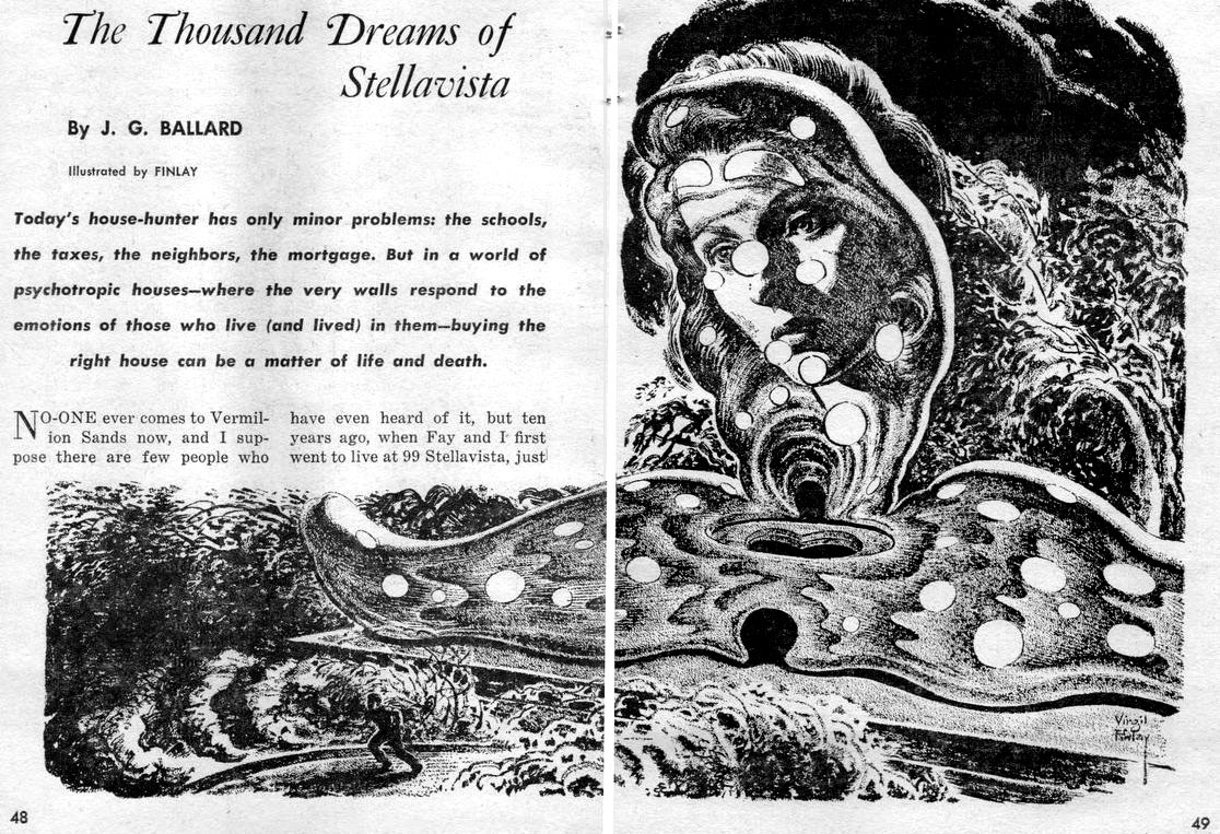
The Vermilion Sands stories fared better in the SF magazines where they first appeared, and the first notable illustration is by the great Virgil Finlay. Ballard and Finlay were paired on a number of occasions in the US magazines but mostly for Ballard’s more traditional SF stories.
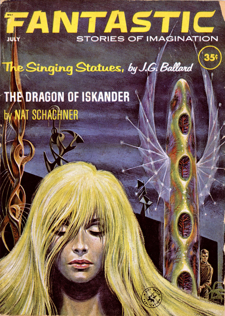
Fantastic Stories of Imagination, July 1962.
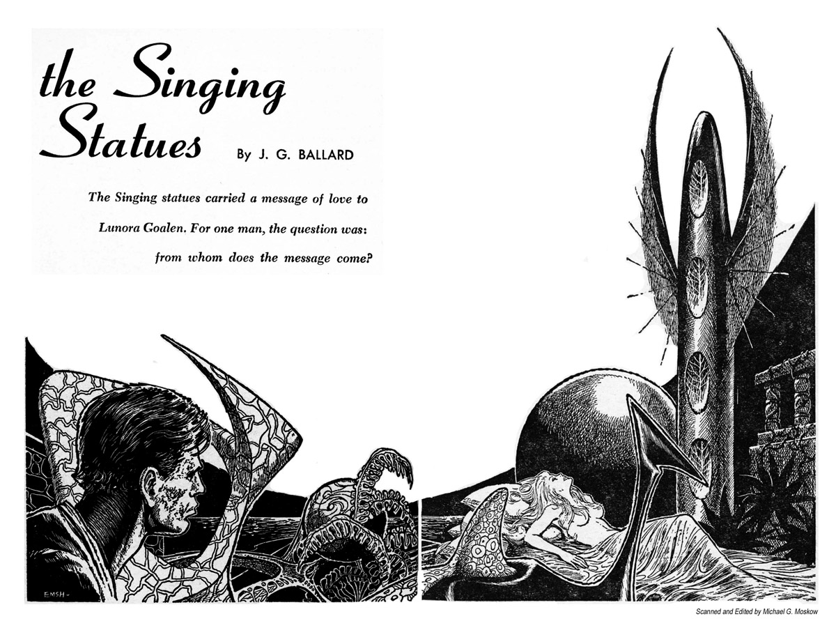
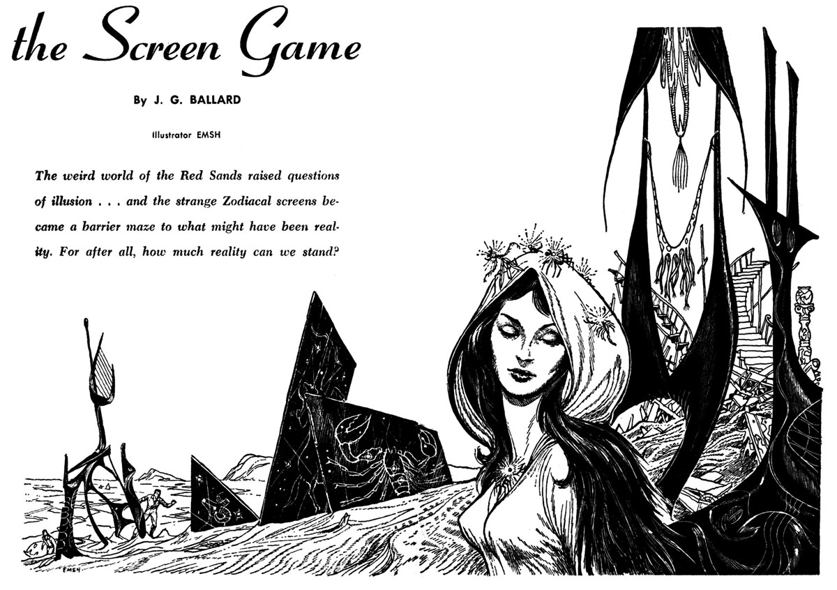
If you can’t have Virgil Finlay then Ed Emshwiller is a worthy substitute. The publication of two of the stories in Fantastic gave Ballard the covers and a pair of particularly good interior spreads. The Screen Game (below) has the additional distinction of being the only SF story to borrow its staging from a Jean Genet play.
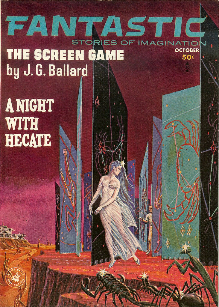
Fantastic Stories of Imagination, October 1963.
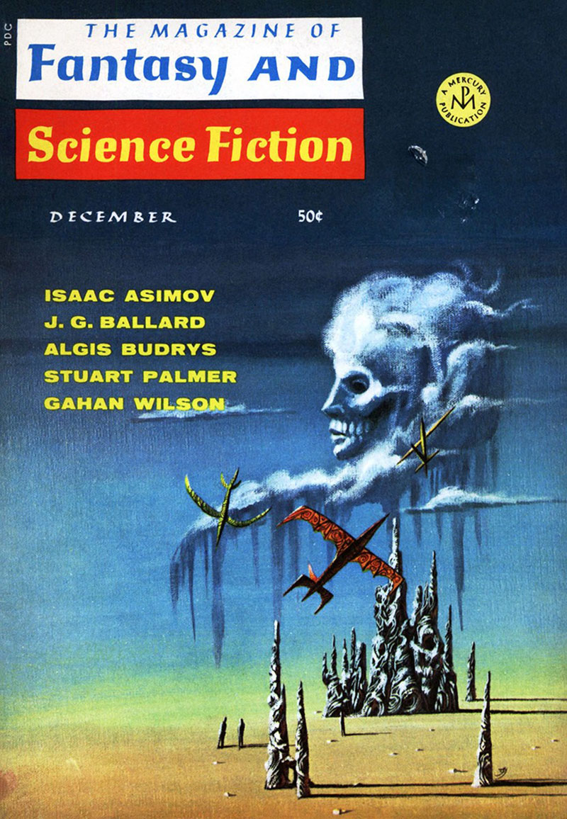
The Magazine of Fantasy and Science Fiction, December 1967.
Fantasy and Science Fiction didn’t run interior illustrations so all we have is Jack Gaughan’s cover painting depicting The Cloud Sculptors of Coral-D. Not as lavish as its predecessors but there’s a definite touch of Dalí in those clouds, isolated rocks and lengthening shadows.
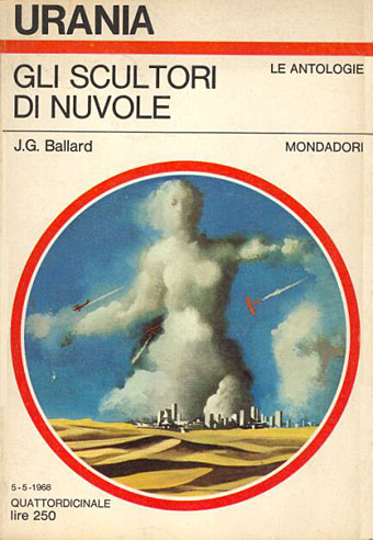
Urania 487, 1968.
This edition of Italian magazine Urania was a Ballard special for which Karel Thole shows us a more mundane view of the cloud sculptors. Vermilion Sands itself appears to be a concrete city.
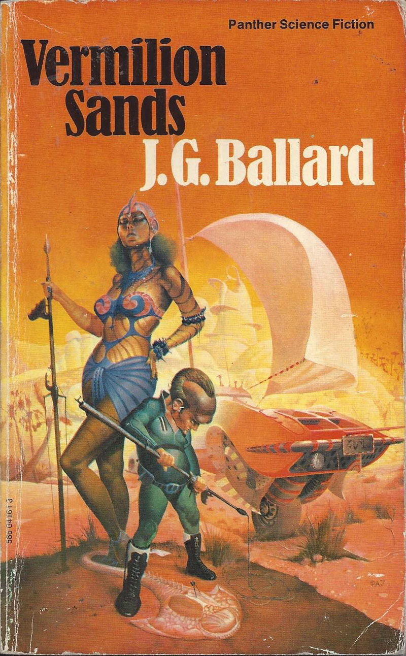
The first UK paperback in 1975 was also the first and last to show a typical SF scene. The sand yachts and sand rays are persistent features of the stories but Peter Jones is the only artist to depict them.
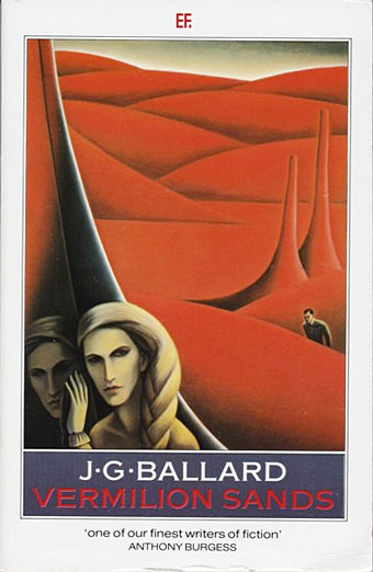
The success of Empire of the Sun shunted Ballard away from the disreputable genres and into the big literary world. When Vermilion Sands was reprinted again in 1985 it carried this bland piece by Grizelda Holderness, one of a series of Ballard reprints from JM Dent which dispensed with overt SF trappings. Everything to date for Vermilion Sands has been increasing abstraction: the triumph of Richard Powers and his scarlet amoebas. The characters in these stories may pass the time in their Surrealist landscapes by reading aloud from Lautréamont but you’ll have to crack the spine of the book to discover this. The publishers wouldn’t dare risk startling the sand rays.
Previously on { feuilleton }
• Ballard and the painters
Really enjoyed this, thank you. Vermillion Sands has haunted me for many, many years. Do you know if any of the stories have ever made it to the big screen?
VERMILION SANDS is probably my favourite of Ballard’s short fiction; it is Ballardianism encapsulated in a darkly glittering vial. I have always appreciated fiction that is less like fiction than a catalogue of an author’s obsessions and interests, especially if they partake on the fantastic, grotesque, and disregarded. Do your AXIOM books not have a similar aesthetic, the interconnected setting being a playground for you phantasies and enthusiasms?
How are you getting on with DOCTOR HOFFMAN? I think there is a moment when the protagonist, Desiderio, visits the seaside peep-show and sees, among other marvels, bejewelled insects, which reminds me of my favourite VERMILION SANDS story, THE SCREEN GAME.
Sam: Thanks, and there haven’t been any screen adaptations to date even though the resort is described as a home to wealthy film stars. If the stories were more generically dramatic I’d imagine they’d be perfect for a one-off TV series, especially now that special effects can be done much more effectively. But they aren’t so they won’t. The trouble with Ballard is that much of his best work is about psychological drama, something that doesn’t work well for a thrill-seeking film or TV audience.
Liam: I finished Doctor Hoffman a few days ago. It also reminds me of Ballard’s The Unlimited Dream Company, another book about surprising transmutations. I’ve been re-reading Ed Bryant’s Cinnabar stories prior to starting another Carter which is what prompted this post since Bryant mentions Vermilion Sands as an influence. The Axiom material is very indebted to these examples of stories that share an invented location (to which one could also add M. John Harrison’s Viriconium Nights). It’s a very convenient vehicle for imaginative fiction since you establish the location then work within it instead of having to reinvent the background each time. And you can also tailor the place to suit your tastes. Axiom, the city, is a dark hybrid of favourite bits of European cities circa 1930, where trams and heavy industry collide with occultism and decadence. Once I find the time to get a Patreon together all this will become more apparent.
what a delight this piece is, I think Vermillion MIGHT be my favourite Ballard? I certainly re read it often enough lol! Excellent piece as always John really enjoyed it very much :)
Love John’s Cape jacket – and a good piece on the book. I think it’s neglected these days. My essay in ‘Deep Ends 2018’ (“Me: Capri: Brigitte Bardot” – a psychogeogrphical/travel/lit hist article of some 15,000 words) conflates the Italian island of Capri with ‘Vermilion Sands’. In my work as a bookseller, I push ‘VS’ a lot, since it’s about the only Bllard now published in the UK in SF livery. Love it!
Thanks, David, Stephen. The comparison with Capri is apt, and would be even more so if the Mediterranean was a desert sea filled with sand rays.