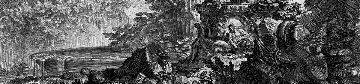
An early promotional poster from 2014 by Jay Shaw.
Ben Wheatley’s film of the novel by JG Ballard approaches. As is my custom, I’ve been avoiding the trailers of this and any other film of interest but the posters are increasingly impressive. Ben Wheatley and fellow Brit filmmaker Peter Strickland (whose The Duke of Burgundy was produced by Wheatley’s Rook Films) have distinguished themselves not only by the quality of their films but also by caring about the designs used to advertise their work. Last month I linked to a story about the dire state of the US poster world where design-by-committee is the order of the day. The designs for Wheatley’s films have been a welcome riposte to this trend. Can the film live up to its posters? Find out in March.
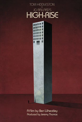
The first poster shows the doomed jeweller heading earthwards for his rendezvous with a parked car. Easy to imagine this design giving a Hollywood marketing committee the vapours.
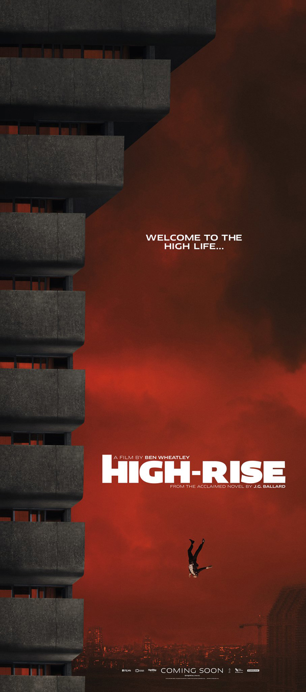
And poster 2 is the view from the car park. A design that Ballard would have loved given the way his prose picks out automotive details such as “chromium trim”.
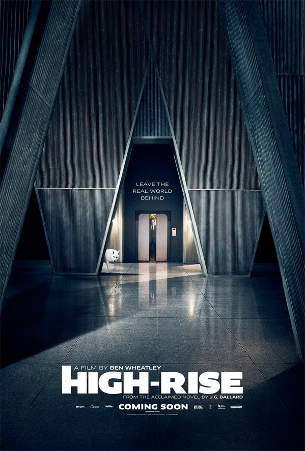
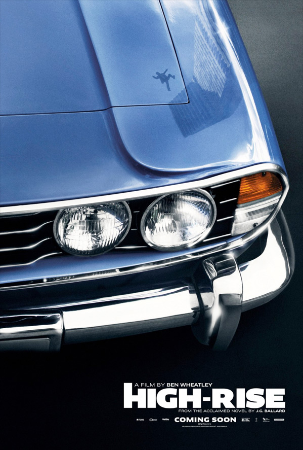
Poster 3 is deliciously architectural, and augurs the best of the bunch…
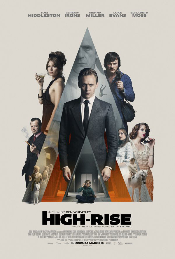
Poster 4 is catnip for Kubrickians, 70s obsessives or simply those who appreciate good design. Wheatley’s film is set in the 1970s so a nod to the Bill Gold/Philip Castle poster for A Clockwork Orange is fitting, as well as being a superb way to arrange the main characters. I don’t recall Ballard saying anything favourable about Kubrick’s film (he didn’t like 2001: A Space Odyssey) but Anthony Burgess enjoyed Ballard’s work, and in 1984 put The Unlimited Dream Company (1979) into his Ninety-Nine Novels: The Best in English since 1939.
I’ve not seen a design credit for any of these recent posters so if anyone has the details please leave a comment.
Previously on { feuilleton }
• Saragossa Manuscript posters
• Parajanov posters
• The poster art of Akiko Stehrenberger
• La Belle et la Bête posters
• Dr Mabuse posters
• The poster art of Frank McCarthy
• Repulsion posters
• The poster art of Vic Fair
• Petulia film posters
• Lucifer Rising posters
• Wild Salomés
• Druillet’s vampires
• Bob Peak revisited
• Alice in Acidland
• Salomé posters
• Polish posters: Freedom on the Fence
• Kaleidoscope: the switched-on thriller
• The Robing of The Birds
• Franciszek Starowieyski, 1930–2009
• Dallamano’s Dorian Gray
• Czech film posters
• The poster art of Richard Amsel
• Bollywood posters
• Lussuria, Invidia, Superbia
• The poster art of Bob Peak
• A premonition of Premonition
• Metropolis posters
• Film noir posters
The Jay Shaw poster up top looks like one of the covers by David Pelham for the 70’s penguin editions
Poster 3 reminds me of the set design for the alien architecture in “Forbidden Planet”.
Poster 4 makes handsome actors into even better art objects. The preferr’d brand of catnip!
Modzilla: Yeah, I think that’s what Jay Shaw had in mind. Many of his posters for other films are pastiches of various styles.
chazza: I’m happy to see any Krell influence manifesting elsewhere.
The posters (barring the Jay Shaw one at the top which was printed as a promotional piece for distributors I believe) are by Empire Design.