
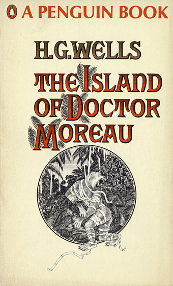
This time last year I happened to be re-reading my way through the collected short stories of HG Wells; this year I’ve been reading The Island of Doctor Moreau, not to continue the seasonal trend, I simply felt the urge. More about Moreau tomorrow.
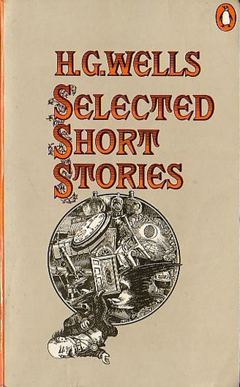
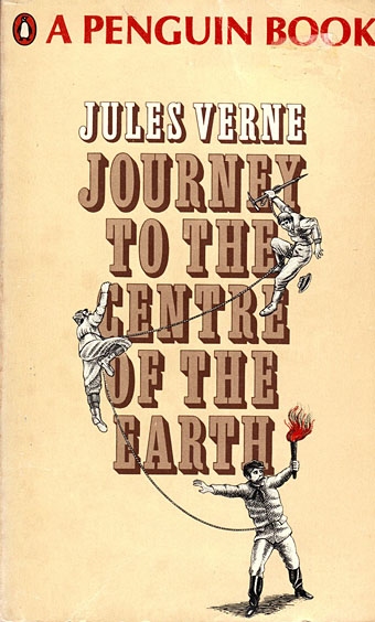
These covers are from a series of Penguin reprints which first appeared in 1967 and went through several editions. Harry Willock was the cover artist, and may also have been the designer of the Wells and Verne titles, other text-only Penguin covers from around this time being credited to Willock. The Penguin Science Fiction site describes the obtrusive “A Penguin Book” legend as the “panic top”, a heavy-handed attempt by Penguin’s management to reinforce their brand. Later reprints dropped this but it’s stamped across most of these editions.
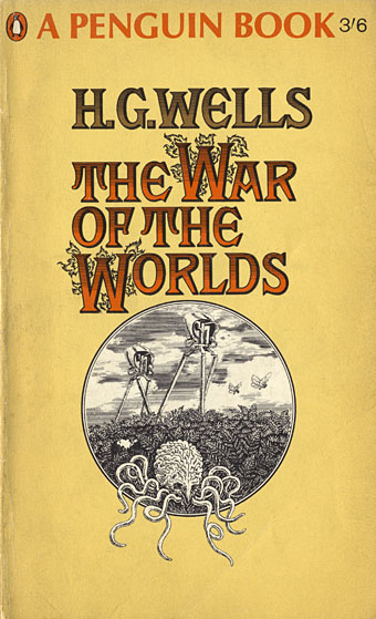
This edition of The War of the Worlds was my first encounter with the novel so the cover has always been very familiar, a factor which probably prevented me from seeing how effectively all the Willock Wells covers work as a set. The Martian war machines aren’t very menacing—especially when they seem to have done little but arouse a pair of butterflies—but I do like the type layouts and the way the illustrations are concentrated into a circle. Willock’s drawings so closely imitate the style of Victorian engravings it’s easy to take them at first glance for the genuine article.
My edition of this one is a 1979 variation which dropped the Victorian typeface and also tinted the illustration. I prefer the original.
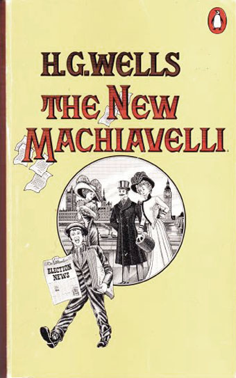
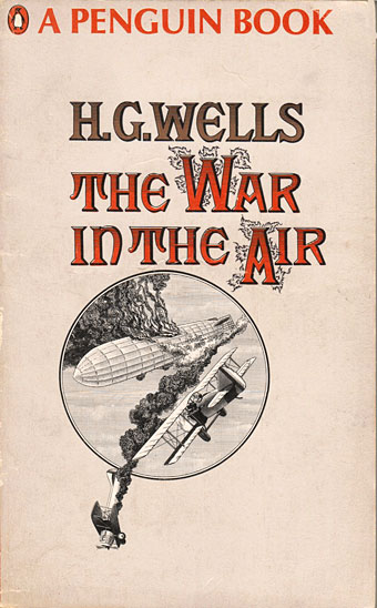
Two more covers along similar lines. The Verne title is from 1968 while the Wells was from 1978, and the last to adopt this faux-Victorian style.
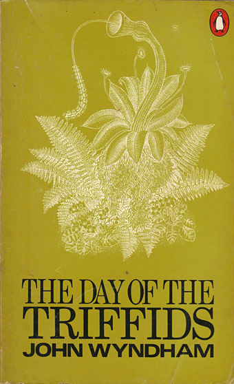
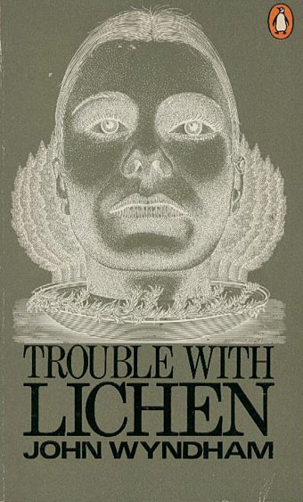
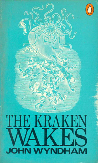
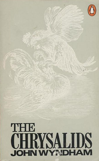
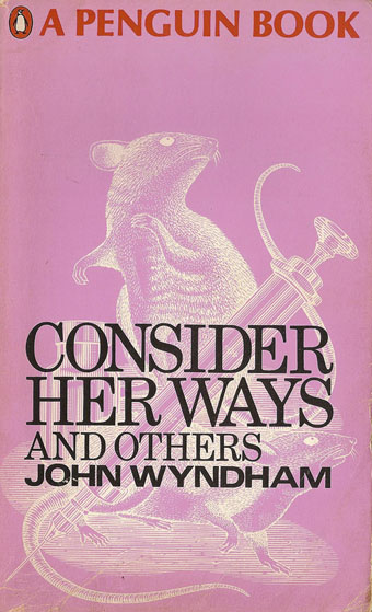
From 1969 on, Willock was also creating the artwork for this impressive series of John Wyndham covers. Once again, his edition of The Day of the Triffids was the first I encountered although in this case I soon tired of the novel. I’m still not sure why that is but I’ve always found Wells sf stories a lot more attractive than Wyndham’s. But I do like these covers (one of which is spoiled by the panic top); the simple expedient of reversing the line drawings out of a coloured background works very well. As with the Wells, this set went through several editions, some of which change the background colours. Six of them also appeared in a boxed collection.
There isn’t much information available about Willock’s other work online apart from credits as illustrator for a number of Alan Aldridge projects. Aldridge was art director at Penguin from 1965–68 so would have had a hand in the design of these covers.


Elsewhere on { feuilleton }
• The book covers archive
• The illustrators archive
Previously on { feuilleton }
• The Time Machine
• The Magic Shop by HG Wells
• HG Wells in Classics Illustrated
• The night that panicked America
• The Door in the Wall
• War of the Worlds book covers
The Wyndham covers are terrific. I find the Wells covers anachronistic. I don’t think they have the right feel for Wells.