
Continuing an occasional series.
A recent post at A Journey Round My Skull is a stylish series of Indian book jackets from 1964 to 1984. These impress partly for the way they rework western design approaches, and they consequently look very different from the florid visuals one might (lazily) expect of Indian cover design. Western culture borrowed more than enough from India in the 1960s, from clothes to music, so it only seems right that the sub-continent should be free to take something back.
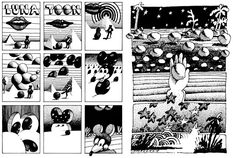
Luna Toon by Victor Moscoso (1968).
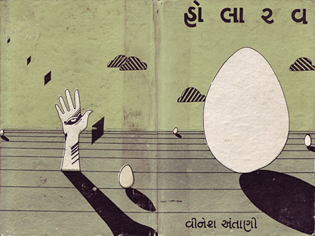
Will at A Journey Round My Skull mentions the above cover design as reminding him of this Krautrock bible, The Crack in the Cosmic Egg, a book which happens to be a favourite repository of musical obsession. The cover reminded me more of the weirdly abstract comic strips created by artist and graphic designer Victor Moscoso for the early run of Zap Comix in the late Sixties. Moscoso was one of the most graphically revolutionary of the West Coast poster artists, and his approach to comics looks surprisingly fresh today next to the work of fellow artists like Robert Crumb. Those limitless vistas go back to Giorgio de Chirico but it was Salvador Dalí who made deserts raked by evening shadows reflect interior landscapes of his own, and it was Dalí’s immense popularity that in turn popularised that endless plane as a stage for surreal events. Moscoso borrows from the Surrealists and comic artists like George Herriman as much as he borrows from Disney; in his posters he was one of many artists taking motifs or whole designs from Art Nouveau. Our Indian egg may well be an original work but the first example in Will’s post is a very Saul Bass-like hand, so I’m guessing that the designers of these books were looking around for inspiration. And that eye-in-a-hand? Moscoso had done that as well.
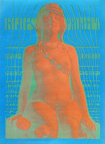
Blues Project Poster by Victor Moscoso (1967).
While we’re discussing Victor Moscoso, it’s convenient to draw attention to a slight mystery connecting his poster art and the great album cover designer, Barney Bubbles. The poster above was one of a number that Moscoso made incorporating Victorian or Edwardian photographs, and two at least of these use antique erotica as their central image.
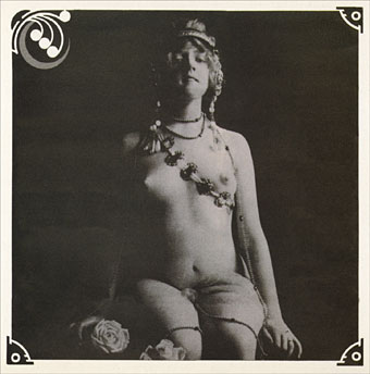
Space Ritual interior, design by Barney Bubbles (1973).
This particular photo always stands out for me. The woman is familiar to anyone who’s seen the interior of the fold-out sleeve Barney Bubbles created for Hawkwind’s Space Ritual album in 1973. Barney spent some time in San Francisco in the late Sixties and was undoubtedly familiar with Moscoso’s work, as he was with all the great designs coming from the West Coast at that time. What surprises me is that he should have somehow found the same image to use as Moscoso did. Was there a popular book of Edwardian erotica which everyone was familiar with? Did he ask Moscoso where he’d found the photo? Did he find it by chance? Barney Bubbles experts don’t know the answer (I’ve asked) and the question is in any case a rather trivial one. But I’m still curious… As early porn photos go it’s a particularly fine one and I’d like to know whether there are more like it and where it came from. Needless to say, if anyone knows more about this, please leave a comment.
Previously on { feuilleton }
• Design as virus 9: Mondrian fashions
• Design as virus 8: Keep Calm and Carry On
• Design as virus 7: eyes and triangles
• Design as virus 6: Cassandre
• Design as virus 5: Gideon Glaser
• Design as virus 4: Metamorphoses
• Design as virus 3: the sincerest form of flattery
• Design as virus 2: album covers
• Design as virus 1: Victorian borders
Fascinating! I had known Victor Moscoso’s work from exposure only, never by name, so now I can study up.
When I did the first post of Indian pulp novels, the blogger mislexic pointed out that all Indian novels — even literary ones — had these wild covers back in the day. He added “in recent times, publishers have replaced them with stock photos.” Maybe this style will come back eventually.
For a more recent (and hilarious, and genius) case of appropriation by what seems to be an Indian designer, check out the use of Sof’ Boy on this print-on-demand edition of “Idle Thoughts of an Idle Fellow.”
Will
Hi Will. I should reiterate that I don’t think the cover necessarily borrows from Moscoso despite the feeling that some of those other designs are based on prior work. But your post gave me a chance to riff on a few things around Moscoso’s art and finally throw the Blues Project/Space Ritual connection out there.
And, yeah…those covers at CCC are crazy, especially Sherlock Holmes in space. Reminds me of the worst cover I saw for William Hope Hodgson’s The House on the Borderland, a cheap American paperback with a painting of a Midwestern shack, nothing at all like Hodgson’s crumbling Irish pile.
Most of those covers feel eerily familiar to me. (Same thing with the 1920s Japanese book covers I posted a few months ago.)
For another tangent, your hunch about a Moscoso influence — and then my looking at his art while thinking about Krautrock — made me remember the connections between Krautrock and the American comix/music underground, which are so obvious but which I often overlook. It took me years to learn the cover art of the first Mythos album is by Rick Griffin. In my scrambled mind that was a classic “German” illustration! (In the last year I’ve been bringing myself up to speed with Rebel Visions.)
I bought that awesome Bubbles book on your recommendation.
Ah, yes, I have that Mythos CD. Not one I like very much really, it’s a bit tepid.
Glad that I’ve pointed someone else to the BB book. I think it’s being launched in a US edition soon which should increase his audience.