
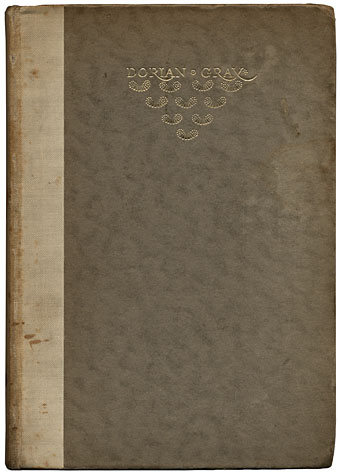
Today’s book purchase was an edition of The Picture of Dorian Gray published in 1945 by the Unicorn Press, London. It’s rather battered and the spine is stained by some unknown brown fluid that may be blood (which would suit a sanguinary tale such as this) but which is most likely something less dramatic.
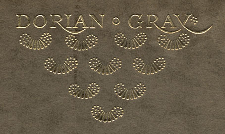
The cover is a cropped version of the design drawn by the wonderful Charles Ricketts (1866–1931) for the original Ward, Lock & Co edition of 1891. More about his work below. Ricketts designed and illustrated a number of Wilde’s books and was far closer to Wilde than Aubrey Beardsley, despite the latter’s permanent association with the writer via Salomé. Ricketts’ title design for Dorian Gray was originally lettered in full and the pattern beneath it extended further down the board. The reversed “y” is a unique touch, something I don’t think I’ve seen anywhere else.
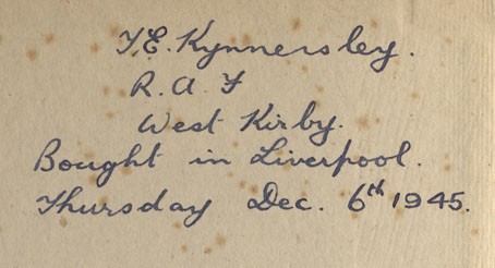
It’s always a pleasure to find books inscribed by previous owners. The letters beneath Mr Kynnersley’s name in this volume are “R.A.F.” denoting his service in the Royal Air Force. The most poignant book inscriptions are those written from the purchaser to a friend, relative or lover being given the book as a gift. Personal statements of this kind always raise a host of questions as to the identity of the people concerned and, if the book is fairly new, set one wondering how it could be given in such good faith yet sold on so soon after. The Book Inscriptions Project has been encouraging contributions of these personal dedications and I suppose I ought to dig out some of the examples I own and forward them.
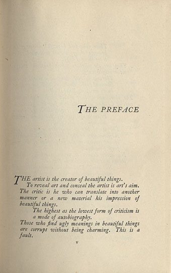
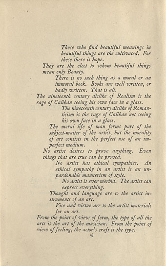
One reason for buying this book was the unusual layout of Wilde’s aphoristic preface. Seeing as the cover is a variant of the first edition I wonder if these copy the original printing. Typographic layout today tends to be regimented by the invisible boxes in which the blocks of type are set, meaning that this kind of page design is far less common, especially from major publishers. Books typeset before digital or electronic typesetting also tend to have variable letter spacing throughout, since the type would be set by hand and kerned by eye.

Cover of The Sphinx by Oscar Wilde; design by Charles Ricketts (1894).
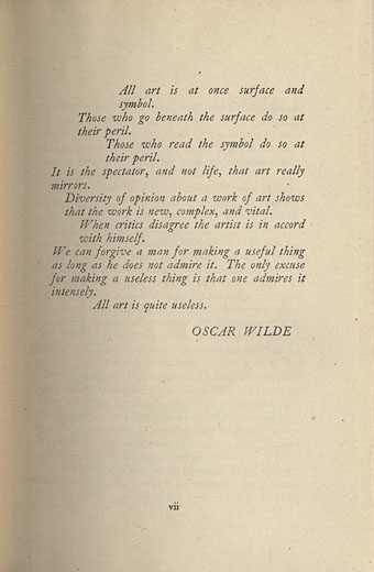
And so to Charles Ricketts whose work I’d been intending on writing about earlier. Ricketts and lifelong partner Charles Shannon were two of Wilde’s gay friends whose devotion to art—especially the art of book and magazine design—delighted him. He described their home at no. 1 The Vale, Chelsea, crowded with objets d’art, as “the one house in London where you will never be bored”. Two of his books were designed and illustrated by Ricketts, A House of Pomegranates (1891) and The Sphinx (1894), and Ricketts provided lettering and cover art for other Wilde books besides Dorian Gray. The Sphinx is easily a match for Salomé, despite being overshadowed by that notorious volume initially. In fact it’s arguably the more successful work in terms of pure book design. Beardsley’s antagonism towards Wilde’s text meant that the words and illustrations are frequently at odds, whereas Ricketts’ illustrations are a perfect complement to Wilde’s verse. Ricketts also oversaw the typesetting of the book, something that Beardsley never did. Rickett’s later considered the book to be his best design.
Melancholia; frontispiece to The Sphinx (originally printed in three colours).
Once again it’s necessary to complain that there isn’t a great deal of an artist’s work on the web. The Victorian Web has a few examples of Ricketts’ other work. The best general introduction in book form is Stephen Calloway’s Charles Ricketts: Subtle and Fantastic Decorator (1979), if you can find a copy.
Elsewhere on { feuilleton }
• The Oscar Wilde archive
• The illustrators archive
• The book covers archive
Previously on { feuilleton }
• Beardsley’s Salomé
• Alla Nazimova’s Salomé
I’m quite the fan of Ricketts, and have a book of his designs that shows the breadth of work he was interested in. Book illustrations and cover designs (including Dorian Gray), jewellery designs, ballet and opera sets and costumes etc. I know that wasn’t unusual for the time, lots of designers worked in many fields, but I really like his work.
That’s good to hear, Andrew, few people I meet have even heard of him, never mind have books of his work.
He seems to have been unusual in being involved in both the print world and the decorative arts. It’s common for designers and artists to produce a variety of work for the theatre and fashion worlds but not to do books as well. That may be due to Modernism which swept away the idea of the lavishly decorated volume. Theatre design, on the other hand, allowed Symbolist types such as Ricketts and Leon Bakst to still pursue their own exotica.
I’ve always wondered how Beardsley would have fared had he made it into the 20th century; he may well have ended up in the theatre as well, he was certainly an enthusiast.
I would like to add that Ricketts & Shannon operated a very successful private press ”Vale Press” named after their home in London, the Vale. I believe they published 75 books including a complete Shakespeare. The books are as you can guess beautifully designed and influenced by William Morris. The Vale Press, Morris’ Kelmscott Press and C.R. Ashbee’s Essex House Press issued some of the most elegant volumes to come out in Victorian and pre world war one England.
Dorian Gray was made into a movie staring Hurd Hatfield and the always-dashing George Sanders. The painting of Gray is presented as a rather bland academic portrait but the one that he discovers at the end of his debauched and ruin ness life was painted by the great American painter Ivan Albright. Surely a stroke of genius by the production design department. However the painting at the end is so ghastly that I cannot imagine what kind of rudeness Dorian has gotten up to in the 18 years. I don’t think Wilde was very specific about Dorian’s acts that dare not be named. The final painting hints that he neglected his personal hygiene, never changed his clothes, flirted with cannibalism and acquired leprosy. It also seems he never had a housekeeper. When he stabs the painting all of the immorality transfers to him and he falls dead in a heap of corruption.
The painting is reproduced along with Albright’s other work in Michael Croydon’s wonderful coffee table book on the artist.
Hi Richard,
I could have mentioned the Vale Press but thought I’d keep it brief; one of the problems with posts of this nature is they quickly turn into mini-essays and there’s only so much time in the day.
I’ve seen the Lewin film many times, of course, and made a brief posting about it in the “Previously” links above. In fact when I look at the novel now I tend to see Lord Henry as being George Sanders, he fits the role so well. I’ve always been fascinated with Ivan Albright’s painting, its use in the film is a rare moment in a Hollywood adaptation where the revelation actually lives up to expectations.
Its wonderful to see the pages from “The Sphinx.” It sent me through my library in search of the one image from that book I was familiar with, of the creature emerging into something reminiscent of Egyptian ruins, (I found it in Brigid Peppin’s book “Fantasy: The Golden Age of Fantastic Illustration.”) I really like that image and its a treat to see other pages. I will have to see what else I can find on him.
Hi Daniel. I’d recommend looking for a copy of the Calloway book mentioned above. It has all the Sphinx artwork and a great deal of other Ricketts work besides.