The Michelangelo-esque photography of Steven Vaschon.
A journal by artist and designer John Coulthart.

The Michelangelo-esque photography of Steven Vaschon.
In which your humble narrator enters a contest…
Speak Up, in collaboration with New York magazine, is proud to announce the first-ever open contest to design the visually acclaimed, graphically exhilarating, by-invitation-only “High Priority” feature illustration in the magazine’s year-end, December 18, 2006 double issue.
High Priority highlights five activities, suggested by New York writers, that are not to be missed. Every week designers and illustrators from around the world are invited to create an interpretive typographic illustration to open “The Week” – the listings section of New York Magazine. New York readers place great weight on these five recommendations, and this page is a regular destination for many.
For examples of past editions of High Priority please visit:
New York‘s High Priority archive
Design Observer’s Variations on a Theme: New York‘s High Priorities
I knew about this listings feature from having read the Design Observer piece (I’ve never seen a copy of New York), and liked the idea for what amounts to the design equivalent of a “standard” in jazz, with different designers having to present a riff on the same brief in each issue. The restrictive nature of the problem is part of its appeal; only two colours are allowed (red and black), the box must be the shape it always is, and the design has to incorporate five categories—Movies, Theater (sic), Art, Nightlife and Restaurants—with the date, the words “High Priority” visible somewhere, and the accompanying critics’ recommendation for each category. Aside from that, anything goes.
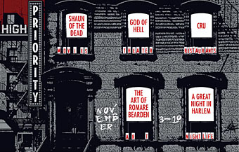
My attempt can be seen above. I was going to do a couple of different designs then pick the best one but in the end I ran out of time. The initial idea was to do something along the lines of the cover for Physical Graffiti by Led Zeppelin (below) but—as is often the case with first ideas—making it work wasn’t so easy.
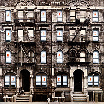
Led Zeppelin’s building is a great photograph of a New York brownstone (the original vinyl sleeve had slots cut in the windows through which the lettering and various pictures on the inner sleeves could be seen); mine had to be pieced together from separate pictures of New York in the 1930s. It doesn’t quite work because there’s not much justification for having the category lettering arranged like rows of birthday cards on the window sills. But maybe I’m being too hasty in pulling it apart when the winner won’t be announced until December 4th. Until then you can browse the 186 other entries. I have to say that the quality of these is really exceptional, if I were one of the judges I’d have a hard time choosing only one. Most of the time I wouldn’t give a second glance to an online contest but this one was fun and the high standard of the other entries has made it worthwhile.