The Return of the Crawling Chaos

nyarlathotep.jpg

Behold Nyarlathotep, v. 3.0, this being yet another revision of an old illustration. Some readers may recognise the imagery from version 2.0 (2009) or even the original that appeared in my Haunter of the Dark book in 1999. Earlier this month the work I’ve been doing for the new edition of the book reached the end of another stage with the completion of all the necessary redrawing of The Dunwich Horror. I’ve also just finished drawing page 24 of the story, the page I’d left half-done when the strip was abandoned in 1989. Everything I do from now on will be new material.

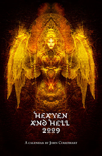
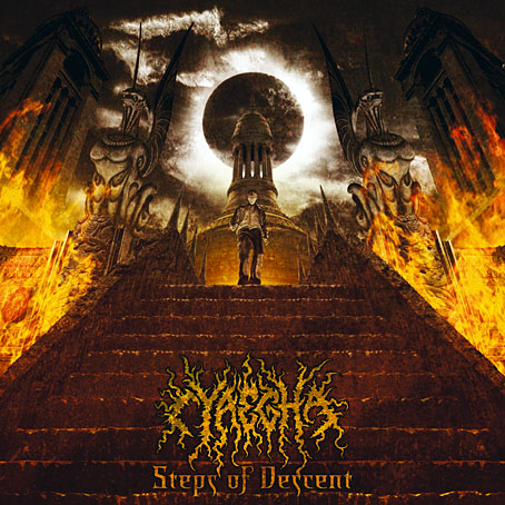
Having got this far I decided to pay a little more attention to the upgrading of the book’s fourth section, The Great Old Ones, by finishing Nyarlathotep, something I began this time last year then set aside when I got involved in rescanning all the old comics pages. As I’ve mentioned before, several of the pieces for this section of the book were some of my earliest digital illustrations, created a few months after I’d bought a secondhand and very underpowered Macintosh computer. Nyarlathotep was an attempt to depict the hybrid nature of a Mythos entity which combines elements of an Egyptian pharaoh, the diabolic “Black Man” of European witch cults, a sinister stage magician or scientist, and the winged abomination that Robert Blake finds lurking in the steeple of the Starry Wisdom church. Version 1 was one of my very first digital collages which suffered as a result of my inexperience with the new medium, hence my eagerness to rework the design in 2009 when Cyaegha, a metal band I’d been working with, requested a Nyarlathotep-themed T-shirt. The first version had been aimed more at the theatrical/scientific aspect of the character, with a poster in the background from John Nevil Maskelyne’s Egyptian Hall in London. For version 2 I added a number of organic elements to bolster the “Haunter of the Dark” side of the character. Version 3 keeps all the details from version 2 while replacing some of the collaged elements with similar ones taken from better sources. The new design is also slightly taller to account for the enlarged page size of the new book.

sephiroth.jpg

The Sephiroth chart from the second edition of the book, 2006.

The most notable additions to the new piece are the names of the character in Latin letters and Egyptian hieroglyphs (𓋔𓇋𓄿𓂋𓈌𓊵), the latter being a suggestion from this Reddit post. The Egyptian spelling is conjectural but I have a guidebook to the hieroglyphic language which confirms that most of the letters are the ones they should be. The words aren’t included solely as decoration. The Great Old Ones was a collaboration with Alan Moore in which Alan wrote eleven texts or invocations which position each god or entity on one of the spheres of the Kabbalistic Tree of Life. Alan was heavily involved with the Kabbalah at this time, being also engaged with the first few issues of Promethea, a story which involves a physical (or metaphysical) journey from Malkuth to Kether. The Great Old Ones takes the same journey in reverse, and from a much darker perspective, like a Lovecraftian equivalent of the Qliphoth, the “nightside” of the Kabbalistic spheres. In Alan’s scheme, Nyarlathotep is positioned at sphere 8, Hod (or “Splendour”), a sphere associated with gods of magic and language like Thoth, Hermes and Mercury. I imagine most Mythos-acquainted occultists would agree with adding Nyarlathotep to this pantheon. In addition to being gods of magic and language, Thoth, Hermes and Mercury also serve as celestial messengers, a function which Lovecraft assigns to Nyarlathotep in The Whisperer in Darkness when one of the Mi-Go declares “To Nyarlathotep, Mighty Messenger, must all things be told.”

As for the rest of The Great Old Ones, I have four more of them still to be reworked, one of which, Abdul Alhazred (or Lovecraft himself) is almost finished. Further progress will be posted here.

Elsewhere on { feuilleton }
• The Lovecraft archive

Previously on { feuilleton }
• Lettering Lovecraft
• Weird ekphrasis and the Dunwich Horrors
• Kadath and Yog-Sothoth
• Another view over Yuggoth
• Nyarlathotep: the Crawling Chaos

Professor Pepper’s Ghosts

pepper.jpg

Professor Pepper’s Ghosts, c. 1885.

From a page of old theatrical posters. A poster from the Egyptian Hall in London, home to regular performances by celebrated conjuror John Nevil Maskelyne, appears in the background of my Nyarlathotep picture.

For a contemporary explanation of Pepper’s Ghost, look here. Thanks to Thom for the tip!

Previously on { feuilleton }
• Nyarlathotep: the Crawling Chaos

Nyarlathotep: the Crawling Chaos

nyarlathotep.jpg

Unveiling another new piece of work, this is a T-shirt design for metal band Cyaegha whose Steps of Descent album I illustrated and designed last year. They asked for something based on HP Lovecraft’s god Nyarlathotep so I thought I’d take the opportunity to rework from scratch the version of this I created in 1999 for the first edition of The Haunter of the Dark. I always felt the earlier piece was going in the right direction but lacked somewhat in execution; this makes up for that. Lovecraft’s Nyarlathotep is one of his most curious creations, in part because the conception of the character changed over many years. In various stories, letters and dream fragments the god/entity is variously described as an Egyptian pharaoh, an itinerant showman with electrical apparatus, the “black man” of European witch cults and the more typically Lovecraftian squamous alien monstrosity. The challenge, then, is to try and represent a little of each of these elements without overly favouring one or the other.

This is one of two illustrations I’ve produced in recent months which use Photoshop to imitate the engraving collage style of Wilfried Sätty, an artist whose work I discussed in an essay for Strange Attractor #2 in 2005. Sätty’s style was derived from Max Ernst’s famous collage “novels” of the 1930s and Photoshop is the ideal tool for this, far better than the old method of scissors, paper and glue. Sätty expanded Ernst’s technique by using reverse printing and the duplication of images; Photoshop extends the technique even further, making it possible to scale images up or down instead of being limited to the size of the original reproduction. The other illustration I’ve done in this style is for a short story and I’ll reveal that closer to publication. In the meantime I should be making a slightly different version of the new Nyarlathotep suitable for the usual range of CafePress products. More about those when they’re done.

Previously on { feuilleton }
• The Haunted Palace
• The art of Stephen Aldrich

Heaven and Hell Calendar

hhcalendar_cover.jpg

It was only a week ago I announced a new calendar for 2009 and now here’s an additional CafePress creation which manages to offer more than another collection of Lovecraft illustrations. This is a sampling of my work from the past few years gathered under the vague rubric of Heaven and Hell. A couple of pieces are variations on earlier designs reworked so as to fit the square page format. Details follow below.

hhcalendar_pages.jpg

1: Angel Passage (CD cover)
2: The Lucid View (detail; book cover)
3: MBV Arkestra (magazine cover)
4: Emissaries (CD cover)
5: Snakes and Ladders (CD cover)
6: Salomé
7: Fallen Angel
8: The Highbury Working (CD cover)
9: Acid Mothers Temple (poster design)
10: Steps of Descent (CD cover)
11: Metal Sushi (detail; book cover)
12: “Mirage in time—image of long-vanish’d pre-human city” (detail)

Previously on { feuilleton }
• Coulthart Calendar 2009

New things for August

cyaegha.jpg

Arriving in the post today was Steps of Descent, the new CD from American band Cyaegha featuring my design and illustration. The name Cyäegha (sic) belongs originally to a Cthulhu Mythos entity invented by Eddie C Bertin, author of The Whispering Horror, my favourite story from the Pan Book of Horror anthologies of the Seventies. The cover illustration is based on a scene from HP Lovecraft’s The Dream Quest of Unknown Kadath and the cover and inner pages feature some photographic material from one of my Paris trips. I was very pleased with the way this turned out and I believe the band are too. Steps of Descent is officially released by Canonical Hours on the 8th of August.

steampunk.jpg

Another recent piece of work is this Steampunk design suggested by writer Jeff VanderMeer who wanted a suitable layout for his semi-serious Steampunk formula. Jeff and wife Ann edited the recent Steampunk anthology from Tachyon so he knows whereof he speaks. This was going to be a T-shirt design but it seems now it may have a different outlet; more about that if and when it happens. The growing popularity of Steampunk as a sub-culture has raised some hackles recently but I like it even though I’ve not read many of the latest literary contributions. Anything which puts more brass, dirigibles and florid Victoriana into the world gets my vote.

Previously on { feuilleton }
• Zeppelin vs. Pterodactyls
• Wanna see something really scary?