Twinkle, twinkle little stars

turner1.jpg

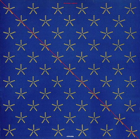
Xitintoday (1978) by Nik Turner’s Sphynx.

It’s been a long time since I’ve had a reason to write about Barney Bubbles but I’ve finally worked out why one of his more mysterious album covers looks the way it does.

When Nik Turner was unceremoniously kicked out of Hawkwind in 1976 he headed to Cairo to consider his next move. While there he recorded an hour or two of flute improvisations inside the sarcophagus in the King’s Chamber of the Great Pyramid of Cheops. The resulting tapes provided the basis for his first solo album, Xitintoday, which was released in 1978 on the Charisma label, and credited to Nik Turner’s Sphynx. Steve Hillage produced the album, helping to craft the meandering solos into a suite of songs based on passages from The Egyptian Book of the Dead. Xitintoday is one of the more unusual concept albums from a decade filled with such things. I’ve always liked it, in many ways it’s closer to Hillage’s oeuvre than Turner’s, as well as being very different to anything else in the Hawk-sphere.

turner2.jpg

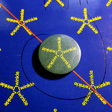
A faded promo badge. The ballpoint scrawl is Mr Turner’s autograph.

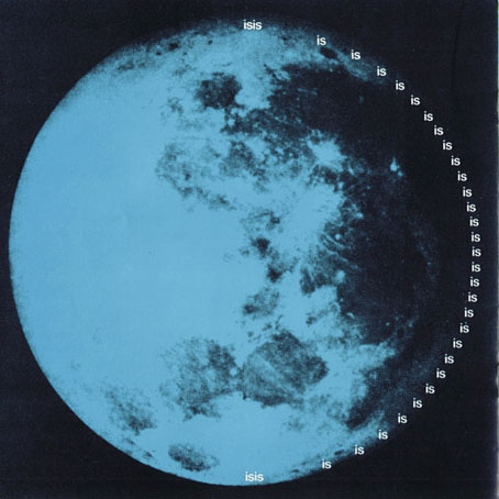
Barney Bubbles’ design for the album is also very different to anything else in the Hawk-sphere, an example of what might be called his High Modernist period, when the hippy motifs and decorative pastiches of his earlier work were replaced with bold, flat colours and playful graphic designs. Xitintoday was released with a square booklet containing lyrics, notes about the mythological theme, and a series of pictures which combine diagrams and Ancient Egyptian reliefs with calligram-like wordplay. The back cover of the album exemplifies the latter, with the word “Day” spelled out in much smaller words reading “Night”; inside the booklet there’s a page for Isis the Moon Goddess where the words “Isis is is is is…” form a curve around a photograph of the Moon. The cover design continues the cosmic theme with a field of star shapes in which each star is created by the word “Twinkle”. The star field makes sense in the context of the booklet but I’ve wondered for a long time why Barney Bubbles thought it was a suitable cover design rather than simply being another booklet page.

turner3.jpg

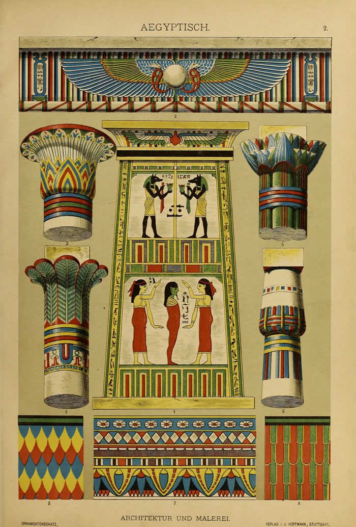
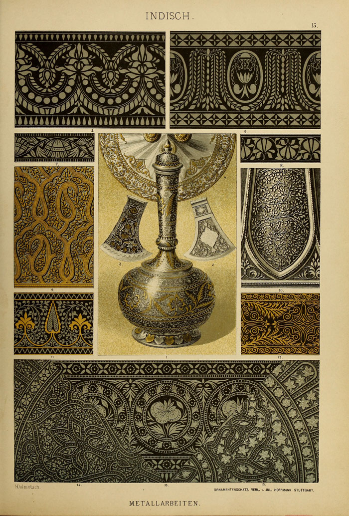
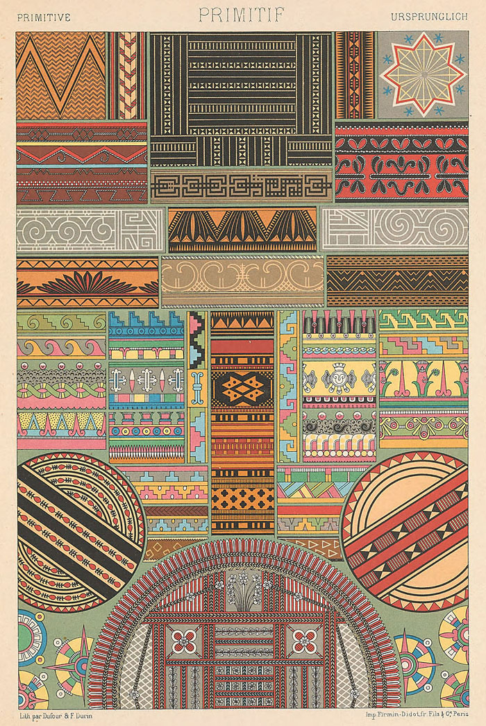
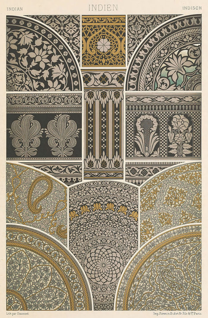
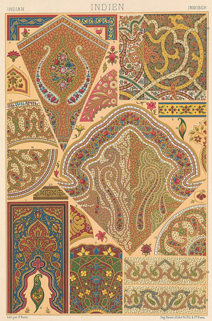
The solution arrived last week when work-related research had me looking through old design books for examples of Ancient Egyptian ornamentation. One of these, The Grammar of Ornament (1856) by Owen Jones, contains several pages of full-colour plates filled with Egyptian pattern samples.

egypt1.jpg

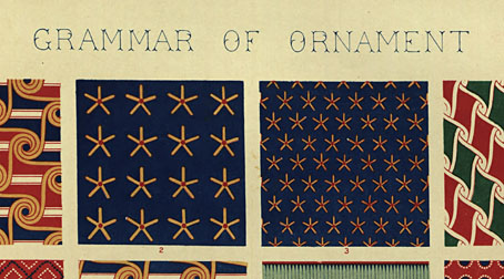
And on one of those pages there are these two squares which made me think immediately of the Xitintoday cover. This might seem tenuous when the cover design doesn’t feature any red dots but Barney Bubbles was an avid Egyptophile, avid enough to name his son after one of the Egyptian gods. A quick search revealed many more examples of this pattern which are closer matches for the cover design.

egypt2.jpg

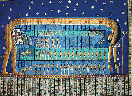
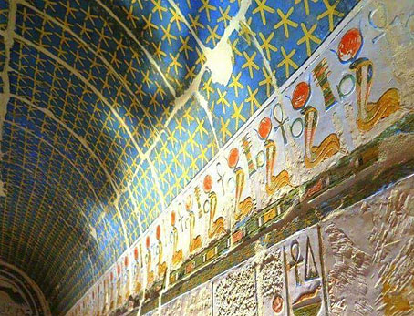
It turns out that the yellow star on a blue background was a common way of representing the night sky in Egyptian art, you’ll find the same stars in wall paintings and on the ceilings inside royal tombs.

egypt3.jpg

For years I’ve regarded the Xitintoday cover as being uncharacteristically random and abstract, surprisingly so when Bubbles designs from the same period are all so smart and well-considered. This discovery puts the Sphynx album in the same category, a design which avoids many more obvious solutions for a combination of the very old and the very new. Another feature of Barney Bubbles design is a kind of “Aha!” moment, when your appreciation of the design catches up with the thinking behind it. The appreciation this time has taken an outrageously long time to arrive but I’m pleased to have got there in the end.

Previously on { feuilleton }
Led Zeppelin IV: Jimmy Page versus Little Bo-Peep
The Grammar of Ornament revisited
On the pyramid

Dolmetsch’s Ornamentenschatz

ornamentenschatz01.jpg

If Racinet’s Polychromatic Ornament (1869–1873) was the French answer to The Grammar of Ornament (1856) by Owen Jones, then Heinrich Dolmetsch’s Der Ornamentenschatz (1887) is the German response to both, an equally lavish collection of colour plates showing ornamental decoration through the ages. Dolmetsch’s book follows the same chronological format as its counterparts, the main difference being an emphasis on objects as much as patterns or small portions of design. And being a German book, there’s rather more attention given to the German Renaissance than you might find elsewhere.

ornamentenschatz02.jpg

ornamentenschatz03.jpg

ornamentenschatz04.jpg

ornamentenschatz05.jpg

Continue reading “Dolmetsch’s Ornamentenschatz”

Racinet’s Polychromatic Ornament

racinet01.jpg

The publication of Owen Jones’ landmark volume, The Grammar of Ornament (1856), prompted decoration curators in other countries to try their hands at equally lavish collections of historic ornament. The first edition of Auguste Racinet’s L’Ornement Polychrome was published by Firmin-Didot from 1869–1873; a second edition appeared in 1885–1887. The plates here are from a British reprinting of the first edition from 1877, and are a recent addition to the Internet Archive’s collection of scanned volumes. I’d seen some of these plates before in a Flickr set but you can’t always trust Flickr users to upload a complete collection of anything (or label things adequately), and the set omitted the introductory material.

racinet02.jpg

Racinet’s book follows the format of Jones’ plates in attempting to represent multiple examples of a historic period (or a regional style) on a single page, but does so with greater ingenuity. Many of the pages achieve this so well that they’re notable pieces of design in themselves. Another thing the Jones and Racinet volumes share which we miss is the metallic inks; Racinet’s pages are embellished in gold and silver which reproduce here as brown and grey. Some scanned books really need to be seen in their original printings.

racinet03.jpg

racinet04.jpg

racinet05.jpg

Continue reading “Racinet’s Polychromatic Ornament”

Christopher Dresser’s Studies in Design

dresser28.jpg

The previous post about Christopher Dresser’s design studies proved popular so here’s another discovery from the same source. A surprise this time was seeing the middle motif on the page above; I have this separated from its neighbours in a collection of Art Nouveau graphics, and used it on the slipcase of a Cradle of Filth CD in 2002. Studies in Design (1876) is a collection of colour plates of Dresser’s design work. Some of these emulate medieval or Arabian/Persian decoration but the most interesting examples for me are Dresser’s more personal pieces. Once you’ve seen a few of these his style is easy to recognise. Thanks to some searching by Mr TjZ I now know that a number of collections of Dresser’s designs are available from (who else?) Dover Publications. More for the shopping list.

dresser18.jpg

dresser19.jpg

Continue reading “Christopher Dresser’s Studies in Design”

Christopher Dresser’s Art of Decorative Design

dresser10.jpg

Studies of decorative design are numerous but this one stands out for the quality of its colour plates, all of which show a variety of designs derived from plants and flowers. The Art of Decorative Design (1862) is one of a number of design books published in the wake of the Great Exhibition of 1851, the most celebrated being Owen Jones’ lavish Grammar of Ornament. Christopher Dresser was a professor of ornamental art and botany who here continues where The Grammar of Ornament ends, exploring the floral design that’s a recurrent feature of Victorian decoration. What’s most remarkable for me about some of these designs is the way they prefigure the forms of Art Nouveau, a style that wouldn’t emerge for another thirty years.

dresser02.jpg

dresser03.jpg

Continue reading “Christopher Dresser’s Art of Decorative Design”