Bulgarian Bee

bee.jpg

It’s unusual but not unprecedented for foreign publishers to use the first-edition cover art when they publish a translation of a book. One of my cover designs for Mike Shevdon’s Courts of the Fayre series was reused for a French edition published by Panini/Eclipse in 2014. This year it’s the turn of The Singular & Extraordinary Tale of Mirror & Goliath by Ishbelle Bee which appeared in a Bulgarian edition last month from Ciela. In this instance I supplied the publisher with many of the work files so that the designers were able to refashion the title using Cyrillic characters. I’m very pleased with the way they’ve done this, the task wasn’t an easy one when some of the lettering was unique to this design. If you live in Sofia (or are on holiday there) watch out for it.

Previously on { feuilleton }
The Contrary Tale of the Butterfly Girl
The Singular & Extraordinary Tale of Mirror & Goliath

Mazes and labyrinths

maze01.jpg

This book, Mazes and Labyrinths: A General Account of their History and Developments (1922) by William Henry Matthews, would have been very useful a couple of years ago when I was working on the cover design for Mike Shevdon’s The Road to Bedlam and required a labyrinth diagram. The one I used, a plan of Julian’s Bower in Alkborough, Lincolnshire, can be found below. I’ve had a lifelong interest in mazes and labyrinths so this book is fascinating beyond any temporary work requirements. Matthews’ study of the form features many diagrams going back to the legendary Cretan labyrinth and the constructions of the Ancient Egyptians. Closer to home there are depictions of the designs which flourished during the great era of landscape gardening in the 18th century, and photographs of some of Britain’s remaining turf mazes. The book may be browsed here or downloaded here.

maze02.jpg

maze03.jpg

maze04.jpg

maze05.jpg

Continue reading “Mazes and labyrinths”

The Eighth Court

shevdon.jpg

Mid-January and here’s the first book cover design of the year, and another title for Angry Robot. This is the fourth book in Mike Shevdon‘s Courts of the Feyre series; since I’d already provided the three earlier books with a uniform design it didn’t take long to create this one. I’ve been very pleased with the reception of these covers, the positive response shows that it’s possible to design something for a fantasy series that isn’t the customary generic illustration plus florid typography. I wrote about the problems of designing fantasy covers last year with a lengthy examination of M. John Harrison’s Viriconium books.

angryrobot.jpg

Two recent Angry Robot covers: Joey HiFi‘s cover for Chuck Wendig and Amazing15‘s Pelican-styled design for Chris F. Holm.

Credit should be given to Angry Robot’s Marc Gascoigne for encouraging this direction, the company has been producing a range of very smart covers which don’t pander to the clichés of the marketplace. There’s more of an incentive for smaller publishers to do this when small press imprints and self-publishers often have terrible cover designs (sad but true) while the multinationals play safe for fear of losing readers. If you want to stand out from the crowd then it helps to look good.

Elsewhere on { feuilleton }
The book covers archive

Previously on { feuilleton }
The Courts of the Feyre

On self-imitation

divinecomp.jpg

Or where Angry Robot leads, HarperCollins follows… The Law of Divine Compensation by Marianne Williamson is published today in the US by HarperOne, an imprint of HarperCollins, and if the cover looks similar to Mike Shevdon‘s recent edition of Sixty-One Nails it’s because I designed both of them. Harper’s contacted me earlier this year asking if I could adapt the Sixty-One Nails design for their new Marianne Williamson title. I was a bit unsure about accepting this at first but Ms Williamson isn’t a novelist so the books wouldn’t be appearing on the same shelves; I also said I’d prefer to create new decorative elements so there was enough difference between the new design and the earlier one. In the end the design was pared back considerably during the usual to and fro between art department and marketing people. Harper’s previous titles in this series have quasi-Victorian border designs on plain backgrounds so there needed to be some continuity. I haven’t seen a copy of the book itself yet but the last I heard the design was going to be given a foil treatment on textured paper.

shevdon1.jpg

It’s always an odd feeling being asked to imitate something you’ve done before. The new work often lacks the sense of accomplishment and exploration you felt earlier because you know exactly how it’s going to end up. When I started work on Mike Shevdon’s covers all I had in mind was that basic frame shape; everything else was improvised. I still prefer those earlier designs, I like the way all the details came together, and the way they look against a black background. Mike told me recently that someone picked up one of the books in a shop to look at the cover then bought the book; that’s exactly the kind of thing a cover designer (and author!) likes to hear.

Elsewhere on { feuilleton }
The book covers archive

Previously on { feuilleton }
Book talk
The Courts of the Feyre

World Fantasy Awards

infernal.jpg

Presenting some of the cover art and interior illustration from 2011 which won me the World Fantasy Award for best artist in Toronto on Sunday. (The complete awards list is here.) It was a surprise to be nominated, and even more of a surprise to win since working in different areas—book, music, comics—is never a good way to get noticed for doing one particular thing. It’s also the case that sf/fantasy art awards tend to favour painters or virtuoso digital artists over people such as myself who I suppose are more illustrator-designers; that’s not a criticism, just an acknowledgement of the strength and popularity of highly-refined pictorial art in this area of the literary world. The recognition hazard works in the opposite direction: the design world often gives the most attention to graphic design alone, with the illustration quotient being regarded as secondary content.

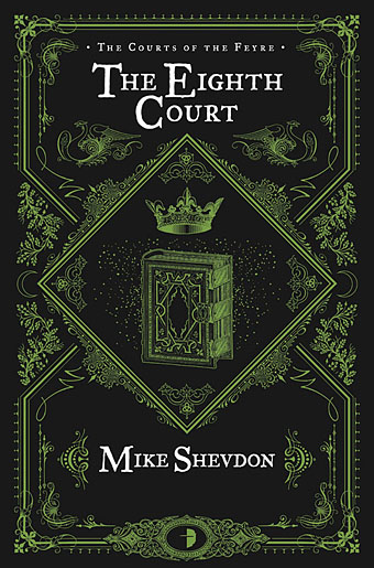
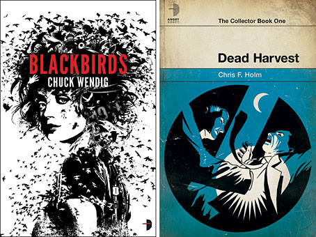
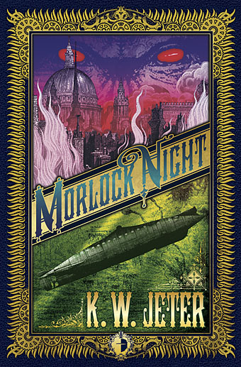
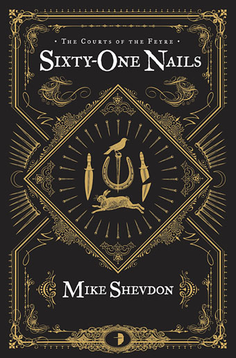
I’m not exactly sure what the judges were looking at of my work so these examples have been chosen for being published during the year under examination. They’re also covers that people seemed to like a lot, especially KW Jeter‘s Morlock Night (even though I still prefer Infernal Devices!), and those for Mike Shevdon‘s books. The Jeter and Shevdon volumes are all published by Angry Robot who will also be publishing Lavie Tidhar‘s The Bookman Histories early next year sporting another of my covers. Lavie’s novel Osama won best novel in Toronto while Ann and Jeff VanderMeer (editors of the Lambshead book below) picked up a best anthology award for their monumental The Weird. And to add to the good company, my regular publishers Tachyon saw one of their authors, Tim Powers, gaining best story collection. Congratulations to everyone, and a big thanks to Ann for collecting my award.

I’m always using these posts to point to other artists so it’s only right that I encourage everyone to go and look at the work of the other nominees. Here they are (although Jon Foster’s site appears down at the moment):

Julie Dillon
Jon Foster
Kathleen Jennings
John Picacio

John Picacio has a rather gorgeous calendar due out soon, details here.

morlock.jpg

lambshead.jpg

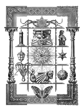
Title page for The Thackery T. Lambshead Cabinet of Curiosities edited by Ann & Jeff VanderMeer (Harper Voyager).

shevdon1.jpg

Continue reading “World Fantasy Awards”