
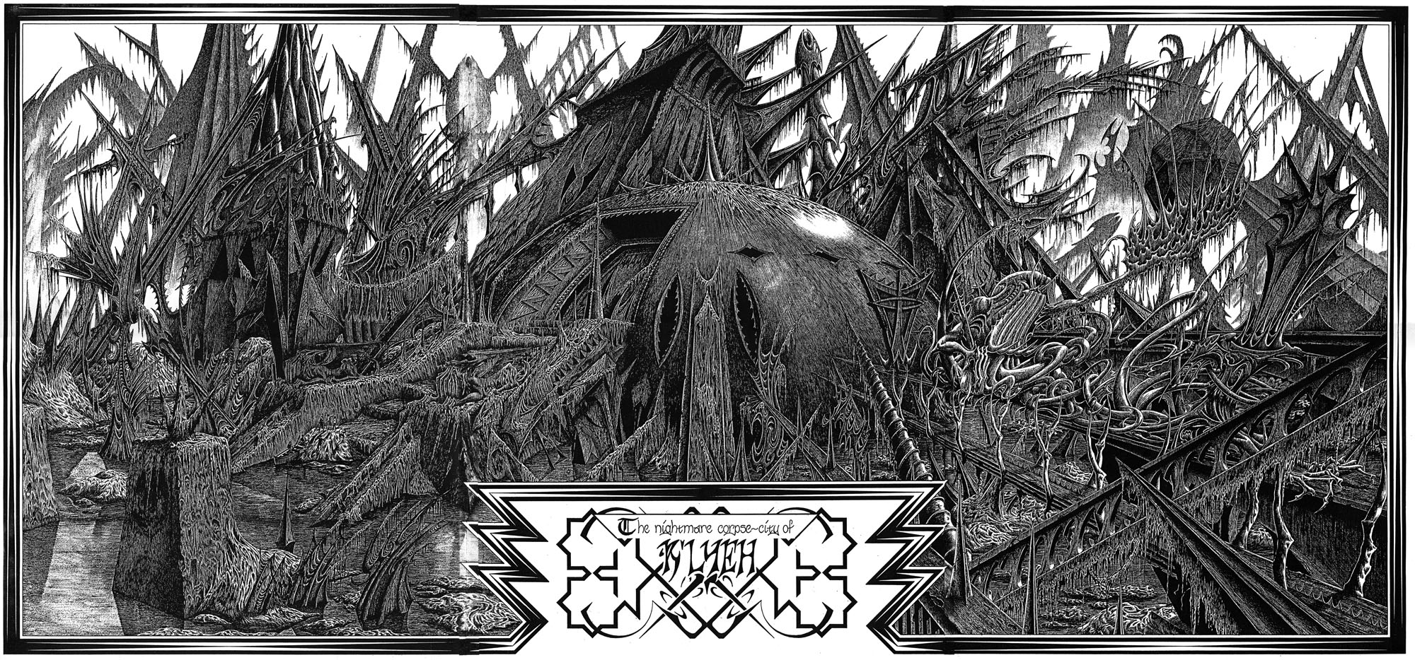
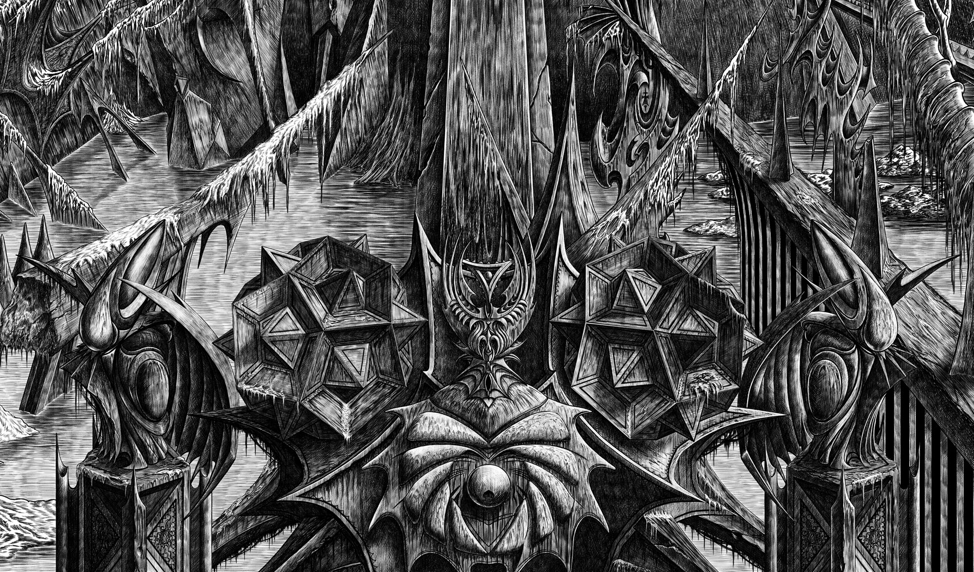
Then, driven ahead by curiosity in their captured yacht under Johansen’s command, the men sight a great stone pillar sticking out of the sea, and in S. Latitude 47°9′, W. Longitude 126°43′, come upon a coastline of mingled mud, ooze, and weedy Cyclopean masonry which can be nothing less than the tangible substance of earth’s supreme terror—the nightmare corpse-city of R’lyeh, that was built in measureless aeons behind history by the vast, loathsome shapes that seeped down from the dark stars. There lay great Cthulhu and his hordes, hidden in green slimy vaults and sending out at last, after cycles incalculable, the thoughts that spread fear to the dreams of the sensitive and called imperiously to the faithful to come on a pilgrimage of liberation and restoration.
HP Lovecraft, The Call of Cthulhu (1928)
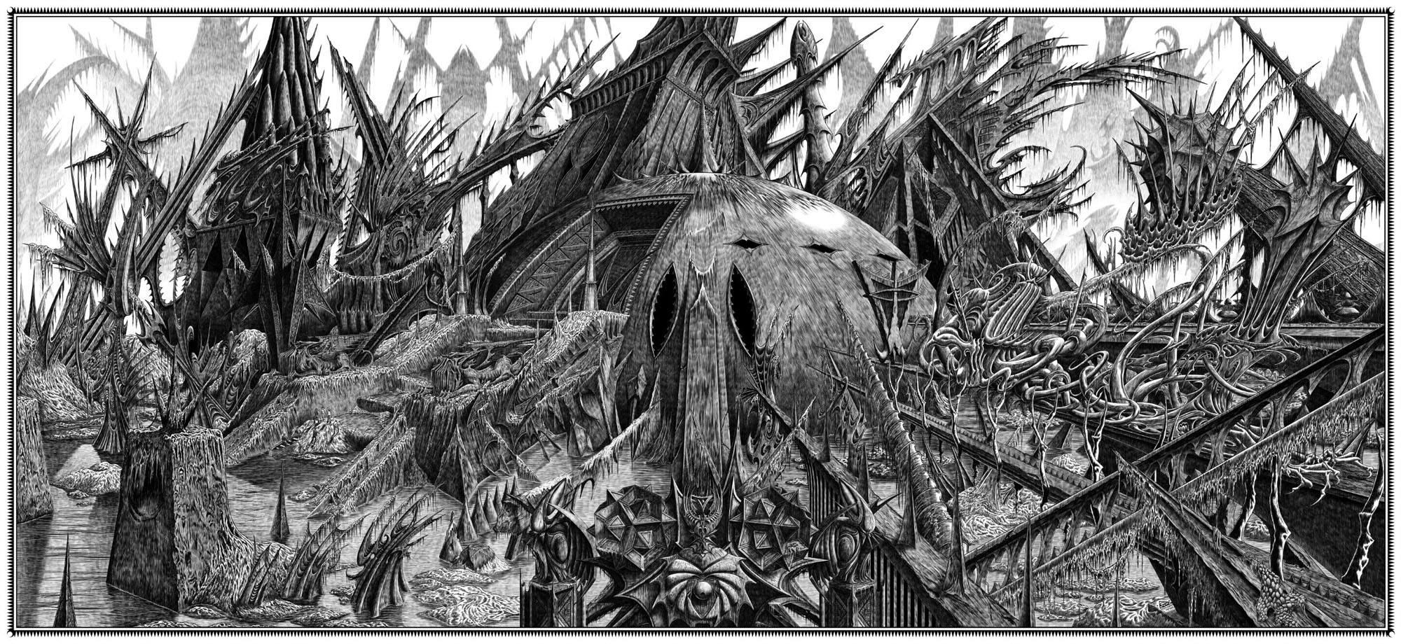
Behold the fruits of a more benevolent pilgrimage of liberation and restoration. It was just over a year ago that I decided to draw an exact replica of the R’lyeh triple-spread from my comic-strip adaptation of The Call of Cthulhu, the intention being to make the picture available as a poster-sized print once I had a print-ordering system in place. The picture may now be purchased here as a giclée print on Hahnemüle Pearl art paper. This is a big picture (870.46 x 401.15 mm or 34.27 x 15.793 ins), and unlike my other Etsy prints I’m afraid there won’t be a half-size version which means the price will remain relatively high. I’m also keeping it as a black-and-white piece despite the temptation to create a tinted version.
And so to the obvious question: why did I want to redraw a large and very detailed piece of art in the first place? Pull up a weed-festooned Cyclopean bollard and I’ll explain…
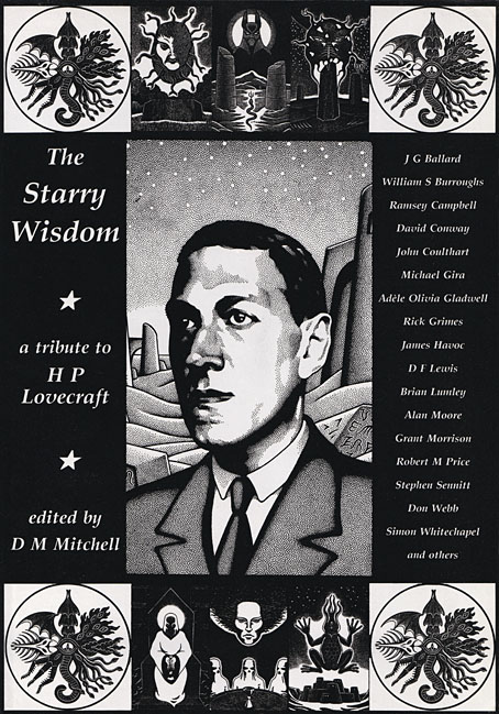
Creation Books, 1994. Cover art by Peter Smith.
I spent 17 months drawing The Call of Cthulhu, from January 1987 to May 1988, using my preferred media of the time, a 0.2 mm Rotring Variant pen on A3 sheets of Daler cartridge paper. The story took its time getting into print but it was eventually published in 1994 by Creation Books as part of The Starry Wisdom, a collection of Lovecraftian fiction edited by DM Mitchell. I was very pleased to be represented in the book but the pleasure turned to dismay when it transpired that all the artwork had vanished after the printing was done. Or almost all the artwork… To this day I don’t know whether the drawings by other artists suffered the same fate, but my Cthulhu pages disappeared along with the anatomical cross-section and the Yuggoth collage that I created specially for the collection. I still don’t know what really happened either, whether the drawings were stolen (possible), thrown away deliberately (unlikely), or thrown away accidentally (also possible). The lack of resolution to the whole business is partly my fault. Losing all that art was a painful thing to consider, and I couldn’t accuse the printer of anything when nobody could say what had happened (I was in the Creation office during one of the phone conversations between publisher and printer). The printer was also located in the middle of a rural county somewhere so journeying there would have been difficult for this non-driver, as well as being pointless if they could only tell me what I knew already. Time passed and I did my best to put the whole episode behind me.
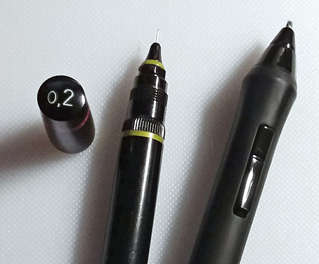
Drawing technology then and now: the Variant pen I used throughout the 1980s and the Wacom stylus I use today. That Variant nib is so fine that I have a faint ink dot tattooed on one of my knuckles from where I accidentally stabbed it into my hand. The Wacom pen looks stubby in comparison but is capable of drawing equally fine lines and much more besides.
On the plus side (there was one), the printer had done a good job of half-toning the artwork, so even though the Starry Wisdom pages are rather small the detail in the drawings is still evident. And I also had a complete set of photocopies of the A3-sized originals. I’d been working for Savoy Books since 1989 during which time making photocopies of new drawings had become second nature. Since 1994 this set of copies has become the original art for the Call of Cthulhu strip, rather like the surviving prints of Murnau’s Nosferatu which are all that anyone can see of his film today. The analogy is an apt one since it also extends to picture quality. Just as silent films always look their best when they’ve been restored from the camera negative, my Rotring drawings really need to be reproduced from the originals. The 0.2 mm pen that I insisted on using throughout the 1980s was too fine for the photocopy machines of the time, especially when my shading was so densely rendered that I might as well have been using a pencil. This isn’t so much of a problem if the pages are being reduced in size but it became one last year when I had the idea of making a print of the R’lyeh panorama that would be the same size as the original drawings. Giclée printing is an ink-jet process that reproduces fine detail with great accuracy, so while I could make full-size prints of the Cthulhu pages they’d never look better than what they were, photocopies that hadn’t fully captured the fine lines of the drawings. This wasn’t the only problem.
All the original Cthulhu pages had a 10 mm margin separating the artwork from the paper edges, with the exception of the double-spread that depicts the Louisiana voodoo ceremony, and the R’lyeh panorama. These were drawn across A3 sheets that were taped together, with the drawing going to the edges of the paper where the sheets were joined. The photocopier couldn’t copy to the very edges of an A3 sheet so the areas where the pages join together have a blank strip a few millimetres wide running from top to bottom. This didn’t really matter when the copies were being used to let people see the story before it was published but the loss of the originals means that these gaps are now like missing frames in a film print.
The scanned photocopies pieced together.
After deciding that the copies didn’t look good enough to offer as full-size prints I had the idea that I might still be able to fix the triple-spread somehow. I’ve been using Photoshop for over 20 years so I’m rather adept at digital repair but I hadn’t tried to do anything with this picture before. In a fit of optimism I scanned the copies then pieced them together only to find that the gaps between the three sheets were too substantial to repair without the work being very evident. The triple-spread as it appears in The Starry Wisdom covers two pages (nobody has ever wanted to pay for a fold-out sheet), and without any discernible joins between the three sheets, so I next tried placing scans of the printed pages behind the photocopy scans. The smaller pages did compensate for the missing artwork but they also looked like a blurry mess, with enlarged half-tone dots that contrasted poorly with the copier lines.
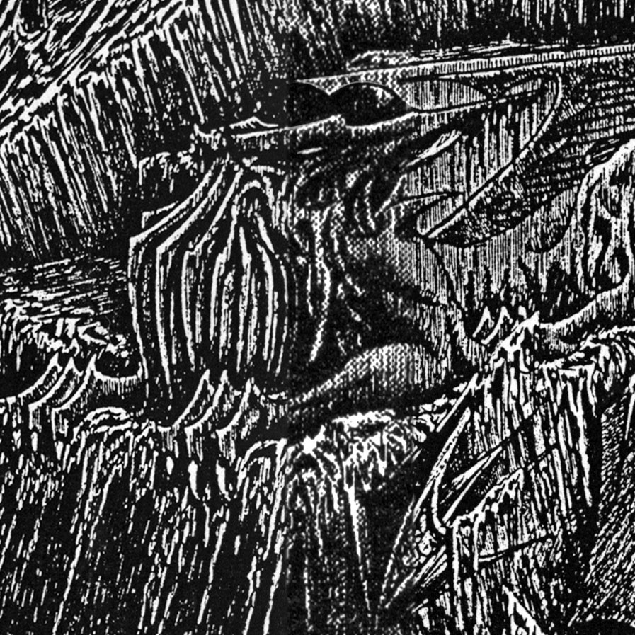
A close-up of the scanned photocopies with a strip of the half-tone scan running down the centre. The copies don’t look too bad at a distance but up close all the fine shading is lost and the shadowed areas are much darker than they should be.
After a day or two of unrewarding work I was sat looking at the spread filling the monitor screen when the Imp of the Perverse struck again: “I could just redraw the whole thing…” For the first time since 1994 I had the complete drawing sitting there in front of me; I also had all the digital tools necessary to allow a new drawing to be made over the scans of the old one. The thing that made the whole process inevitable was creating a new 6-pixel Photoshop brush that closely matched the appearance of a 0.2 mm Rotring Variant ink line. I made a new Photoshop layer over the scans then spent an hour or so drawing over a corner to convince myself that it would be worth spending a lot more time recreating the whole drawing. Once the decision was made all I had to to was put in the necessary hours.
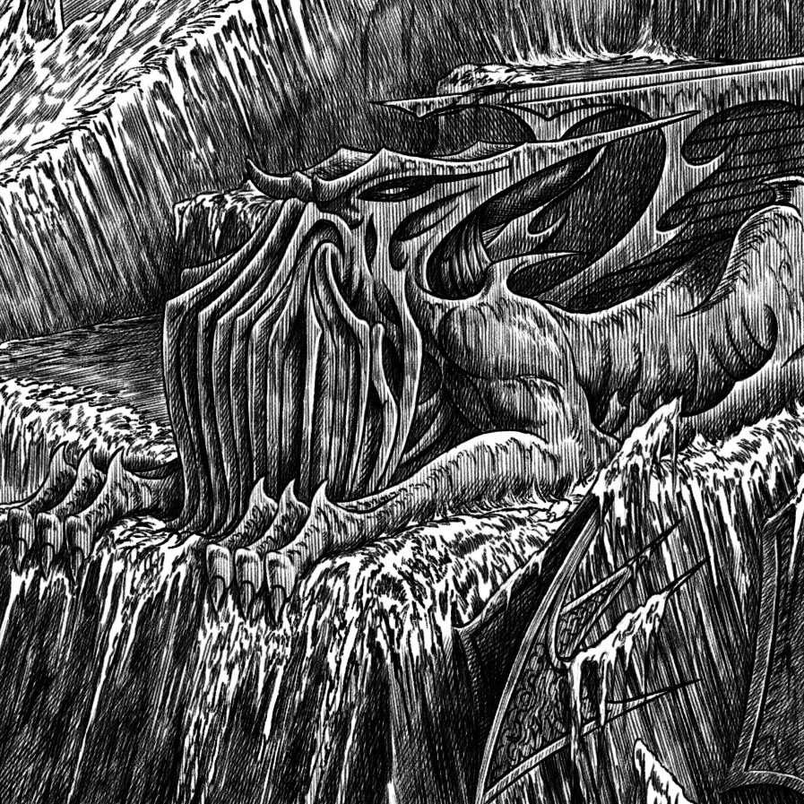
The same area as it appears in the new drawing. All my Rotring drawing of the 1980s is shaded like this.
In 1988 it took me six weeks to draw the original triple-spread; the new version took five-and-a-half months, but then I was busy working on other things such as a new cover for Alan Moore’s Voice of the Fire. The resurrected R’lyeh is an almost exact replica of the original but there are a few differences such as more detail on the right-hand side. The urge to finish drawing the story had made me skimp on some of the details of weed and ruin as I worked my way across the first version, with the result that the left side of the picture was always more detailed than the right. And since the new version was intended to be a picture rather than a super-sized comics panel I also got rid of the central title box so this area is now filled with completely new details including a tiny Penrose triangle. The only thing I couldn’t quite match was the smoothness of the original shading, something that’s most evident in the background. Digital drawing is a combination of stylus and software, including the brush setting. Photoshop brushes are endlessly flexible but still difficult to set up to precisely match a physical equivalent. My Rotring shading could fill large areas with vertical lines that blended smoothly, something I couldn’t quite achieve with this particular brush, but this doesn’t really matter when the main objective was to restore a lost drawing. The opportunity to draw a panorama of R’lyeh was almost the sole reason for adapting the story in the first place which is why the spread dominates the strip.
New weirdness.
Part of the great attraction of R’lyeh is the way it combines the lost world, the sunken city and alien horror in a single location. For a place that houses monstrous beings descended from the stars it’s fitting that Point Nemo today is known as “the spacecraft cemetery” from the amount of satellites and other orbiting debris ditched there. My drawing is an unfeasible view of a place that’s supposed to have been lying under the sea for a million years, there’s too much fancy architectural detail and not enough weed, ooze and general decay. I knew this when I was drawing the picture in 1988, and wasn’t really worried about strict accuracy, even though accuracy is debatable when HP Lovecraft is evasive about the details. My depiction was more about the sensation that the place creates in the minds of the sailors who discover it:
Johansen and his men were awed by the cosmic majesty of this dripping Babylon of elder demons, and must have guessed without guidance that it was nothing of this or of any sane planet.
Cosmic majesty, irrational architecture, structures without any apparent purpose: this is what I wanted to draw rather than a heap of stones covered in mud and weed. The Call of Cthulhu is one of the first stories in which Lovecraft refers to non-Euclidean architecture so I followed this angle (so to speak) by watching one of the BBC’s Open University lectures which explains non-Euclidean geometry from first principles. This gave me the concept of a geometry of curves rather than straight lines, hence the superfluity of flaring spikes and similar structures. Lovecraft illustrators have always been more interested in drawing monsters than alien architecture so this is still an under-explored area. I wouldn’t mind making further explorations but for the moment I’m happy to have my picture back. And now you can have it too.
Elsewhere on { feuilleton }
• The Lovecraft archive
“In the realm of comic books or graphic novels, note must be taken of the British artist, John Coulthart, who emerged in the 1980s and has become one of the most accomplished Lovecraft illustrators of his time. H. P. Lovecraft’s The Haunter of the Dark and Other Creative Visions (Oneiros Books, 2000) features some of his best work. Coulthart also appears in a curious volume, The Starry Wisdom: A Tribute to H. P. Lovecraft (Creation Books, 1994), a farrago of fiction (much of it not very Lovecraftian) whose existence is justified only by its inclusion of Coulthart’s evocative adaptation of “The Call of Cthulhu”…”
–S. T. Joshi, The Recognition of H. P. Lovecraft: His Rise from Obscurity to World Renown (Hippocampus Press, 2021)
Thanks!
Breathtaking. Almost literally.
Thanks :)