
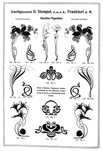
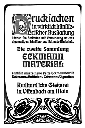
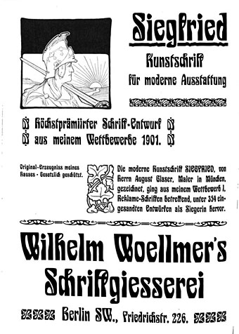
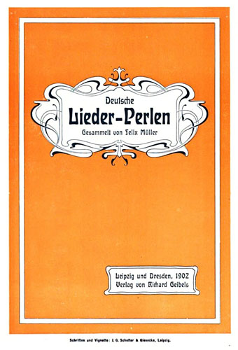
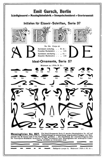
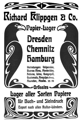
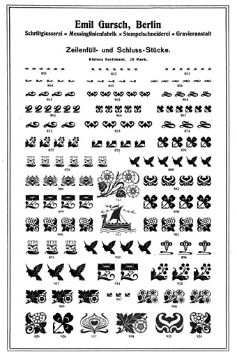
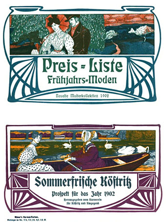
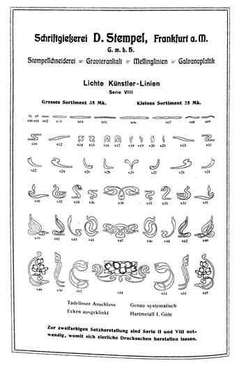
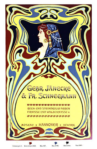
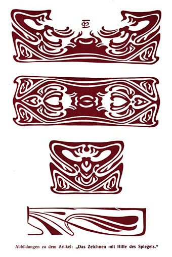
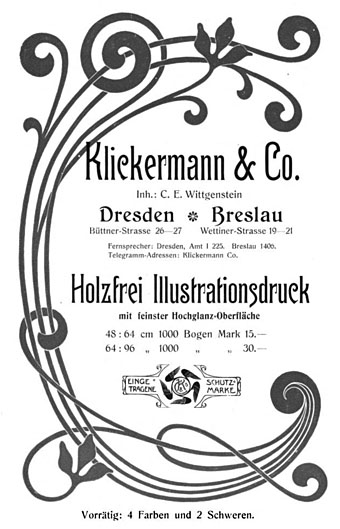
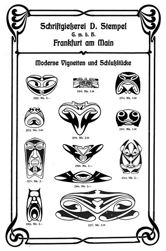
My work this week is more Deco than Nouveau but I enjoy looking at Art Nouveau graphics even when I don’t have any immediate use for them. Typographische Jahrbücher was a German publication for typographers and printers whose pages are filled with samples of the latest type styles and print decorations, together with many adverts that use the same graphics. The examples here are from issues for the year 1902 when Art Nouveau (or Jugendstil as it was in Germany and Austria) had reached its peak as the predominant European style. This is the kind of book I love to see, one with a wide variety of borders, letterforms and motifs for print use alone, not designs for textiles or other crafts. Of note are the pages below promoting a pair of recent typefaces, Eckmann and Siegfried. Both designs soon fell out of fashion but returned to prominence in the 1960s among the typefaces of the occult revival. It’s a shame the quality of this book isn’t better—it’s another poor Google scan—but I’m happy to find it. 750 pages; dig in here.
Previously on { feuilleton }
• Allerlei Gedanken in Vignettenform
• Buchschmuck und Flächenmuster by Max Benirschke
• Kunstgewerbliche Schmuckformen für die Fläche