
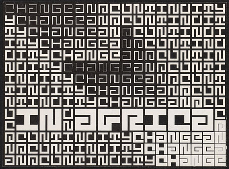
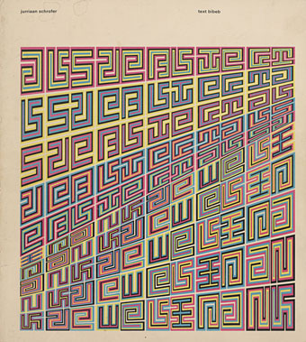
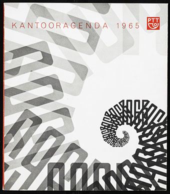
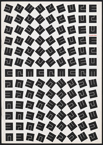
Design by Jurriaan Schrofer.
That’s Maurits Cornelis Escher (1898–1972), the Dutch artist, and Jurriaan Schrofer (1926–90), the Dutch typographer and graphic designer. Aside from a shared nationality the pair had a similar interest in periodicity and incremental metamorphosis, something that’s strikingly apparent when you compare their works. I don’t know much about Schrofer so I can’t say whether he was consciously following Escher’s example or whether this is coincidence. Some of the gradations and distortions also bear comparison with the Op Art paintings of Bridget Riley, Victor Vasarely and others.
MC Escher signed most of his works with three square “MCE” letters which are remarkably similar to Schrofer’s type designs.
There’s an opportunity to find out more about Schrofer’s distinctive approach to graphic design in a forthcoming book from Unit Editions (currently available at a reduced pre-order price). More of his work can be seen at But Does It Float and scattered around Tumblr. MC Escher is well-represented on the web; I’d suggest starting at WikiPaintings.
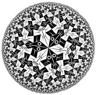
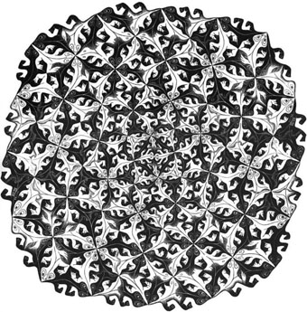
Circle Limit I (1958) by MC Escher.
Design by Jurriaan Schrofer.
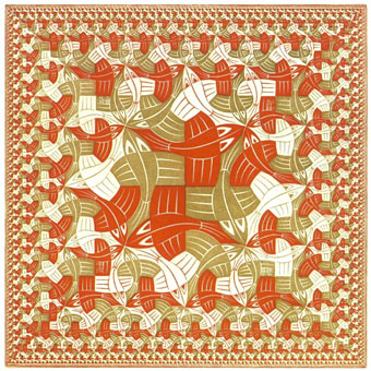
Square Limit (colour, 1964) by MC Escher.
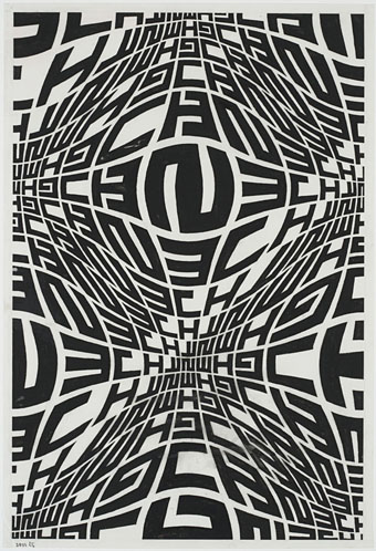
Design by Jurriaan Schrofer.
Smaller and Smaller (colour, 1956) by MC Escher.
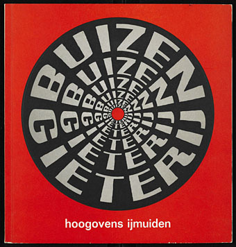
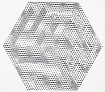
Design by Jurriaan Schrofer.
Division (1956) by MC Escher.
Design by Jurriaan Schrofer.
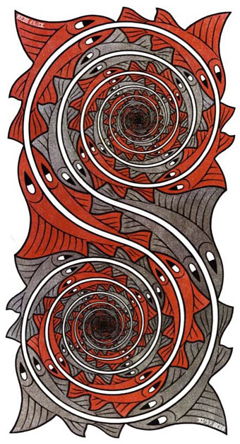
Whirlpools (1957) by MC Escher.
Design by Jurriaan Schrofer.
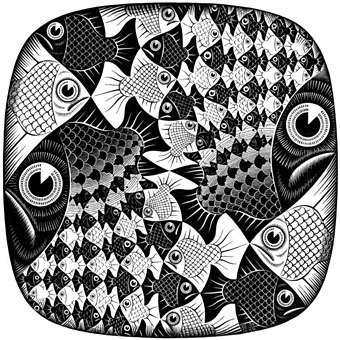
Fishes and Scales (1959) by MC Escher.
Design by Jurriaan Schrofer.
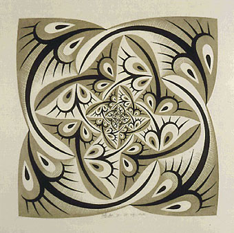
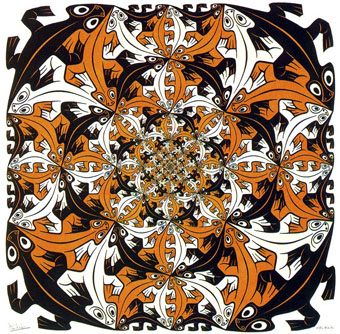
Path of Life II (colour, 1958) by MC Escher.