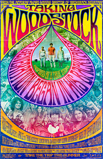
I mentioned Ang Lee’s forthcoming film, Taking Woodstock, last week and this poster by Mojo makes a decent fist of capturing some of the West Coast psychedelic style. I thought at first that the rainbow hues were garish in the wrong way, the San Francisco poster artists used bold colours but limited their palette since many of them were working for screenprinting. But since this film concerns the story of a gay man, Elliot Tiber, and his attempt to provide a home for the Woodstock festival in 1969—and since the rainbow flag is now a gay symbol—it makes sense even if the overall impression is of colour clash. I like the subtle touch of making the poster look worn, something I’ve done myself on a recent book cover design which is also styled as a cinema poster. I’ll be posting that here in due course.
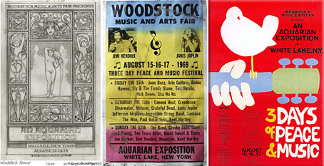
That’s the film promotion; the posters for the original event can be seen at Woodstock posters. The pencil sketch on the left is an elaborate Art Nouveau-styled design intended for the festival before the original choice of venue was refused. The sheet in the centre looks like a hasty promo piece for the new venue while the poster on the right is the final version with the famous dove graphic by Arnold Skolnick. That dove came to symbolise the whole event, hence its appearance on the Taking Woodstock one-sheet.
Taking Woodstock opens in the US on August 15th, 2009, the 40th anniversary of the festival.
Previously on { feuilleton }
• Over the rainbow
• Dutch psychedelia
• Family Dog postcards


John, thanks for sharing this poster — I think Mojo did a great job with it. I especially like the drop shaped feature which highlights the whole psychedelic aspect. It is a great throwback piece in my opinion!
I also wanted to mention how much I enjoy your site… in my opinion it is in a class of its own, which is rare in todays online world.
Sean
Hi Sean, and thanks, glad you like the site.
Mojo do some great posters many of which take risks which designers often wouldn’t attempt for big commercial projects like feature films. They ran the titles backwards on some of the Benjamin Button posters and with this one I’m surprised they managed to get the distorted type past the studio marketing department. As it is, this design will probably get replaced by something simpler for the UK, something that happens all too often.