
I created a cover design recently for Jeff VanderMeer‘s new novel, Finch, and shortly after completing that Jeff asked if I could put together some cover ideas for his forthcoming writer’s guide, Booklife, which Tachyon will be publishing later this year. Jeff is known as a fantasy writer but this book was intended to have a general appeal for any would-be or working writer. It also needed to look suitably contemporary and (possibly) reflect the discussion within which concerns the modern writer’s use of computers, the internet and social networks. Lastly, several lines of text needed to be placed on the cover without it looking confused or messy.
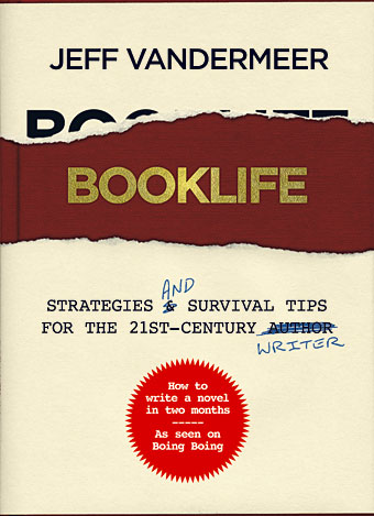
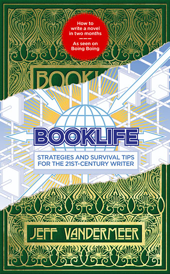
I agreed to this whilst busy with several other projects so the initial drafts were rather haphazard. (That’s my excuse, anyway.) The first version (above) came out of an idea to apply a kind of trompe l’oeil effect to the cover with a torn dustjacket and handwritten amendments. The red call-out/roundel highlights an important sub-section of the book. This was knocked up very quickly and, as well as not looking very contemporary, the title doesn’t look enough like gold blocking to be convincing. Jeff requested something more up-to-date.
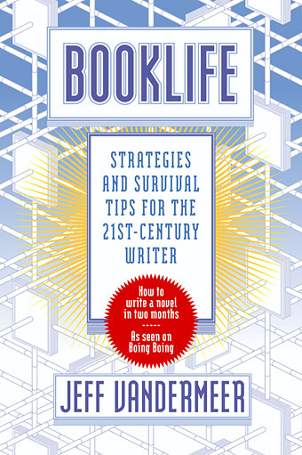
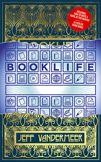
Version 2 was a hasty attempt to get contemporary although this looks too bland and sterile, like a business primer or a university press book. We’d talked about trying to convey the nature of electronic networks without resorting to the internet clichés of the Nineties, hence the connected books in the background. I was thinking of the kind of clear-line illustration you get in some European comics but this turned out to be one of those ideas which seem good in the abstract yet trying to get it to work turns out to be a) difficult and b) not such a good idea after all. The background quickly became crowded and confused when trying to convey any kind of depth. This cover has the first appearance of one of my sunbursts, a habitual motif I’m guilty of using in places where it doesn’t always belong. I blame a Catholic upbringing which left me with a halo obsession.
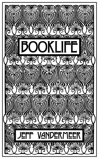
Jeff wasn’t keen on this either so he suggested I go back to the first version but show an old Victorian book design ripped away to reveal something contemporary underneath. He mentioned William Morris designs but I didn’t think they would be suitable; Morris’s books have beautiful elaborate borders but their layout follows the medieval page grid which is asymmetrical. I wanted something equally elaborate but with suitable symmetry.

A bit of web searching turned up this Jean Lorrain cover by Léon Rudnicki which I have in a book of art nouveau design but at a size too small to be usable. It took a fair amount of work to refashion a medium-res jpeg into the vector version below.
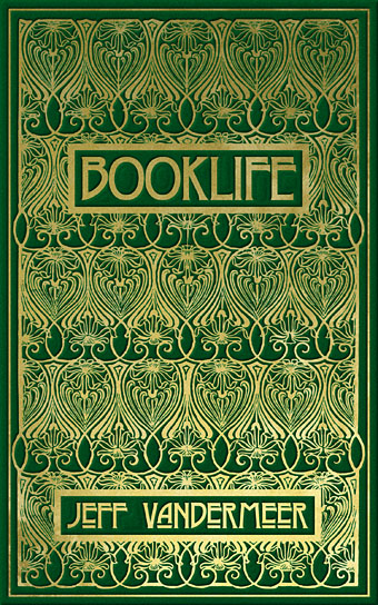
Some additional work in Photoshop and we had something which looked like an old cover blocked in gold.
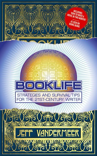
Which was then ripped away to reveal a new version of the earlier bland cover. A globe has been introduced as a new feature although I warned about globes being too closely associated with travel books.
An unfinished draft. Jeff suggested changing the green cover to blue and he wasn’t keen on the diagonal tear so this was made horizontal. By this point I’d decided to get rid of the networked books and replace them with symbols that convey the digital world. Ideally you’d want to spend some time creating symbols like this yourself but I still had too many other things on the go so these are taken from a Linotype set of office dingbats. Some of these are now distinctly dated, there’s a floppy disc (which I didn’t use) and the computer monitor has a curved edge to the screen like an old TV. The sunburst is still hanging in there but has turned blue. In design terms blue often signifies the future (in a cold electronic sense) in the same way that sepia signifies the past.
Another unfinished draft which attempted to combine the symbols with the globe. Jeff liked this but I didn’t, I felt that attempting to combine two very different covers had led us astray. Jeff was still eager to convey a sense of modernity or even the future and I thought this would be difficult. In the 1990s there was a well-defined sense of futurity attached to anything cybernetic or computer-oriented. That idea and its attendant imagery is now thoroughly outmoded, computer technology is so embedded in our lives that we barely notice it. Our phones are as powerful as home computers were a decade ago. In graphic design terms there’s currently no shorthand (apart from vague blue tones) that says “the future”, not least because people aren’t sure what the future will be or if there’ll be one that anyone actually wants to live in.
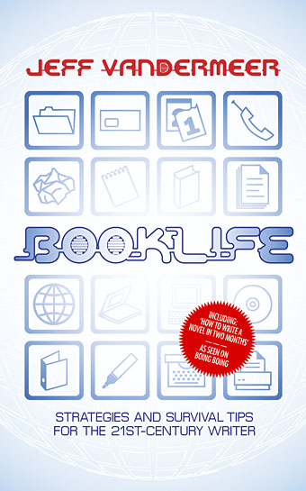
So the torn book was scrapped but I kept the globe and some of the office symbols. The roundel still persists. I picked out a distinctive typeface for the title although if we’d have gone with this as the final cover I would have removed the filler elements from the O and the D.
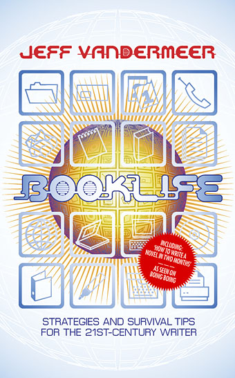
Jeff thought this was okay but asked to see the globe brought back so here it is along with the returning sunburst.
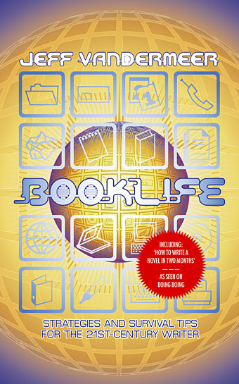
I think this was the one which Jeff liked most of all but I didn’t although the colours at least blend together. I felt we were still at the cold business end of things and suggested scrapping all of these approaches and trying something new.
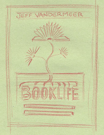
Which is what I did. Jeff had earlier suggested growing roots although I couldn’t see how that could be easily reconciled with the digital networks aspect. USB cables as roots? Hmm… Whilst pondering this one of those flashes of inspiration occurred which I immediately sketched and emailed. I knew this would look good if it was done as a very clean vector layout—a cross-section of earth with the title putting out roots and books blooming from a plant stem. Jeff liked it so I set to work.
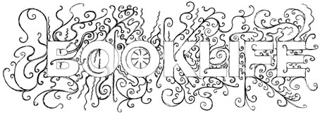
First thing to do was to get the title right which involved printing out the type at large size then drawing the roots with a pencil.

Next I needed a suitably stylised plant and came across this very tiny motif in one of my design source books. This was from an art nouveau border design so a trace element of older book styles would still be present. All that was required now was to put the various elements together.
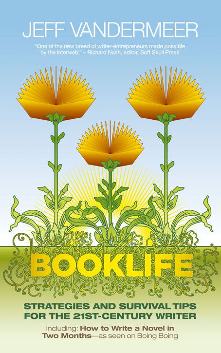
And here’s the result which finally pleased everyone. Slightly different to the sketch since I decided to borrow a trick from designer Barney Bubbles and make the book flowers and the title lettering form a face which gives an additional, subliminal quality to the title. I managed to get the sunburst in there with some justification at last—it adds depth and colour as well as being…the sun—and there was enough space for a quote at the top. All the type ended up as different weights of Helvetica. Watching the Brian Eno documentary last night I was struck by his comment that instruments today give you a vast array of sounds when all you really need are a handful of very good ones. The same applies to typefaces. I love typography, and enjoy seeing new designs appear, but despite the thousands of available typefaces you often come back to a small selection which do the job better than anything else. Helvetica is one of these.
This cover is a good example of how much the design process is about narrowing your range of options. Some of the blind alleys would have been avoided if we’d discussed ideas at length beforehand but we were both very busy and some of the intermediate stages only came together after playing around in Illustrator. This isn’t the first time I’ve had the flash of inspiration occur way down the line, sometimes all you can do is thrash around waiting for lightning to strike. I’m happy to say it usually strikes for me a lot earlier than this but as long as it keeps striking I don’t mind. As always, reaching the destination is the important thing, not how you get there.
Previously on { feuilleton }
• Finch
• Steampunk Horror Shortcuts
• A cover for Mr. VanderMeer
• Pasticheur’s Addiction
• Fungal observations
• Shriek: The Movie
• Jeff on Bldgblog
• An announcement redux
• City of Saints and Madmen
Funny how the internet works – I was reading the latest post on Jeff’s blog on my reader and this happened to be next newest item down, funnily enough explicating the design process of the cover of a book that I plan on purchasing (due to reading Jeff’s blog) yet doesn’t really exist as a whole yet. Great to see how your design process works out the communication b/w the both of you.
I like the last version best as well (did not go much for the globe concept of the earlier version). The blooming books is both a very nice idea and a great design.
Hi JM. Jeff should be writing something about this himself in the next day or so. I would have posted this earlier but was waiting until he returned from Australia.
Thanks, Nathalie, glad you like it.
Thanks for this. It gave me a real insight into your working methods which I find fascinating, and it’s a beautiful and well realized design.
John’s also being extraordinarily kind, as I was very frazzled during the whole process. I’ve never had to deal with cover issues while still writing a book before. So he had to put up with a lot of emails and conflicting information. I think if John and I hadn’t worked together before, and if he hadn’t had so much experience dealing with idiots, it might’ve come out differently. As it is, he saved my ass on this project, since the cover also has to function as an image on the upcoming blog/website for the book, and perform in many other contexts. My real problem was being able to properly visualize “the future” as something other than mechanistic. John would’ve gotten to that last cover a lot faster without my white noise, I’m sure.
As it is, that last cover is great because there’s a hidden subtext for SF/F fans but it’ll also appeal to any writer, I think, from the 18-year-old just getting into it to the 83-year-old who writes as a hobby and reads John Grisham novels.
So, thanks, John.
JeffV
John, your rendering of the green and gold ‘Lorrain’-style cover is stunning!! I can almost feel the embossed gold under my fingertips, and that antique book smell in my nostrils. (I especially love the diagonal tear version with the green and gold cover.)
I was excited to hear about this book, I’m such a fan of Jeff’s work and which blogger isn’t a frustrated writer?
Thanks Andrew. I like the challenge of trying to render different materials in Photoshop. It’s actually pretty easy compared using paints as I used to.
This was great to see and wonderfully educational. I really like the place you started from, but that final BookLife text treatment is really outstanding. Can’t wait to see this in the flesh.
Thanks, Will. Looks like I should do posts like this more often.
John,
I found this entry to be a fascinating insight into how you go about designing your totally gorgeous book covers. More please!
hi john,
is the use of the word ‘interweb’ in the quote under the author’s name an ironic joke? if so it is very very subtle, so much so i just can’t help wondering…
http://en.wikipedia.org/wiki/Interweb
:-)
Hi Mike. That quote is exactly as I was given it and I expect Richard Nash was using it in full awareness of its faux-naive aspect. If there’s any additional intent to its use beyond a mere blurb, you’d have to ask the author.
It’s just for the catalog. The quote will change for the finalized book. But I do think it’s kinda funny.
JeffV
And it was intentional. And not very subtle, unless you’re in the Congress.
thanks for filling me in. i think you’re right to change it for the finalized book :-)
the flowers remind me of venus fly traps, which kind of ties in with the ‘survival’ thing. maybe the back cover has one of the book-flowers slammed shut, with the legs of a squashed fly dangling out of it! just kidding :-)
it was interesting to see the whole stage thing.
Just be thankful it isn’t a quote from Niles Sledgehammer…
I’ve enjoying drifting around your site. Here it’s interesting to see the false starts and wanderings–the final cover is by far the best because it suggests both the approach of (Vandermeerish) light and the disclosing of things that are hidden, to be unearthed or brought into that light. And those things are greater claims for what’s inside than anything else on the various covers.
Thanks, Marly, it’s been great seeing the response to this.
I luv em all, damn good work and luv seeing the process.
Thanks, Frank.
John
Thanks for posting this and so much detail too, it’s an absolutely fascinating and compelling post. What’s astonishing to me is how much detail and finish you went into from a very early stage. You are clearly passionate and conscientious about your work, but also have no qualms about starting all over again if the piece doesn’t do as you want it to, no matter how deeply you have gone into one idea. Marvelously inspiring.
David
Thanks David, this isn’t always a desirable way to work but sometimes it’s necessary if both writer and designer are groping towards a rather nebulous goal.