
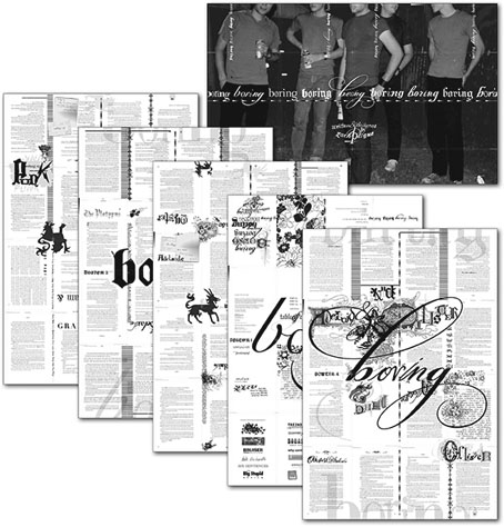
This multi-faceted design event from Featherproof Books turned up in the post recently, a book which actually deserves the designation “novel” for once. boring boring boring boring boring boring boring by Zach Plague manifests across a range of media—book, poster, compact disc—with the book being the most elaborately-designed work of fiction I’ve seen in a long time.
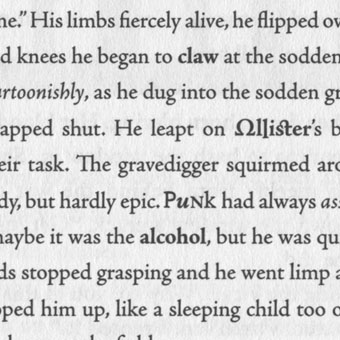
When the mysterious gray book that drives their twisted relationship goes missing, Ollister and Adelaide lose their post-modern marbles. He plots revenge against art patriarch The Platypus, while she obsesses over their anti-love affair. Meanwhile, the art school set experiments with bad drugs, bad sex, and bad ideas. But none of these desperate young minds has counted on the intrusion of a punk named Punk and his potent sex drug. This wild slew of characters get caught up in the gravitational pull of The Platypus’ giant art ball, where a confused art terrorism cell threatens a ludicrous and hilarious implosion. Zach Plague has written and designed a hybrid typo/graphic novel which skewers the art world, and those boring enough to fall into its traps.
I’ve not had chance to read this yet (still plodding through Ulysses) so can’t comment on the story but I like the design. As well as a fancy spot UV finish on the jacket (that’s a mix of matt and gloss to you) and much vogueishly baroque business occurring in and around the pages, the text is set in a variety of typefaces with considerable attention to detail.
Adobe’s book design application InDesign has a find and replace function which simplifies this kind of thing but it still takes some dedication to apply it to every page of a novel. The usual reaction to experimental work like this is for people to cry “gimmick”; in the case of the recent run of Savoy Books, my most detailed design—for Robert Meadley’s A Tea Dance at Savoy (2003)—featured illustrations and inset elements on every page, only to be dismissed by one review as being “like a website”, whatever that means. Given that the design of novels hasn’t advanced much since the 19th century I’d say we could stand to see more of this approach. Typographic experiment has a lengthy history despite the general lack of encouragement, from early examples in Apollinaire’s poetry to more recent works such as House of Leaves by Mark Z Danielewski. There’s always the risk that doing this becomes a distraction but then interesting art has to take risks as well. The rule of thumb among the science fiction writers of the Sixties when they were pushing the stylistic boundaries was that the form followed the content; if the content can support this kind of presentation there’s no reason not to try it, is there?
Elsewhere on { feuilleton }
• The book covers archive