
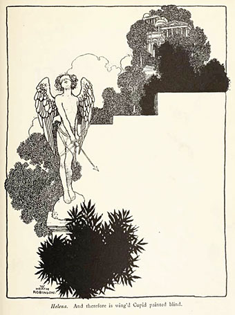
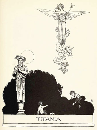
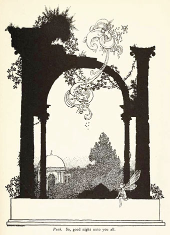
I wasn’t planning on featuring William Heath Robinson again so soon but I couldn’t resist posting some extracts from his 1914 edition of A Midsummer Night’s Dream, another great download from the scanned books at the Internet Archive. I have a few of these illustrations in a WHR monograph but I didn’t realise the book as a whole was so good. The Robinson brothers had a remarkable mastery of space in their work, no doubt derived from Beardsley but they found a way to make his expanses of black and white work for their own distinctive styles. This book, like many of those of the period, features colour plates but I much prefer Heath Robinson’s black-and-white work to his watercolours. His Poe book contains many fine drawings but his style is more suited to this Shakespeare play, especially in the depictions of clouds of fairy figures tumbling through the air.
Elsewhere on { feuilleton }
• The illustrators archive.
Previously on { feuilleton }
• William Heath Robinson’s illustrated Poe
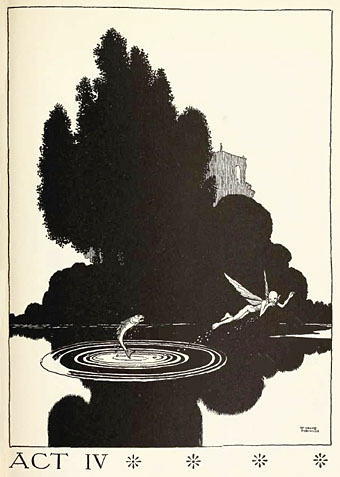
Lovely. This Act IV picture makes me regret not having the necessary skills to make an animationthat would end up with the fish eating the fairy…
I was In Minnesota for a few days and picked up a book I think you would like too: Illustrations to “The Tale of Genji” by Yoshitaka Amano.
Some of them reminded me of some ballet costume paintings by Léon Bakst, strangely enough.
Would need to be a bigger fish!
Amano is very influenced by this period of illustration, so that’s not surprising. I love his work, rather than being a slavish imitation he gives it a Japanese twist. I referred to an Amano exhibition recently.
I love this book. I’ve been lucky enough to have a physical copy in my hands in the past and like you’re other friend said, that Act IV page is just fantastic, one of the best examples of the genre I know, perfect use of black and white-space, form, humour, details… guh! just lovely. My friend the printer at The Old Stile Press included that image in their 20th century bibliography as one of the ‘influences’ on him as a child which made him want to be involved in the creation of print and books.
I wish someone would do facsimile editions of some of these books, they’re so beautifully designed. I have a “facsimile” edition of Harry Clarke’s Perrault which isn’t ideal—they changed the title page for a start—but it does include all the illustrations.
Iv got a copy of the first edition. Wish i could share it with a wider public