

Random browsing this week turned up some nice high-res photos of Harmony in Blue and Gold, as James Abbott McNeill Whistler named the room he decorated for Frederick R. Leyland in 1878. Leyland had bought one of Whistler’s paintings, La Princesse du pays de la porcelaine (1864), and architect Thomas Jeckyll was concerned that the painting and furnishings would clash, hence the invitation for Whistler to help with the colour scheme.
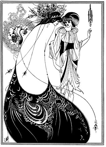
I’ve always preferred this luscious, gold-leafed design to the worthy medievalism of contemporary William Morris. Even though Whistler completed the work prior to the 1890s, the combination of Orientalism and peacocks (the signature bird of the Decadence) seems very much tied to the fin de siècle not least because of Aubrey and Mabel Beardsley’s visit to the room in 1891. Beardsley was very impressed with the painting and with the golden birds, the style of which later formed the inspiration for his famous Peacock Skirt illustration in Salomé (1894).

There’s a good overview here of the history of the room, including details of the falling out between the combative artist and his client, and the story of the room’s removal to America and subsequent restoration.
Previously on { feuilleton }
• Beardsley’s Salomé
• Alla Nazimova’s Salomé
Too damn beautiful for words.
Oh, you know this is one of my favorite things in the world!
Oh, I missed your post. That must have been when I was having trouble with the website.
I’ve often wondered what a whole house would be like done in this style, whether it would be too rich, like eating a whole cake at one sitting.
Fabulous room! How can one dare set furnitures in that type of decorations is something I have always wondered. Maybe just a round sofa in the middle ?
I think it was a dining room! That seems a shame as a large table would have cluttered the place and I have visions of servants coming and going, kicking the doors open and so on.
I finally got to see this room a couple of weeks ago — the first time that the Freer was open when I was in town. I think it actually looks better in these photographs than in real life, in part because there are railings that keep you from getting very close to the walls (but also end up in the edges of your visual field almost anywhere you look but up) and also because the current lighting is considerably dimmer.
(Also, the link is broken — the new link to that material seems to be http://www.asia.si.edu/exhibitions/online/peacock/default.htm.)
For what it’s worth, my favorite things from that trip were the Tryon pastels in this exhibit. The photographs were also cool, but the pastels were gemlike.
Thanks Claire, just checked the link and it seems okay (it’s also the same as your link) so that must have been a temporary glitch.
I’m jealous of anyone who gets to see this room, railings or no. A shame about the lighting; I’d not considered that but it makes sense to protect the paintwork. It’s often the case with drawings in museums that you get to see them but in very dim light. In the case of colour works a decent book reproduction is often better.
Place – Freer Gallery of Art – “Peacock Room – Unshuttered” – James Whistler
http://www.youtube.com/watch?v=o_W9uJg5HI0
The opening of the shutters lets natural light into the Peacock Room
A digital restoration of the color:
http://www.youtube.com/watch?v=FSIR8l6xbzI