
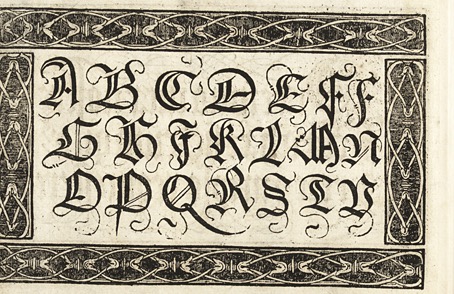
Work-related research over the past week has had me looking for interesting 14th-century alphabets. This is a period I usually ignore in favour of the designs of the following century which tend to be a lot more florid, often to the point of illegibility. (Michael Baurenfeind’s books offer prime examples.) Medieval alphabets are more readable on the whole, once you attune yourself to the missing letters (“j”, “u” and sometimes “w”), also the common occurrence of the long “s”, the bar that crosses the “x”, and the way that “z” will resemble a number 3.
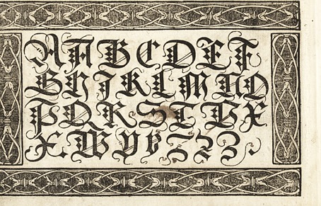
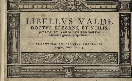
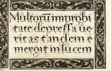
The examples below are the more eccentric samples given in Libellus Valde Doctus Elegans, et Utilis, Multa et Varia Scribendarum (Elegant and Useful Book on the Learned Art of Writing), a collection by Urban Wyss published in Switzerland in 1564. Wyss presents the Gothic scripts that are common to the period before showing the reader a number of pages unlike any I’ve seen elsewhere, including one with the text running in reverse across the page. (This may be a printing error but I’m assuming not.) The book has an obvious pedagogic intent: the first page shows the student the best way to hold a pen when writing, while the second page depicts a classroom where a group of infants are learning to read and write.
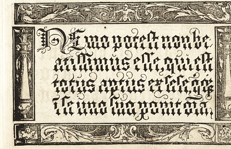
The passages of text that separate the alphabets are mostly aphoristic rather than referring to the stylistic variations on display. I was hoping the text might be more technical, and that the changes of style would be there to emphasise some point being made. This would have made the book a very early example of graphic design in which the form of the text was used to reinforce an argument. An article in a 1945 issue of Graphis refutes this:
Unlike other books on calligraphy the Libellus valde doctus is for the most part composed in Latin and intended for pupils of academic schools. The texts chosen for the models are drawn from the works of Cicero, the most read Latin writer at that time. They are meant to serve not only for the mechanical training of the copyist but further for his schooling in good Latin expression, not to speak of the beneficial influence on the pupil of their content in wisdom.
This does at least give us a very minor connection to graphic design beyond the letterforms themselves. Cicero may not be quoted so often today but some of his writing is put to use whenever a designer fills a column with Lorem ipsum placeholder text, the words of which are extracted from De finibus bonorum et malorum. Posthumous recognition of a sort, although I expect the Roman senator would prefer to be remembered for the meaning of his statements rather than the individual words used to compose them.
Continue reading “The Elegant and Useful Book of Urban Wyss”