New things for July

motorway_city_sm.jpg

Motorway City by Hawkwind, Flicknife Records single (1983).

This month’s issue of Record Collector magazine has a feature about Hawkwind which featured my Motorway City sleeve among its illustrations. It was odd seeing this again, being a single it doesn’t turn up so often and it has the distinction of being one of the oldest of my works in print. Although the single was released in 1983, the drawing was done in 1980 (I was 18 at the time) and it ended up with Dave Brock somehow.

The A-side is taken from the Zones album, which sports one of my more successful cover illustrations for the band, and the song is a Ballardian eulogy to driving on motorways at night. Despite their reputation for being a bunch of spaced-out hippies, Hawkwind were frequently drawn to the harder side of things (Lemmy used to shout “Die! Die!” at their tripping audience and was proud of freaking people out), and this song isn’t even science fiction, despite my flat futuristic cityscape in the background. Before he finished with the band for good, singer Robert Calvert wrote two songs based on JG Ballard books, High Rise and the punk- and Crash-derived thrash piece Death Trap, both on the PXR5 album from 1979. Motorway City was written around the same time and it’s a shame it didn’t have Death Trap on the B-side instead of yet another version of Master of the Universe. My drawing was done as black on white but the record company smartly (for once) reversed out the design which I always felt made it look a lot better, as well as fitting more with the night-driving theme.

Also this month, I’m in the process of reworking the website a bit which means making more prints of artwork available. I’ve started with some of the Lovecraft pictures, which is always the most popular stuff but I’ll gradually be working through everything and setting up PayPal facilities for other items. Many pictures and designs can already be had as prints at CafePress but that system is best for t-shirts and other goods, it lacks the personal touch which people often want from a signed print.

Previously on { feuilleton }
Hawkwind: They’re still feeling mean
Barney Bubbles: artist and designer

New York City abandoned

ial1.jpg

ial2.jpg

ial3.jpg

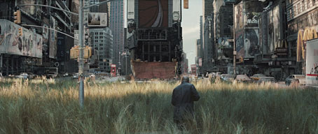
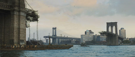
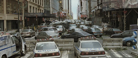
That great staple of science fiction and horror stories—the derelict city—turns up again in the trailer for the latest adaptation of Richard Matheson’s pulp classic, I Am Legend. The novel has an obvious appeal for filmmakers since Matheson was an accomplished screenwriter and an expert at crafting taught, high concept storylines. Other notable productions of his work include The Incredible Shrinking Man (one of JG Ballard’s favourite films; currently being remade), British horror thriller Night of the Eagle, Roger Corman’s Poe adaptations, the Night Stalker/Night Strangler TV movies, Steven Spielberg’s early film, Duel, and one of the most memorable episodes of The Twilight Zone, ‘Nightmare at 20,000 feet‘.

ial4.jpg

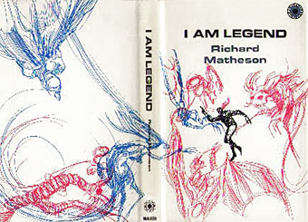
First edition jacket (1954).

The premise of I Am Legend is simple and direct: what would it be like to be the last man on earth if vampires (actually plague victims with vampire-like symptoms) had taken over the world? The book was first filmed in 1964 as The Last Man on Earth starring Vincent Price. I’ve never seen this but due to one of those copyright quirks it’s now in the public domain and can be downloaded for free here. George Romero’s 1968 Night of the Living Dead (and his subsequent zombie saga) was influenced by Matheson’s novel, then a big budget version arrived in 1972, The Omega Man, with Charlton Heston in typical gung-ho mode. I was impressed with that when I saw it as a teenager but it now seems fatuous for the most part. The new film has Will Smith as Matheson’s lone survivor in a setting that greatly benefits from judicious use of CGI to roughen the views of the abandoned city (especially good in the HD trailer). I’ve no idea yet how this will fare as an adaptation. Matheson’s novel ends on a bleak note that a director like Romero would have no problem with but which Hollywood hates so I’m inclined to be suspicious; The Omega Man changed the tone and the ending of the book substantially. The film is released in December, so we’ll find out then.

The I Am Legend Archive

Previously on { feuilleton }
Nosferatu

Fantastic art from Pan Books

larkin_fantastic.jpg

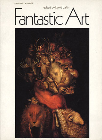
Fantastic Art (1973).
Cover: Earth by Arcimboldo.

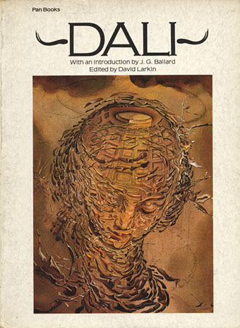
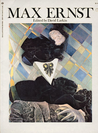
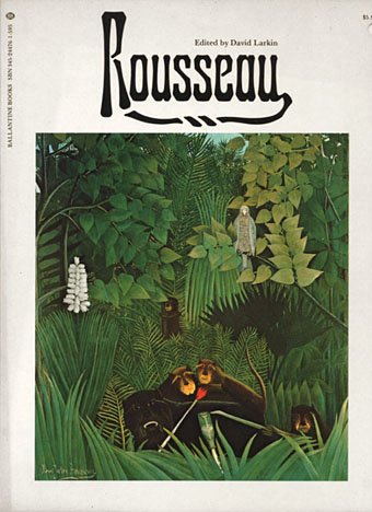
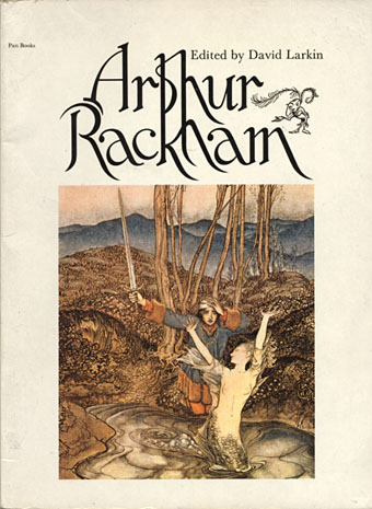
I’d thought of writing something about this book series even before I started this blog since there’s very little information to be found about it online. I can’t compete with the serious Penguin-heads, and I’m not much of a dedicated book collector anyway, but I do have a decent collection of the art books that Pan/Ballantine published in the UK throughout the 1970s. The books were published simultaneously by Ballantine/Peacock Press in the US, and nearly all were edited by David Larkin, with Betty Ballantine overseeing the American editions. Two of the series, the Dalí and Magritte, were among the first art books I owned. Over the years I’ve gradually accumulated most of the set, and I always look for their distinctive white spines in secondhand shops.

The Pan books were a uniform size, approximately A4 (297 x 210 mm), with a single picture on each recto page surrounded by generous margins. The reproductions were excellent, printed on quality paper, and all featured specially-commissioned introductions (JG Ballard for the Dalí book) with those pages printed on textured sheets. Each book was beautifully designed, the opening pages and introductions often featuring black-and-white vignettes if the artists in question produced line drawings. David Larkin’s focus was on art that tended to the fantastic, visionary or imaginative, something that was in vogue throughout the Seventies after psychedelic art had ransacked the Victorian and Edwardian eras for inspiration a few years earlier. Aubrey Beardsley had been rediscovered in the mid-Sixties (turning up on the cover of Sgt. Pepper) and underground magazines such as Oz and IT helped create a renewed interest in art that would look good when you were stoned or tripping. The Pan books weren’t “head books” as such but its probably fair to say that the series was supported and made possible by the prevailing attitudes of the time.

larkin_magritte.jpg

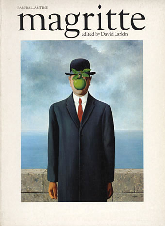
Magritte (1972).
Cover: The Son of Man.

As the series developed the format evolved away from fine art towards contemporary fantasy art, and as a result became less interesting for me, although the success of the Frank Frazetta books undoubtedly meant that this was the way the sales were going. The demand for the Ernst and Rousseau titles can be gauged by the remainder cut-outs on their covers. The final volumes (which I’ve never bought) featured artists such as Brian Froud (The Dark Crystal), Alan Lee (The Lord of the Rings) and others, with their Faeries, Giants, Castles and Gnomes books. I’m still missing a couple of the earlier numbers which I could now order online but that would spoil the game of letting chance deliver the goods, wouldn’t it?

Fantastic Art is easily my favourite, a great collection of visionary work through the ages beginning with Bosch and proceeding through Goya, John Martin, Richard Dadd, the Symbolists and the Surrealists to what was then contemporary work by artists such as Hundertwasser. This was one of the first of the series and seems to be the key volume in the way it provides an overview of the art that would follow.

larkin_dali.jpg

Dali (1974).
Cover: Raphaelesque Head Exploding.

A great introduction by JG Ballard in this one, replete with the usual phrases about “the dark causeways of our spinal columns”.

larkin_innocent.jpg

Innocent Art (1974).
Cover: Cat by André Duranton.

A collection of what used to be called naive painting, ie: work by unschooled “Sunday painters” such as Rousseau. Outsider art is the preferred term these days even though the work itself hasn’t always changed.

larkin_ernst.jpg

Max Ernst (1975).
Cover: Euclid.

Ernst’s later work in this book was the most abstract and experimental of the series. Europe After the Rain was printed across a fold-out sheet so that its full width could be displayed.

larkin_rousseau.jpg

Rousseau (1975).
Cover: The Merry Jesters.

larkin_dreamers.jpg

The English Dreamers (1975).
Cover: The Bridesmaid by John Everett Millais.

larkin_rackham.jpg

Arthur Rackham (1975).
Cover: Clerk Colville (from Some British Ballads).

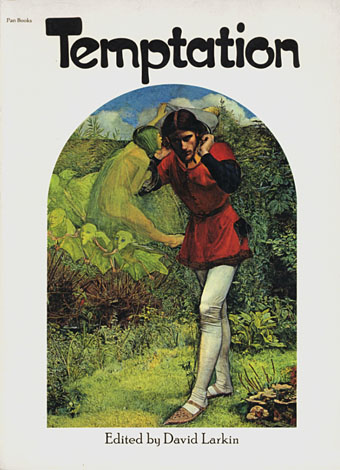
larkin_temptation.jpg

Temptation (1975).
Cover: Ferdinand Lured by Ariel by John Everett Millais.

An unusual collection with a wide range of pictures (Bosch, Alma-Tadema, Balthus). Mainly concerns sexual temptation for female bodies but also includes Biblical and other temptations.

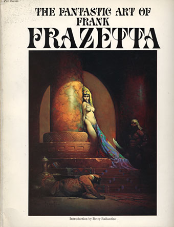
larkin_frazetta1.jpg

The Fantastic Art of Frank Frazetta (1975).
Cover: Egyptian Queen.

The book that launched a thousand metal albums. Volume One here was the first attempt to collect Frazetta’s work and was easily the most popular title of the series, going through many reprintings and prompting three follow-up volumes. Many of the reproductions are superior to their equivalents in Taschen’s later Icon collection. This was the first one I bought after the Surrealist books and, while I’ve never been a muscle obsessive, I couldn’t help but notice all the male flesh on display.

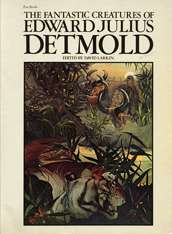
larkin_detmold.jpg

The Fantastic Creatures of Edward Julius Detmold (1976).
Cover: Shere Khan in the jungle (from The Jungle Book).

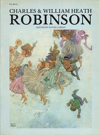
larkin_robinson.jpg

Charles and William Heath Robinson (1976).
Cover: Elfin Mount (from Hans Andersen’s Fairy Tales).

A collection of the Robinsons’ fairy tale paintings. A break from the format with a blue cover.

larkin_larsson.jpg

The Paintings of Carl Larsson (1976).
Cover: The Kitchen.

Another break with the format, the book being printed landscape to suit Larsson’s drawings and paintings. As with the Ernst book, a fold-out page was a special feature.

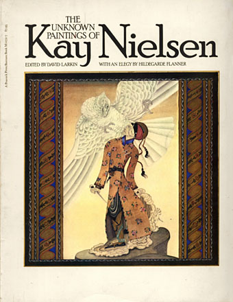
larkin_nielsen.jpg

The Unknown Paintings of Kay Nielsen (1977).
Cover: The Tale of the Third Dervish.

A collection of Nielsen’s work derived from Turkish and Persian miniatures.

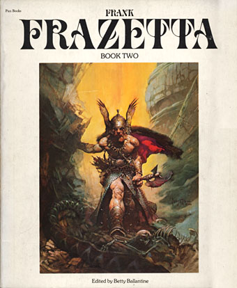
larkin_frazetta2.jpg

Frank Frazetta, Book Two (1977).
Cover: Dark Kingdom.

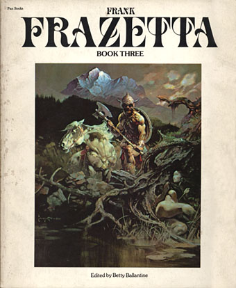
larkin_frazetta3.jpg

Frank Frazetta, Book Three (1978).
Cover painting: Nightwinds.

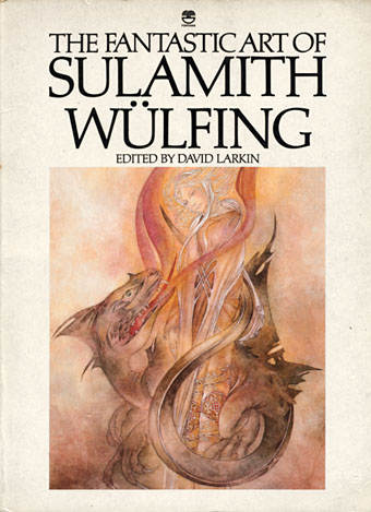
larkin_wulfing.jpg

The Fantastic Art of Sulamith Wülfing (1978).
Cover: The Big Dragon.

Part of the series but published by Fontana/Collins, not Pan.

Elsewhere on { feuilleton }
The fantastic art archive
The book covers archive
The illustrators archive

The Surrealist Revolution

bunuel.jpg

The riddle of the rocks by Jonathan Jones
It was the art movement that shocked the world. It was sexy, weird and dangerous—and it’s still hugely influential today. Jonathan Jones travels to the coast of Spain to explore the landscape that inspired Salvador Dalí, the greatest surrealist of them all.

The Guardian, Monday March 5, 2007

I AM SCRAMBLING over the rocks that dominate the coastline of Cadaqués in north-east Spain. They look like crumbling chunks of bread floating on a soup of seawater. Surreal is a word we throw about easily today, almost a century after it was coined by the poet Guillaume Apollinaire. Yet if there is anywhere on earth you can still hope to put a precise and historical meaning on the “surreal” and “surrealism”, it is among these rocks. To scramble over them is to enter a world of distorted scale inhabited by tiny monsters. Armoured invertebrates crawl about on barely submerged formations. I reach into the water for a shell and the orange pincers of a hermit crab flick my fingers away.

The entire history of surrealism—from the collages of Max Ernst to Salvador Dalí’s Lobster Telephone—can be read in these igneous formations, just as surely as they unfold the geological history of Catalonia.

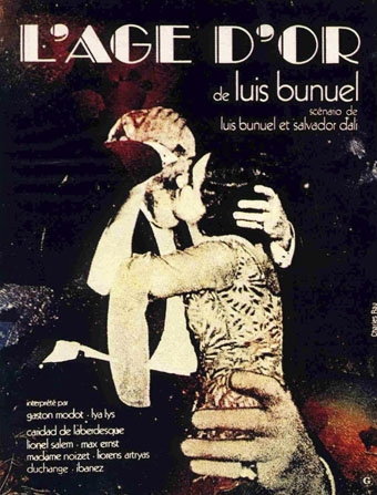
I sit down on a jagged ridge. What if I fell? Would they find a skeleton looking just like the bones of the four dead bishops in L’Age d’Or, the surrealist film Luis Buñuel shot here in 1930?

Buñuel had been shown these rocks by his college friend Dalí years earlier. It was here they had scripted their infamous film Un Chien Andalou. Dalí came from Figueras, on the Ampurdán plain beyond the mountains that enclose Cadaqués, and spent his childhood summers here, exploring the rock pools and being cruel to the sea creatures. In most people’s eyes, this is a beautiful Mediterranean setting. It certainly looked lovely to Dalí’s close friend, the poet Federico García Lorca, when Dalí brought him here in the 1920s: in his Ode to Salvador Dalí, Lorca lyrically praises the moon reflected in the calm, wide bay…

Continues here.

Previously on { feuilleton }
The persistence of DNA
Salvador Dalí’s apocalyptic happening
The music of Igor Wakhévitch
Dalí Atomicus
Las Pozas and Edward James
Impressions de la Haute Mongolie

Sculptural collage: Eduardo Paolozzi

paolozzi1.jpg

Michelangelo’s ‘David’ (1987).

In a similar vein to the dismembered Soviet monument in the previous post, there’s the sculpture of the late, great Eduardo Paolozzi (1924–2005). The giant head of Invention is especially impressive when seen in situ outside London’s Design Museum, its pieces separated by the words of a Leonardo da Vinci quotation: “Human subtlety will never devise an invention more beautiful, more simple or more direct than does Nature, because in her inventions, nothing is lacking and nothing is superfluous.”

It should be noted, in light of another recent post, that Paolozzi was associated with New Worlds when the magazine was at its height, credited (jokingly) as “Aeronautics Advisor” even though he had little or nothing to do with the publication aside from being friends with contributor JG Ballard. There’s a great Studio International discussion here from 1971 between Paolozzi, Ballard and critic Frank Whitford, in which they talk around the subjects of Surrealism, violence in life and the arts, and other typically Ballardian concerns.

paolozzi3.jpg

Invention.

paolozzi2.jpg

Portrait of Richard Rogers (1988).

Previously on { feuilleton }
Revenant volumes: Bob Haberfield, New Worlds and others
JG Ballard book covers
Ballard on Modernism