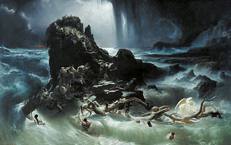
The Deluge (1840).
In the days before cinema and the likes of Roland Emmerich, people had to visit galleries or see touring exhibitions of huge paintings for their fill of artistic cataclysm. I discovered some of these works on my first visit to the Tate Gallery (now Tate Britain), aged 13. I was there to see favourite pictures by the Pop artists and Surrealists and so was completely unprepared for the room of three John Martin paintings and the awesome (and enormous) The Deluge by Francis Danby (1793–1861). These were pictures that never appeared in conventional art histories although subsequent scouring of libaries revealed at least one book devoted to Martin’s scenes of Biblical destruction. Danby, on the other hand, remained obscure, and for years this single painting was the only work of his that I’d seen.
Over the years I’ve come to prefer The Deluge to many of Martin’s paintings. His figures are larger and the draughtsmanship is better, the composition is more developed and the technical qualities (despite complaints in the article below) are superb. Like many painters of this period, Danby had great skill at rendering the translucence of water and the gorgeous texture of the waves in this painting was one of the first things to strike me (something that’s impossible see in books or online reproduction). Closer examination reveals detail of a kind that Martin usually buries or ignores, from the tiny ark sailing away on the horizon, to the lion clutching desperately at a branch to escape the water. Most curious of all, in the far right the painter has stranded a pair of anomalous Biblical figures, a glowing angel and what appears to be a drowned giant. The Deluge is probably Danby’s most accomplished work so it’s good to know it remains on public display.
The following article is seventeen years old and remains the only newspaper or magazine feature I’ve seen about Danby’s work to date.

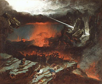
An Attempt to illustrate the Opening of the Sixth Seal (1828).
Darkness Visible
Many of the sombre, apocalyptic works by the nineteenth-century painter Francis Danby have become darker still as the paint and varnish have deteriorated over the years. But now some have been successfully restored for a retrospective of his work.
Andrew Graham-Dixon
Saturday, February 11th 1989
The Independent
FRANCIS DANBY’S The Upas, or Poison Tree in the Island of Java, the smash sensation of the annual British Institution exhibition of 1820 and one of the most ambitious narrative paintings of its time, has languished in the obscurity of the V&A’s basement for more than a century. Recently restored, it is the focal point of the Danby retrospective that has been mounted jointly by the Bristol City Museum and Art Gallery and the Tate Gallery. The Upas Tree marked Francis Danby’s London debut, and in some style. Measuring 66in by 99in, Danby’s gloomy canvas was an enormous calling-card, his way of announcing that here, from provincial Bristol (via Ireland, his place of birth), was a young painter to be reckoned with.
Continue reading “The apocalyptic art of Francis Danby”

 ‘He created his own universe and became its star’