
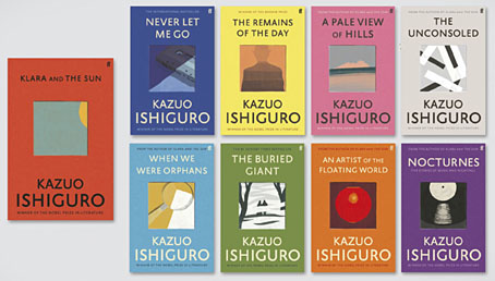
I like seeing an author’s works designed as a set, and so do the bigger publishers for whom redesigns are a useful way to freshen their back catalogue. This month the Faber edition of Klara and the Sun by Kazuo Ishiguro provides the template for a redesign of the author’s previous works, with new editions of the seven other novels plus a story collection, Nocturnes. I’ve not read any of these books so I’ll leave it to Ishiguro’s readers to gauge the suitability of the minimal illustrations, although the one for Nocturnes is the kind of visual pun that designers today often search for. The image is explained by the book’s subtitle, “Five Stories of Music and Nightfall”. I’d have been tempted to go the George Hardie route with the illustrations, flattening the colours, adding outlines, and placing that cassette and shadow at forty-five-degree angles. But Hardie’s bold isometrics might seem a little too cartoony for Ishiguro. Faber designer Pete Adlington recounts the thinking behind his covers here.


Elsewhere on { feuilleton }
• The book covers archive
My first reaction before I even looked closely was that the typography was “Faberish.” Are the center illustrations actual die-cuts or do they just look that way on the screen?
They look like die-cuts from a distance but they’re all drawings or paintings with slightly uneven edges. A range of die-cut covers would be impressive but probably too costly even for a Nobel Prize winner.