
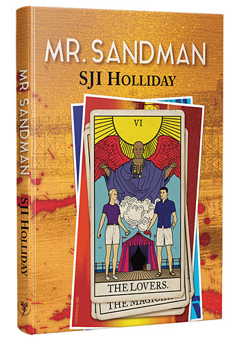
The last cover reveal of the year isn’t my last cover of the year, two more will follow this one but they won’t be made public until next year. As before, I’ve only done the illustration this time, PS Publishing having an in-house designer who does the rest. Mr Sandman by SJI Holliday is another hardback novella, a horror tale with a sense of humour and a Monkey’s Paw-like warning about careless wishes:
Sophie is bored with her perfectly nice but deathly dull boyfriend Matthew. Sensing he’s about to lose her, Matthew takes her on a last-ditch attempt trip to the seaside, hoping to rekindle their dying flames. But things take a dark turn when Sophie visits Mr Sandman, a Haitian priest, who claims that he can change Matthew into the boyfriend that she wants. But does Sophie really know what she wants? Never has the phrase “be careful what you wish for” been more apt. Because Matthew does change…just not in the way that anyone could’ve predicted.
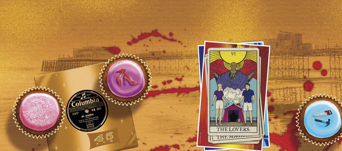
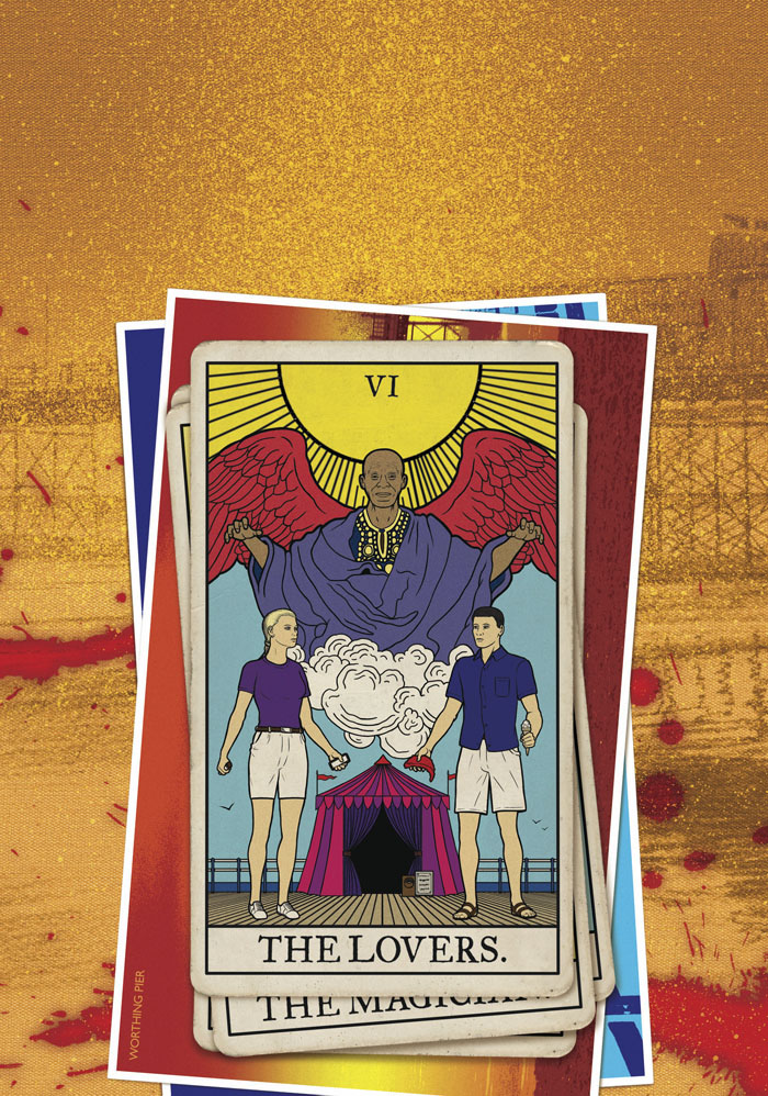
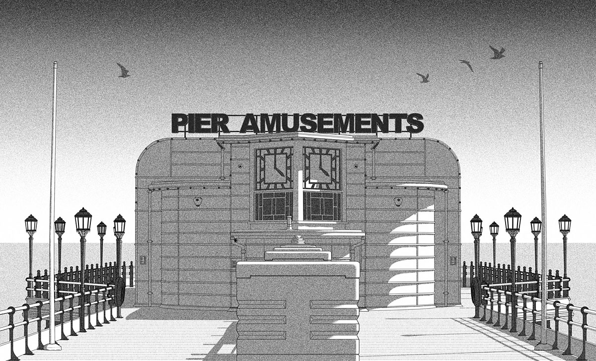
Worthing is a seaside town on the south coast of England that’s generally regarded as a poor relation of nearby Brighton. Despite this status the town does possess an award-winning pier which is the main focus of SJI Holliday’s story, so this seemed an inevitable focus for the cover as well. My idea was for something in the manner of Tom Adams, an artist who specialised in arrangements of carefully-painted objects on vague or sketchy backgrounds, with the backgrounds often depicting the location of the story. Having grown up in another seaside town blessed with three piers I’m well aware that all these structures aren’t the same so the pier details have been properly researched. The Tarot cards are an example of artistic licence, however, since the novella doesn’t mention Tarot divination. But with a narrative that concerns a visit to a fortune-teller’s booth this didn’t seem like too much of a stretch, as well as being a convenient way of depicting the main characters. Pamela Colman Smith’s cards were the model for these; the two main characters look a little stiff but that’s the way the figures are represented on her Lovers card, and the awkwardness of the relationship is a dominant theme. As for the cupcakes, these are all very relevant to the story but you’ll have to read the book to find out why.
Endpaper illustration.
Previously on { feuilleton }
• Tom Adams Uncovered
• Out of season