
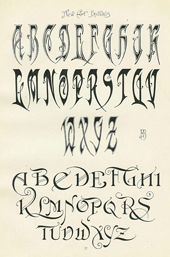
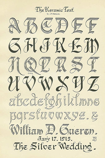
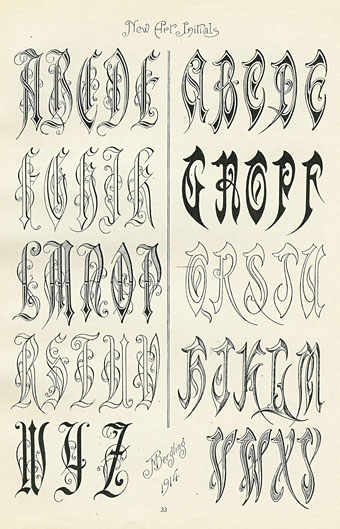
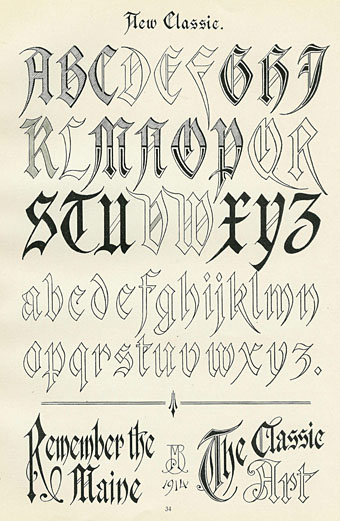
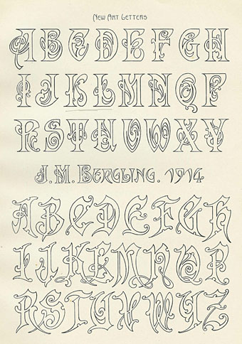
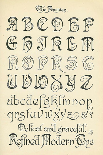
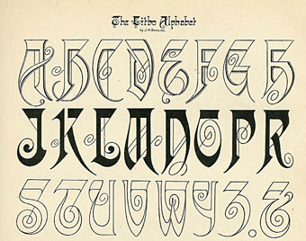
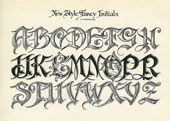
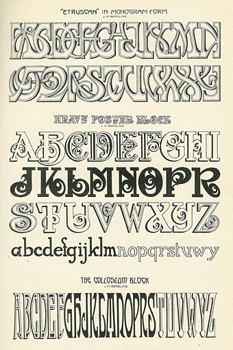
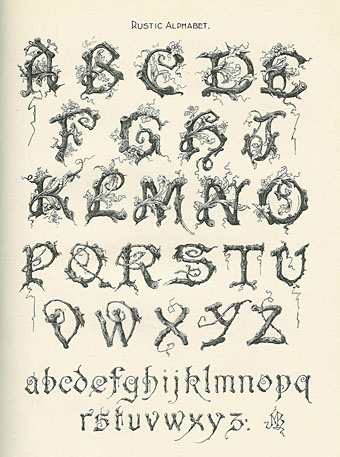
Old type catalogues seldom contain any unusual typefaces so you have to look to craft books for original letterforms. Art Alphabets and Lettering (1914) is an American book for artists and sign painters written and designed by JM Bergling which contains several pages of novel designs among its more familiar typefaces. Bergling evidently had a flair for alphabet design, there are more unique examples here than you’d usually find in a book of this kind, and Bergling’s letterforms are consistently stylish and inventive. In addition to providing a number of spiky variants on the Art Nouveau style (which by 1914 was going out of fashion), he also found time to draw his own version of a 19th-century staple, the Rustic Alphabet. There are two copies of the book at the Internet Archive: a complete one and an incomplete one, the latter volume possibly being a later printing since it contains a number of pages not included in the former.
Previously on { feuilleton }
• Grand capitals
• Costume capitals
• Paulini’s mythological alphabet
• Joseph Balthazar Silvestre’s Alphabet-album
• Johann Theodor de Bry’s Neiw Kunstliches Alphabet
• The Book of Ornamental Alphabets
• Paul Franck’s calligraphy
• Gramato-graphices
• John Bickham’s Fables and other short poems
• Letters and Lettering
• Studies in Pen Art
• Flourishes
A lot of these alphabets skip either “i” or “j”; what’s up with that? Why not skip “u” or “v”?
Nice designs, by the way.
Having designed a few alphabets of my own, I’d guess it’s because I and J are easier to derive from other letters. I and U require designing because they’re vowels, while V often requires more stylisation from U than J does from I.