
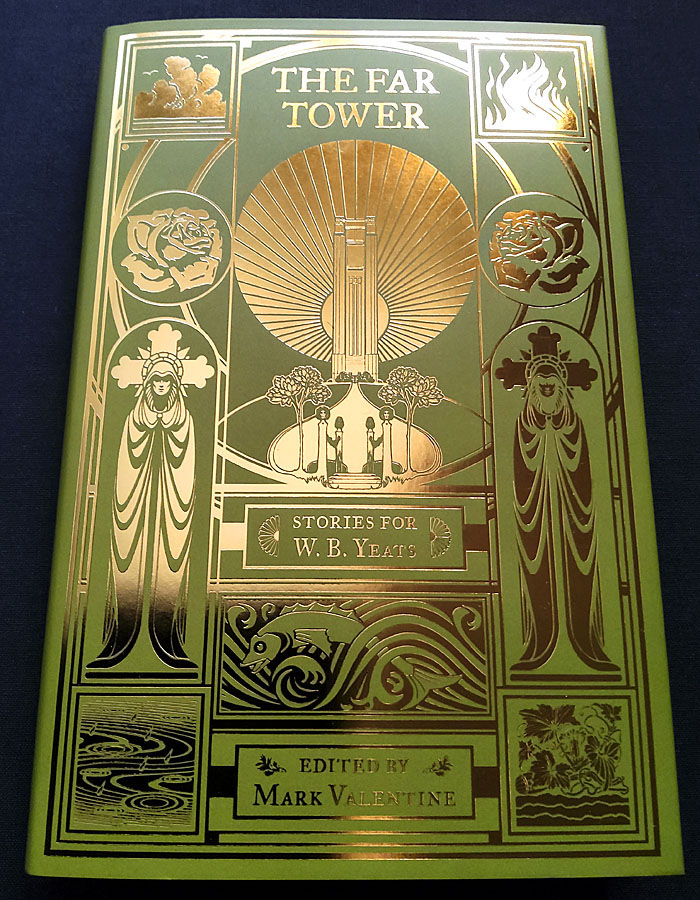
I’ve already written about the design for this story collection from Swan River Press but the gradient layout does nothing to convey the splendour of the foil-embossed printing. In the past when I’d suggested to publishers that foil printing might be an option the idea was always turned down for reasons of cost. My original intention for The Far Tower was for the design to be printed in a metallic ink so it might resemble the gold-on-green cover of the Yeats book which was the model for this volume. Metallic inks don’t always work too well, however, especially on a darkish background, so I said to Swan River “Or we could do it in gold foil…” To my surprise and delight they said “Why not?” So here’s the result. A great end to the year. The book is available here.
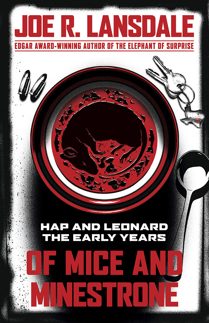
And back in October, I posted what everyone thought at the time was the final design for Of Mice and Minestrone, a new book of Hap and Leonard stories by Joe R Lansdale. The Hap and Leonard books are popular works (there was a TV series based on them a while back) so they’re subject to the demands of the marketplace which in this case required a cover more in line with the red/white/black arrangement of some of Lansdale’s related titles. I’d already done most of this as an additional draft during the work on the first design so the reworking wasn’t too time-consuming. The rodent in the soup is more visible in this version which is another point in its favour. Of Mice and Minestrone will be published by Tachyon in May next year.
Previously on { feuilleton }
• The Far Tower: Stories for WB Yeats
• Of Mice and Minestrone