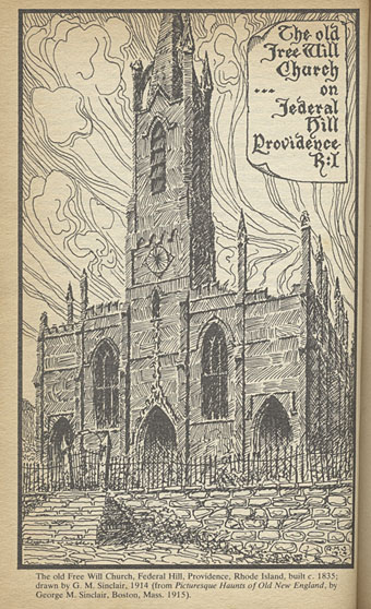
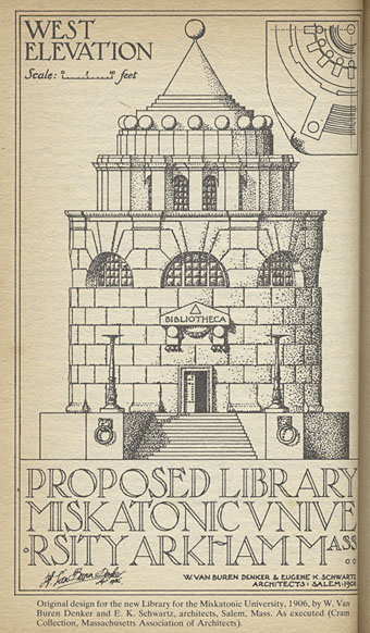
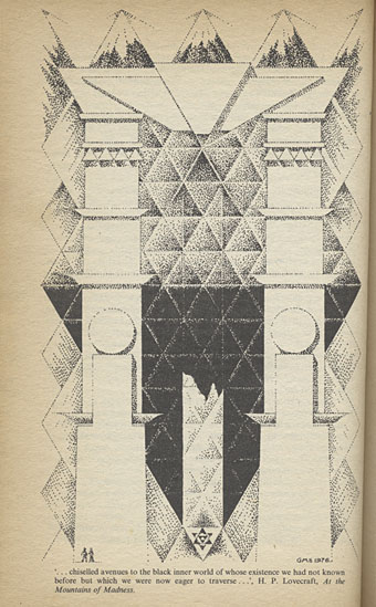
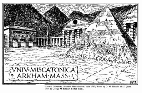
And speaking of architecture… I wouldn’t usually punish the spine of a scarce paperback by subjecting it to trial by flatbed scanner but not all of these drawings have found their way to the web. The artist is Gavin Stamp, here masquerading as “GM Sinclair” for illustrations used in the appendices of the aforementioned Necronomicon (1978), edited by George Hay. The book was published in hardback by occult specialists Neville Spearman, with a paperback following two years later from Corgi Books.
For a purportedly real Necronomicon this one always struck me as more plausible than the US equivalent by Simon; Hay and his collaborators, Robert Turner and David Langford, go to some lengths to describe the sourcing of rare manuscripts from the British Museum, and the process of cryptographic decoding that follows. But the part of the book that made the greatest impression was the essay contributions by Christopher Frayling and Angela Carter, and Gavin Stamp’s accompanying illustrations. In 1980 unless you knew an older book collector (which I didn’t) serious writing about Lovecraft’s work was hard to find. Hay’s book and Stamp’s illustrations were one of several discoveries that pushed me towards illustrating Lovecraft myself.
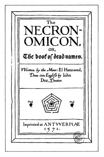
The pictures above are taken from the paperback while the ones below are lifted from David Langford’s site. I borrowed the pentagonal labyrinth from the title page for the cover of the NecronomiCon convention booklet: two Necronomicons joined, and a nod to a group of writers who helped me along the way.
Elsewhere on { feuilleton }
• The Lovecraft archive

The Hay Necronomicon has much to recommend it over both the Simon Necronomicon and L. Sprague de Camp’s Al Azif from around the same time – Colin Wilson’s introduction so skillfully wove fact and fiction that he had to post an essay explaining the hoax, which has caught some people out as late as the 2000s. Even the magical and historical material was more well-considered than the equivalent in Simon’s book, which gave only lip service to Lovecraft or the Mythos, and you’re correct that the artwork in general was much better, especially the black-and-white photographs of manuscript pages. It’s also been fairly widely translated, too.
Really pleased with these pictures: I had heard about this paperback edition, but never found one.
Can it be assumed that the architect who designed Miscatonic Uni’s Old Quadrangle was some disciple, or had some relationship, to Claude-Nicolas Ledoux? The similarities with the Saline royale d’Arc-et-Senans (built between 1775 and 1779) are striking.
Also, Ledoux planned pyramid-shaped, as well as sphere-shaped, structures he was never given an opportunity to build.
The Wiki entry on Stamp is quite impressive
[makes notes for Ars Necronomica *2017*]
>https://en.wikipedia.org/wiki/Gavin_Stamp
Tororo: Stamp is an architectural historian so that may be a deliberate reference to Ledoux.
Pyramids were a common feature of Neo-Classical architecture as a result of the Egyptian influence on the Romans. The pyramidal tomb of Gaius Cestius in Rome is the model of many subsequent examples you find elsewhere, especially in Britain: Hawksmoor crowned at least one of his churches with a pyramid, and there are small pyramidal tombs and follies in many cemeteries and gardens of country houses.
The joey Zone: One reason I liked Stamp’s drawings so much, especially the one of the church, was that they looked authoritative. I still think Stamp’s church is closer to Lovecraft’s description in the story than my version which was too spiky and overtly Gothic.
Any idea who was the artist for the illustrations in ‘Club Dumas’? The first illustration, at least, is reminiscent of
The front-page Necronomicon image reminds me of the illustrations fro “Club Dumas”, purportedly illustrating De Umbrarum Regni Novem Portis. Any idea who was the artist for those illustrations?
I note in passing that one of the fictional books mentioned in “Club Dumas” is Astarloa’s “Treatise on the Art of Fencing”, which surely brings it under the auspices of Feuilleton.
Whoops, first sentence in previous comment is a pentimento.
In the ideal world, the old Free Will Church would bear a closer resemblance to St Leonards in Shoreditch.
The illustrations in my edition of Pérez-Reverte’s novel are uncredited which adds to their charm. I suppose they may have been credited in the original. I have a later novel of PR’s entitled The Fencing Master which I’ve yet to read.
Lovecraft describes the Starry Wisdom church as being in Upjohn’s Gothic Revival style which makes it a little more interesting than its model (which is now demolished):
https://www.flickr.com/photos/cthulhuwho1/3810023709