
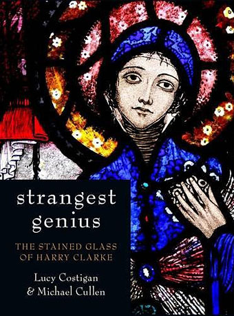
I mentioned Harry Clarke’s stained glass work last year since Flickr now has some decent photos of Clarke’s incredible window designs. Published this month is Strangest Genius: The Stained Glass of Harry Clarke by Lucy Costigan and Michael Cullen, the first proper book-length study of the windows and other stained glass work produced by the Clarke studio. It’s costly but then this is a unique book showcasing the entirety of the artist’s work in the medium. Further details here.
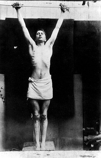
Harry Clarke posing as Christ in his studio.
Previously on { feuilleton }
• Joseph Cavalieri’s stained glass
• Harry Clarke’s stained glass
• Poe at 200
• IKO stained glass
• Harry Clarke’s The Year’s at the Spring
• The art of Harry Clarke, 1889–1931
This is a ‘must buy’ item for me. The first decent study since Nicola Gordon-Bowe’s bio twenty years ago. Thanks for posting!
Thanks for this post! I’ve added the book to my “to buy” list, and just spent an hour on the Flickr set. Stained glass horribly difficult to photograph well, and I have several blurred images of Clarke windows of my own to confirming this.
He seems to have done thing with glass that no-one else could do. I especially love the background fill of flowers/sea anemones in some of the windows. Did he ever do fabric designs? I think I have seen silk handkerchiefs from the 1920s with very similar patterns.
Hi AlyxL. I’ve never heard of their being any fabric designs, outside of illustration he seemed to devote all his energies to the glass work, understandably since he was so adept with it. Some Harry Clarke stage designs would have been fascinating to see.
WOW, i have never seen that photo before, fantastic, he’s one of my favourite artists and gives me great pleasure to be able to see his work fairly often here in Dublin, the extraordinary detailing in his work is just amazing and his illustrations are just divine too.
Thank you so much.
I have just taken delivery of ‘Strangest Genius’, and although I have only had time to glance through it, I would recommend it to anyone interested in Clarke’s art…
Just got “Nightmares in Decay” a collection of Harry Clarke’s Poe illustrations, and you get a mention in the introduction by D. M. Mitchell -“Manchester artist John Coulthart frequently incorporates stylistic elements borrowed from artists he admires (from Piranesi and Dore to Virgil Finlay and Burne Hogarth). In his amazing art for the graphic novel “Reverbstorm” Coulthart has created a collage of images and scenes reflecting famous modernist paintings and pulp comics alike, offered partly as tribute to the artists he admires, and synthesised into a unique and powerful vision of cosmic delirium. Clarke is among the artists to whom he pays tribute in this comic, as he draws strongly on Clarke’s frenzied sinuous use of line and the powerful, almost bludgeoning use of chiaroscuro. In one panel in particular, called “The Weird of Spring Heeled Jack” (reproduced in the Creation Onerious volume “The Haunter of the Dark”) there is a recognisable pastiche of Clarke’s illustrations for Poe.”
“a unique and powerful vision of cosmic delirium” – not bad at all. Reminds me of the time someone told me I had an “apocalyptic snarl”.
Thanks, that Lord Horror picture may also be in the latest issue of Rue Morgue magazine since they were running a Harry Clarke feature; they asked me some questions about him and requested the artwork. I haven’t seen the mag, however, nor the Creation book, for that matter. Despite their publishing my own book they never send me copies of things. Dave Mitchell is a bit more conscientious on that score.
AlyxL said “Did he ever do fabric designs? I think I have seen silk handkerchiefs from the 1920s with very similar patterns.”
To quote Mitchell’s introduction again “Clarke also designed fabrics and handkerchiefs, boxes and lanterns…”
What I wouldn’t do to own a Harry Clarke lantern.
Sadly the Strangest Genius is spoiled by the distortion of some of the photographs. The designer has obviously stretched some of the photographs horizontally, rather than proportionally, to fit the layout grid, resulting in eliptical haloes and faces.
Strangest Genius: was Nominated for ‘ Best Published Irish book of the year’ You can vote for the book here http://www.irishbookawards.ie/ViewBook.aspx?book=269634
Thanks
Michael Cullen
Martin, when you say “The designer has obviously stretched some of the photographs horizontally” I’d like to know how you can feel so certain about this. Speaking as a book designer myself it makes no sense to stretch a photo to fill the space of a design; you’d enlarge or reduce the picture proportionally.
There’s a more straightforward, and, it should be said, far more charitable explanation for the occasional distortion of some of the pictures: namely that they’re photographs of windows in buildings which I’m sure presented many difficulties for the photographers concerned. Photographing a circle from below causes precisely the distortion you’d expect to see in a few of the pictures. Given the fact that this is the first book anyone has produced of Clarke’s incredible stained glass work, and that the book is beautifully designed and printed, it seems churlish in the extreme to pick fault in such a manner, especially if you have no evidence to back up your grievance.
This image of Harry Clarke posing as Christ features in our film –
HARRY CLARKE – DARKNESS IN LIGHT
An award-winning film produced by Camel Productions, written and directed by John J Doherty http://camelproductions.net/
“Documentarian John J Doherty examines the life of Clarke and the controversial nature of his work, culminating in his clash with the conservative Irish Free State over his ‘offensive’ masterpiece, the Geneva Window’. Visually spectacular and poetically told, Darkness in Light is a fitting showcase of Clarke’s unique and haunting vision.” Boston Irish Film Festival
Trailer – http://www.youtube.com/watch?v=ATWj10GXY7Y
In reply to John, I’m talking about enlargements of the same photo. Look at the central image on p265, then look at the enlargement on p269, or compare the 2 images of Our Lady on p 132, or the images of St Patrick on pp 188 & 189, where the whole window has been stretched, while the image on the enlargement is correct. I could go on.
Not that it’s particularly related but I just came back from Salisbury and took some pictures of some very nice stained glass.
Photos can be viewed here: http://www.facebook.com/album.php?aid=34167&id=100001501388167&l=a660ce35df
I spent NYE on my own, drinking and editing this together from Clarke’s Stained glass designs… Thought you might like it…
http://www.youtube.com/watch?v=qMFGFKialQ8