

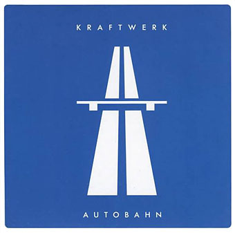
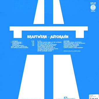
Autobahn by Kraftwerk; Vertigo #6360 620.
Colin Buttimer was in touch last week to let me know he’d copied my Barney Bubbles post (with my permission) to his excellent new site, Hard Format, which is devoted to the art of music design. In the intro to that piece he repeats something he’d mentioned to me earlier, namely his belief that Barney Bubbles designed the UK release of Kraftwerk’s Autobahn album in 1974. I thought this unlikely at first but the more I’ve been thinking about it the more possible it seems. So here’s a quick run through the evidence in the hope that someone out there may have more information to either confirm or deny the theory.
The 2004 version from the unreleased The Catalogue.
Firstly it should be noted that the original German sleeve was a painting by the group’s regular designer, Emil Schult, who also helped write the title track. Schult’s painting/collage seems at odds with the group’s later rigorous aesthetic and it’s surprising that the design has persisted alongside the UK design. Something which complicates the theory here is that the German painting and cover design exist in several variations, with a car dashboard visible in the early pressings and—crucially—the German autobahn symbol (similar to the UK motorway symbol on the UK release) superimposed on the painting. I have one of the later vinyl reissues with Schult’s painting on the cover and the motorway bridge printed on both sides of the inner sleeve. But someone in the UK still made the decision to make the appropriated road sign the focus of the design for its first UK outing. The previous Kraftwerk album, the wonderful Ralf & Florian, also has at least two different cover designs while their first two albums—featuring their distinctive traffic cone trademark—were repackaged as a double set by Vertigo in 1972. That design takes their stencil lettering and applies it to an oscilloscope wave. Like the Vertigo Autobahn sleeve the design is uncredited, as were a number of other Vertigo releases.
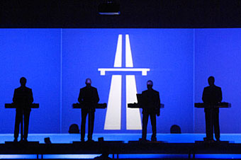
Kraftwerk on stage in 2005.
So where does Barney Bubbles fit in?
1) He was one of a number of designers working for Vertigo in the early Seventies. Marcus Keef produced many of the covers for the folky/prog side of things while Hipgnosis and Roger Dean were among the other talents given an early start by the label. There are two covers credited to BB under his Teenburger name, the first album by Cressida in 1970 and, more significantly, Gracious! by Gracious, also 1970. The stark simplicity of the latter’s giant italic exclamation mark runs counter to anything else on the label at that time.
2) The Gracious! design is printed on bubble-textured card while the white areas of the Autobahn design are embossed onto the sleeve. Texturing isn’t unique to the Gracious album, however, so this factor is circumstantial. Vertigo’s designers used a number of elaborate effects from die-cut sleeves to packaging which opened out to a much larger size, a trick BB famously used later for his Space Ritual and Armed Forces sleeves. Black Sabbath’s Master of Reality album was designed by the Bloomsbury Group and that cover uses a similar embossing.
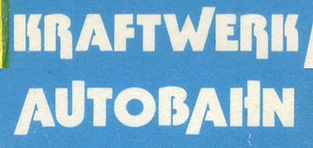
3) The typography. This is probably the clincher for me. The title design for Autobahn is a very odd variant of a Herbert Beyer Bauhaus-style typeface although ITC didn’t produce their Bauhaus face until 1975. It isn’t the earlier Beyer-derived Blippo either, several of the characters are different shapes and several have also been extended slightly. The Bauhaus reference is a clue for me simply because it fits with Barney’s knowledge of design history and also his sense of humour—Germans! The type layout on the back of the sleeve is even more telling. Typography is often like a signature and BB was very sharp with his use of type; he was also very fond of using Futura and the album credits are indeed set in Futura (another German type design incidentally). After this release Futura became the default Kraftwerk typeface until they began using computer-styled designs. You want more? It’s difficult to tell from a low-res jpeg but the word Gracious! on his earlier sleeve looks to me like it was set in the bold condensed oblique weight of Futura.
The Autobahn titles as reproduced on the UK cassette release.
ITC Bauhaus Heavy designed by Edward Benguiat and Victor Caruso (1975).
Why does this matter? For a start there’s still more of Barney Bubbles’ work to be brought to light, so this can be considered one part of an ongoing investigation. It’s an important piece of graphic design which nonetheless remains uncredited. Peter Saville has frequently mentioned this sleeve design as a formative influence. In #231 of The Wire magazine he said:
Not only did the music have a profound influence on me, the sleeve made a lasting impression—the appropriated road sign symbolising the excitement and romance of travelling through Europe. It was my introduction to semiotics, and inspired a use of visual codes that I would develop later through Factory Records.
The person who introduced Saville to Autobahn was designer Malcolm Garrett who later worked with Barney Bubbles. Both Garrett and Saville acknowledged the importance of Barney’s work in Paul Gorman’s recent book, Reasons to be Cheerful. Saville was later designing sleeves for OMD whose music owes a huge debt to Kraftwerk. It would be surprising if all these disparate threads could be traced back to a single design source.
As always, if anyone has any further information please leave a comment.
• Vertigoswirl.com | A very thorough guide to all the original Vertigo releases.
Update: added the 2004 CD version.
Elsewhere on { feuilleton }
• The album covers archive
Persuasive post John.
I’d assumed it was Emil Schult (partic after reading the admittedly spotty I Was A Robot).
Schult similarly delighted in obscuring his design contributions.
As far as I can detect BB had severed his association with Phillips/Vertigo by this time (though as a diligent freelance was never beyond returning to a client and 74 was relatively fallow).
Hello John, good to read your analysis. You refer to the type being a very odd version of another typeface – I understand you’re referring to the different weights, etc., but the extending of certain letters is delightfully playful and entirely in character with the theme of the music and the rest of the design.
I own both the early German pressing (with dashboard, Emil Shult in the mirror) and this version. Although, as you point out, there was something of a schematic approach in earlier releases, the approach was faithfully realised with the (non-)release of the Katalog a couple of years ago, in which the covers were redesigned utilising a hard-edged iconography. Visit http://www.kraftwerk.com and click on the Info link to view, the site’s in pesky Flash and so can’t be bookmarked. The autobahn symbol’s aesthetic of appropriation perfectly realises the group’s romantic embrace of the modern, technologised world and can be connected directly to Ralf’s enthusiasm for responding to everyday sounds as ongoing soundtrack.
The nature of the appropriation may account for the design’s relatively low status. However, the design is very impressive in its attention to detail. I particularly like the decision to have the lanes extend out of top and bottom of the frame. Whoever is responsible, I believe it’s been a key ingredient in the group’s conceptual development. In the Minimum Maximum visuals both styles are utilised, the symbol perhaps representing the modern, the Schult illustration a pre-fascist Romantic ideal of technology.
Oh and thanks for your mention of Hard Format (we’re approaching our two year anniversary btw :-)
Hi Paul. I should have mentioned above that I ran this past BB experts Rebecca & Mike who said they only know of the earlier Vertigo jobs. I also suggested they try and contact Emil Schult since he’d be best placed to offer further information.
Colin: that Bauhaus-style typeface is likely one of the many hundreds of designs from that period which still haven’t been digitised. And, yes, I was aware of The Catalogue, in fact I had a lengthy post planned at one time examining the group’s design and their emphasis on symbols from the traffic cone on. As you note, there’s been a shift of emphasis from pictures to signs, the other notable example being the way Radioactivity has moved from radio activity to nuclear hazard, dropping the old Nazi radio in place of a warning symbol.
It would be remarkable if this was a Barney Bubbles work, yet, considering its influence, equally remarkable if it was merely whacked together quickly one day by somebody at Vertigo.
hello…
whilst side-stepping the minutiae of differing Vertigo nomenclature ( Phillips / Vertigo / Phonogram ) it might be worth just filling in a little gap by saying that there were some Vertigo releases Barney worked on after 1974; Clover’s ‘Unavailable’ (1977) and Graham Parker and The Rumour’s ‘The Parkerilla’ (1978), being two that immediately spring to mind.
:-)
news update…
we’ve had a brief but informative chat with Emil Schult about this. Emil says that the UK Autobahn sleeve design is based on the sticker he designed for the original German issue. you can see a pic of the stickered German sleeve here http://static.rateyourmusic.com/album_images/5481.jpg
Emil commented that the typestyle on the UK sleeve is different to his sticker however, and confirmed he did not put the UK sleeve together.
all in all, this isn’t looking like a Barney to us…
Well, that’s great in any case, many thanks for the info.
Part of the confusion for me with this has been not knowing what the very first (German) edition of the album looked like. I didn’t know whether that was a sticker or something printed on the sleeve, for example, and matters are further complicated by the German sleeve being later reworked, as noted above.
You want more? I also noted above that the third album, Ralf & Florian was redesigned for its UK release. Looking just now at the Discogs page I see this:
Over to you, R&M!
hello there…
coincidentally, we’ve looked at this Ralf & Florian Discogs page before. we noticed that on the back of the sleeve the text reads ‘music, production, cover: R. Hütter & F. Schneider’.
tbh, we would be inclined to believe the credit on this sleeve.
are there any other hunches out there?
:-)
Ah, but I think all that Vertigo did with the Ralf & Florian Philips sleeve is chop out the credit for front cover photographer, Robert Franke. If you look at this page you’ll see that the type arrangement is exactly the same otherwise–albeit better arranged–and on the Vertigo sleeve they also credit Emil Schult’s comic which, like many booklet inserts of the period, I don’t think was included in later editions.
Incidentally, I’ve always loved that back cover photo of Ralf & Florian.
aha… see what you mean… interesting…
well, it remains an open question then, although it isn’t feeling Barney to us (but you can’t make a final judgement on that basis).
will keep you posted..
:-)
Just had a look at my copy of the Schult illustrated cover. The application of the extra sticker on the cover is very strange It doesn’t add anything to the original, in fact it detracts from it by duplicating the group’s name and title. I had always assumed that the sticker was applied as an afterthought by the record company to indicate that the two sleeves contained the same contents. I still think that whoever designed the UK version was a talented designer, not a hack.
Yeah, I thought it strange that the original cover should be stickered, it seems rather redundant. Some of the CDs I’ve designed recently were stickered since the artists wanted their credit in very small type which makes distributors nervous. But that wasn’t the case here.
One explanation would be that it was the UK record which started getting airplay and led to their first chart hit. So maybe Philips then decided to sticker remaining copies of the German album? Although this would imply that the UK sleeve predated the sticker which Emil Schult says isn’t the case.
The mystery persists!
Have a butcher’s at my post here: http://www.barneybubbles.com/blog/archives/836
Thought you might be interested:
http://www.hardformat.org/3159/kraftwerk-autobahn/
and
http://www.hardformat.org/3615/kraftwerk-autobahn-non-uk-version/
A small detail, but I noticed that the choice of font for the front of the UK cover (“Ralf and Florian”) is German modernist classic Futura, whereas the original German version uses a traditional style black letter for the names. A comment on international/cosmopolitan vs local/parochial? Whoever did the UK adapt was either lucky or it was a deliberate choice.
Hi,
this is so interesting to read! I notice this discussion is not so recent, but maybe you can help me anyway… do you guys know about the difference between the two Emil Schult paintings of the German cover? The one with and the (possibly later version) without the dashboard? You have mentioned that the dashboard one seems to be the earlier, original cover of the first German edition? Does anyone know as of when the non-dashboard version is used? (or ähm, why?)
I’m really curious and can’t seem to find out more about the two versions..
Thanks!
Mel
The dashboard was used on the original 1974 German release and also on releases elsewhere (e.g. Canada, 1975) that didn’t do a local alternative design. The idea is that the front cover is a driver’s eye view from inside the car looking ahead, and on the back cover it is as if the driver has looked back to see a view of the band sitting on the back seat – the design plays with the idea of front/back.
The version without the dashboard was the 1984 re-release of the album. This album has a concert photo of the band on the back cover, so the front/back concept of the cover-car viewpoint is broken, hence there is no need to show a dashboard. Instead the image just becomes a kind of idealized, childlike view of a highway landscape.
‘scuse me, I mean 1985 re-release.
brillant! thanks for the info!
I’m just working on an analysis of the cover in terms of national identity, and another way of reading the two different versions could be along the lines of Kraftwerk’s statement of intention: “Autobahn was about finding our artistic situation: where are we? What is the sound of the German Bundesrepublik?”. Maybe the two different paintings point to an altered status of the “artistic situation” in Germany in ’74 and ’85.
Hi Melanie. My take on the gradual evolution of the covers would be that it’s less to do with Germany changing and more the group’s slow paring away of extraneous details in their design. You see this process occurring with Radioactivity and Trans Europe Express which in their Catalogue versions have their cover art reduced to the simplest signs. The only instance of Kraftwerk having any kind of change of direction for more than design reasons is the shift from Radioactivity’s radio cover to the later emphasis on the scientific symbol, a change also indicated by the change of lyrics in that song.