
Penguin is really coming up with the goods these days, living up to their reputation as a house with high standards of cover design, unlike Picador and the shabby way they treated Cormac McCarthy recently.
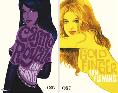
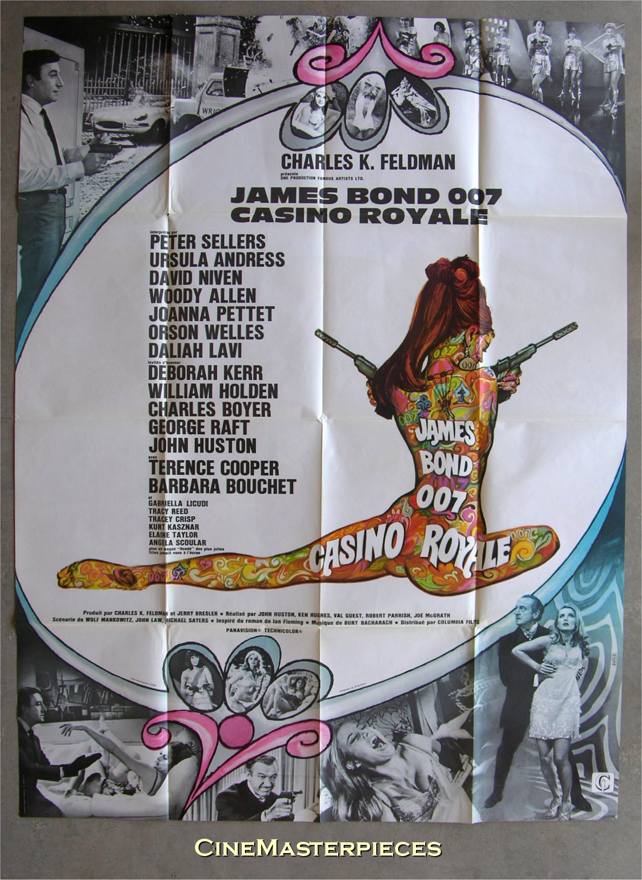
Ian Fleming’s Bond novels are the latest to receive a makeover with some fabulous art from illustrator Michael Gillette. 2008 is Fleming’s centenary so the books have been republished as demi-format hardbacks with these new designs adorning the jackets. Each cover features a different girl matched to the theme of the book (yes, I know they’re women but in Bond’s world women are always girls unless they’re Miss Moneypenny); each cover also features groovy period type which alludes to the hand-drawn elaborations of the Sixties and Seventies. The effect is reminiscent of the poster art for the 1967 film of Casino Royale (below) which used a naked girl as the focal point; all Bond posters before and after this place oo7 himself centre stage. Penguin even dare to push the level of pastiche by making On Her Majesty’s Secret Service look rather like an old romance novel, not such a surprising decision since this is the book where Bond gets married.
My favourite Bond covers remain the old Pan paperbacks from 1963 but that’s just me; these look great. There’s been a persistent moan recently from authors and publishers worrying about file sharing as they foresee the publishing world going the same way as the music business. The solution is obvious: you can’t stop texts being copied and distributed but you can make the books themselves desirable objects so make them worth buying and owning. Penguin has numbered the spines of the new Bond books as they did with their recent Sherlock Holmes reprints, a smart appeal to book collectors as well as a tip to read them in the order they were written. “Smart” is the key word here; Picador take note.
Update: The Pan covers mentioned above were designed by Raymond Hawkey. Bond site MI6.co.uk has some details about the designer.
Elsewhere on { feuilleton }
• The book covers archive
Previously on { feuilleton }
• Repackaging Cormac
• The World’s Greatest Detective
• James Bond postage stamps
• Boys Own Books
Those old Bond covers are just fabulous, aren’t they? So tactile. But I agree with you — the new ones have the right stuff.
I have a full set of Bonds from the mid 70s, girls on every cover…and all of them straddling giant golden guns! And wearing disco jackets too, pink vinyl etc. Well, it was the height of the Roger Moore era, but even so, give me David-Niven era 007 over *that* any day.
I like the old Pan covers partly for shameless nostalgic reasons since they were the first Bond books I saw. You used to see them everywhere and a friend at school in the Seventies had the full set. What you can’t see from the Flickr scan is the bulletholes punched through the Thunderball cover.
More importantly, those were the first books I remember seeing that showed how you could communicate the essence of a story through a few visual motifs, and do that across a whole series. That made a big impression at the time.
John, I agree with you about the imagination and spirit behind these designs and it’s the more appropriate because Ian Fleming was himself a keen book collector and edited a book collecting magazine for a while. In fact, he was featured in the Times Literary Supplement last week on the strength of it: he got his own publisher, Cape, to reprint a 1930s lost classic, All Night At Mr Stanyhurst’s by Hugh Edwards: a novel of 18th century shipwreck.
Thanks Mark, didn’t know about Fleming’s book collecting. Charlie Higson didn’t mention that in his Fleming profile in the Guardian at the weekend, it doesn’t quite chime with the common perception of the author being a kind of Bond manqué.
John
I agree – the usual image of him in an evening suit, with smoke spiralling from a cigarette in an elegant holder, doesn’t quite suggest the furtive forager amongst old tomes. But in the introduction to that lost classic he says his own desert island luxury would be the Times Lit Supp dropped each week by a well-trained albatross!
Mark
There are some older Pan editions with a B/W photo of Bond holding his gun showing in the bottom right-hand corner. That man is actually Ralph Vernon-Hunt who was MD at Pan at the time. RVH was a spitfire ace in WWII so it had a certain dash, and saved on a model fee, both perfect for his style.
Gary