
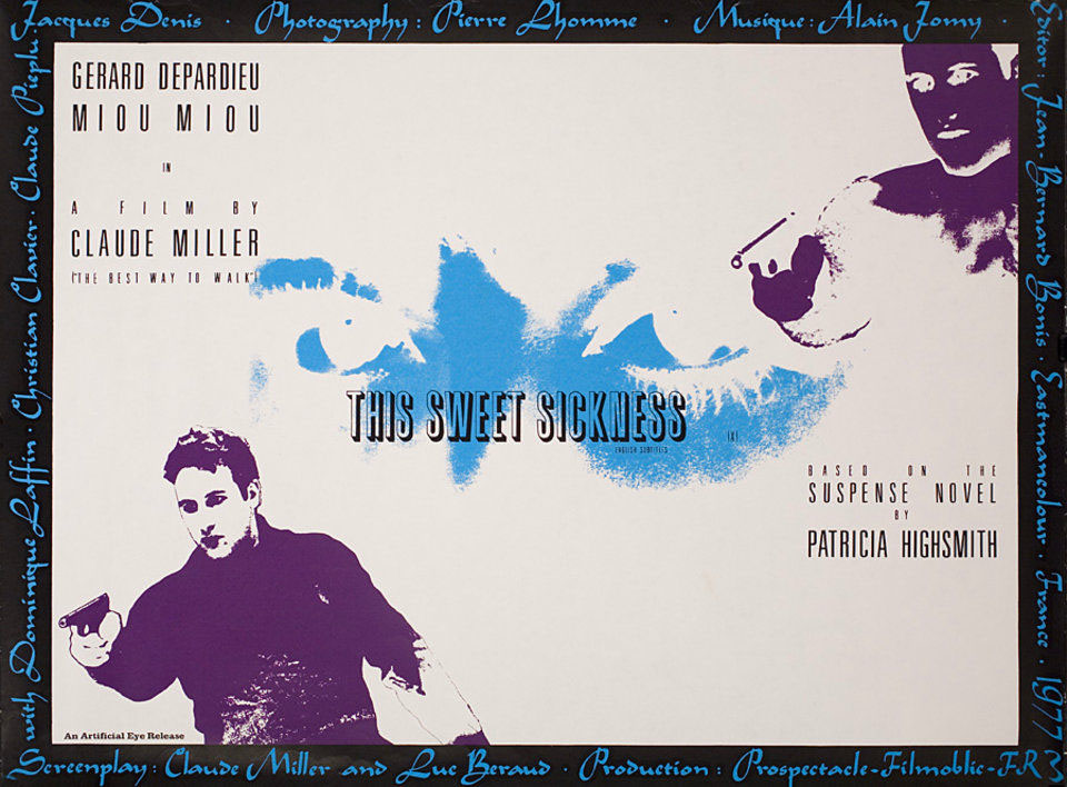
This Sweet Sickness (1977).
Looking around for Quay Brothers designs turned up an item I hadn’t seen before, a poster for the UK release of a French film by Claude Miller, This Sweet Sickness, starring Gérard Depardieu. I’ve not seen the film either, nor have I read the Patricia Highsmith novel on which it was based although a copy of the book has been sitting on my shelves for some time, together with a couple of other unread Highsmiths. The poster dates from just before the Quays started to get serious about their own film-making.
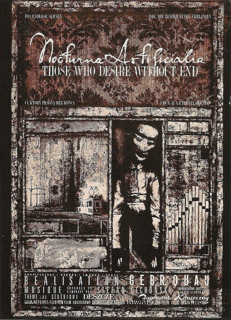
Nocturna Artificiala: Those Who Desire Without End (1979). The organ pipes, which don’t appear in the film, are an allusion to the improvised organ score by Stefan Cichonski.
Being graphic designers as well as film-makers puts the Quay Brothers in a very rare class, one where they not only make the films but also design the posters used to promote their films. Offhand, I can only think of the late Eva Svankmajerová as being in the same company so it’s perhaps fitting that her husband and artistic collaborator, Jan Svankmajer, was the subject of an early film by the Quays.
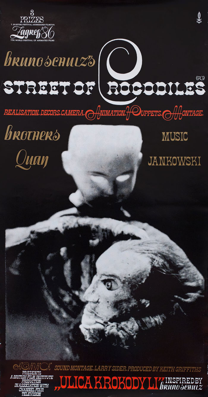
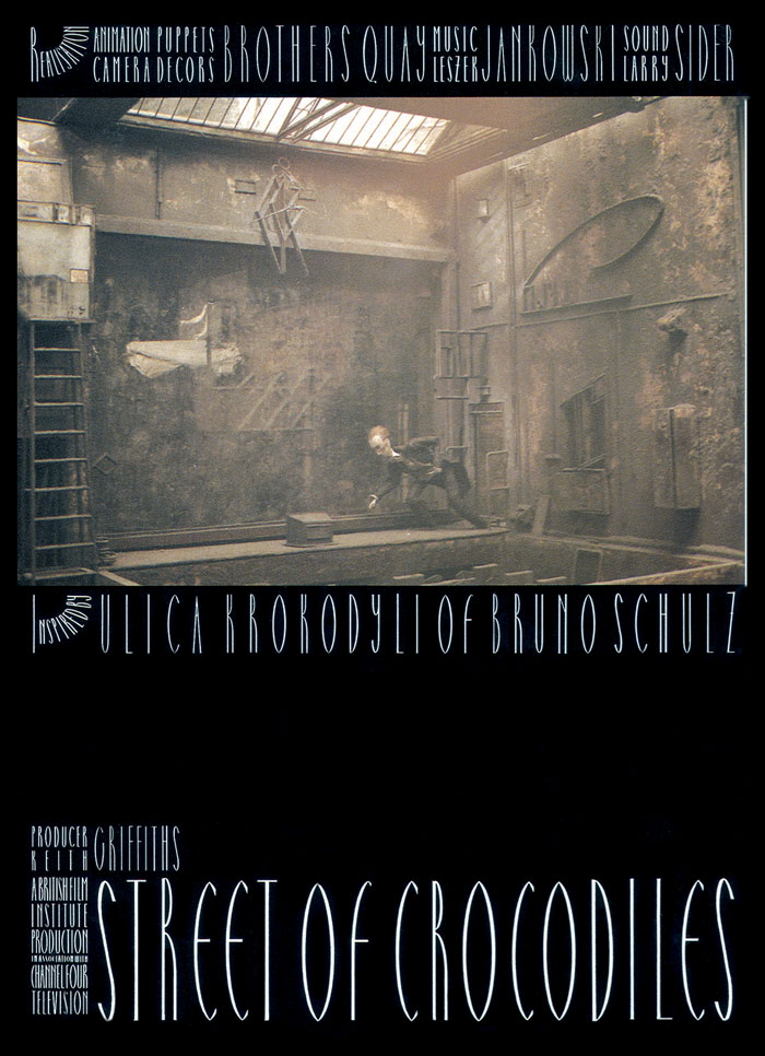
Street of Crocodiles (1986).
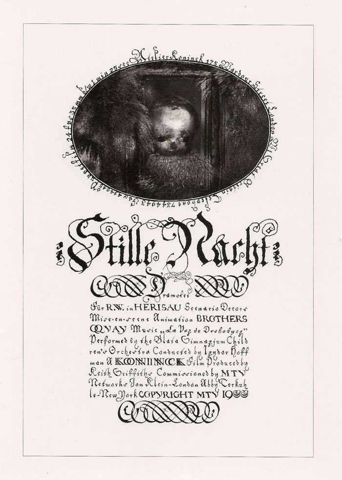
Stille Nacht: Dramolet (1988). An early use of Heinrich Holzmüller’s typographic designs.
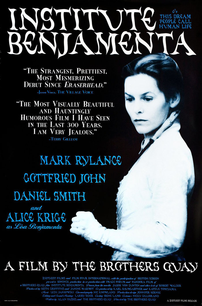
Institute Benjamenta, or This Dream People Call Human Life (1995).
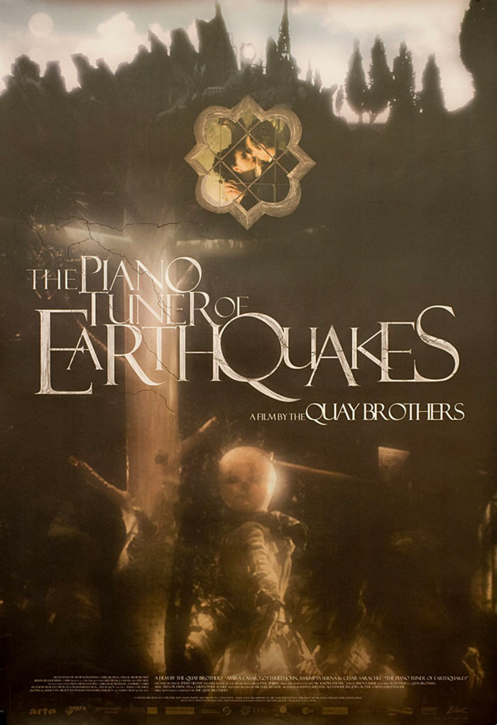
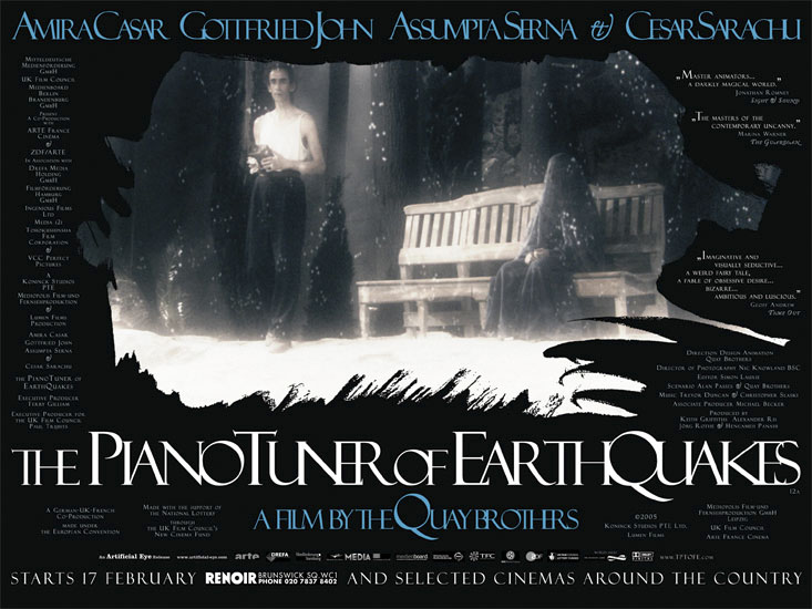
The Piano Tuner of Earthquakes (2005).
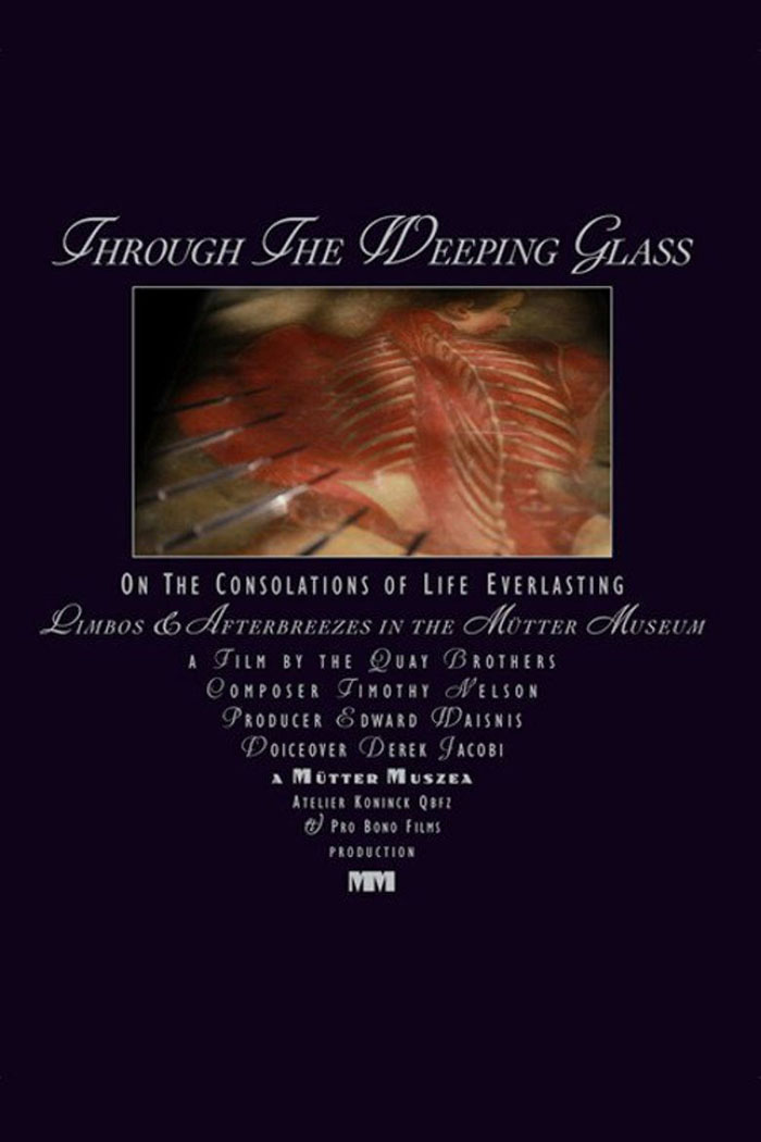
Through the Weeping Glass: On the Consolations of Life Everlasting (2011).
Elsewhere on { feuilleton }
• The Quay Brothers archive
Their influences seem so European that it is was astonishing to me when I found out that the Quay Brothers are Americans. Their work brings to mind another American artist, writer Thomas Ligotti. Any of these graphics could be covers for his books. Stories like “Dr Voke and Mr Veech” and “The Mystics of Muelenberg” could be Quay films. Ligotti is frequently associated with Lovecraft because he dedicated an early story to HPL but by his own admission he is much more influenced by Schulz and Bernhard. But then there is a long distinguished line of American artists who turned towards Europe for inspiration.
Yes, I never think of Ligotti as being Lovecraftian even though we’ve both had our work in Lovecraft-themed collections. That quality of things being awry for no specific reason is much closer to Robert Aickman or, as you say, Bruno Schulz, than Lovecraft. As it happens, I made a Quays/Ligotti connection myself when I used a shot from Street of Crocodiles as the cover for this mix:
http://www.johncoulthart.com/feuilleton/2015/10/31/a-mix-for-halloween-teatro-grottesco/
Ligotti appreciates the uncanny nature of puppets so I’d be surprised if he didn’t also appreciate some of the Quays’ films.
Thanks for keeping updating on the undiscovered works of the Quays. For the last two years, this website has been a treasure box for me. 1977, I think it’s when they just moved back to Europe. It was said in Susan Buchan’s book, that they got an unexpected grant from the National Endowment Fund that included some of their illustrations and the grant allowed them to discover Celtic designs and contexts. After the grant ruan out, they moved to Holland where they designed book covers.
Hello, and thanks for the appreciation and the book tip. I have a copy of that book but I didn’t think to look in it for this post. I should do that before making any other post in future, she’s very thorough.