
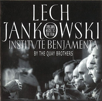
Institute Benjamenta (1998) by Lech Jankowski.
Continuing an occasional series about artists or designers whose work has appeared on record sleeves. Regular readers won’t be surprised to hear that I’ve had this one in mind for some time but it’s taken a while to put together. The main problem has been the Quay Brothers’ habit of using a variety of different names when they were working as designers; variations include “Stefen” rather than Stephen Quay, the Brothers Quai, Gebr. Quay, Jumeaux Quay, The Quays, Atelier Koninck (or Koninck Atelier), and so on. The catalogue compilers at Discogs do a good job of keeping up with the alternate names of groups or musical artists but stumble over those used by anyone else associated with an album’s production. Consequently, this collection of covers shouldn’t be taken as complete or final. Some of the discoveries would have been impossible without the checklist of Quays ephemera that accompanied the MoMA exhibition in 2012.
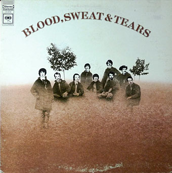
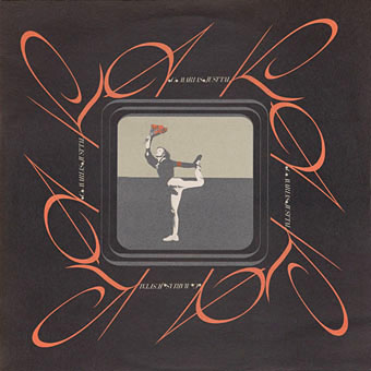
Blood, Sweat & Tears (1968) by Blood, Sweat & Tears.
This must be one of the earliest of the Quays’ commercial works. As with other covers from the first decade of their career, the credit is for illustration alone, graphic design came later.

Mozart: Violin Concerto No. 2 In D Major, Violin Concerto No. 5 In A Major (“Turkish”) (197?); Zurich Chamber Orchestra, Zino Francescatti, Edmond De Stoutz.
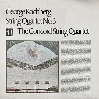
George Rochberg: String Quartet No. 3 (1973); The Concord String Quartet.
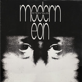
Fiction Tales (1981) by Modern Eon.
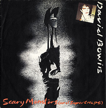
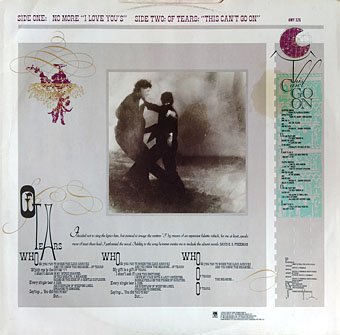
Scary Monsters (And Super Creeps) (1981) by David Bowie.
Yes, David Bowie. Who knew, etc? This was the third single from Bowie’s excellent album of the same name, and once again the Quays only provided the artwork. Much as I like the album, I’ve never thought the cover art was suitable, and would have preferred to see the Quays do the whole thing. The design of the single is a good example of the failure of nerve you often get from large record companies when they can’t resist spoiling something with a superfluous picture of the artist. I’ve recently been reading Eye of the Storm by Storm Thorgerson, a book about cover design filled with complaints about similar aesthetic blunders.
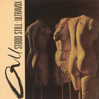
All Stood Still (1981) by Ultravox.
Another single sleeve. Design for this one is credited to Leagve [sic] and Atelier Koninck, Londyn [sic].
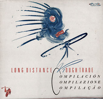
Long Distance Rough Trade (1982).
A Spanish compilation of songs released on the Rough Trade label. The painted figure is a precursor of similar figures the brothers created a few years later for their Italo Calvino cover designs.
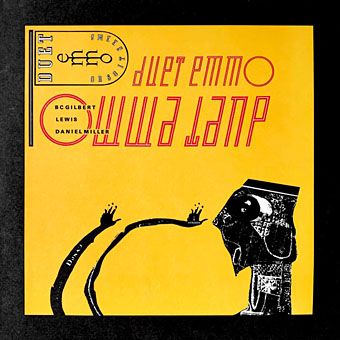
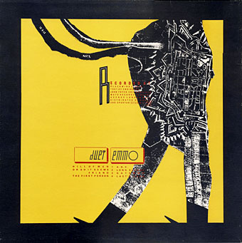
Or So It Seems (1983) Duet Emmo.
Duet Emmo was a one-off collaboration between post-punk group Dome and Mute label boss Daniel Miller (Dome + Mute = Duet Emmo), Dome being an improvisatory duo formed by Bruce Gilbert and Graham Lewis after they left Wire. Dome recorded four albums of awkward and unusual music which I recommend to anyone who enjoys the outer limits of the post-punk era. The Quays, meanwhile, created a poster for a Japanese Dome release which may be seen in one of the group’s two CD collections, and the continuing association led to the next release in this list.
Just Talk (1986) by A.C. Marias
Another single sleeve. A.C. Marias was a short-lived project from Angela Conway, a regular collaborator with Gilbert and Lewis.
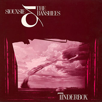
Tinderbox (1986) by Siouxsie & The Banshees.
I’d managed to miss the Quays’ design credit for this one when I wrote a post about Lucille Handberg’s famous tornado photograph.
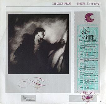
The Lover Speaks (1986) by The Lover Speaks.
As with the Banshees, the credit for this one is for the design alone but very good design it is.
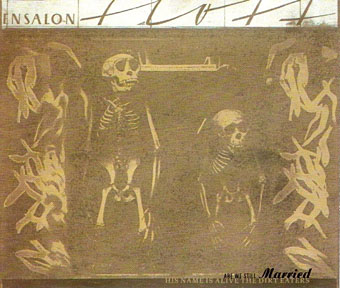
The Dirt Eaters (1992) by His Name Is Alive.
An EP released on the 4AD label so the design this time is by Vaughan Oliver. The cover art is a still from one of the Quays’ two promotional films for the group.
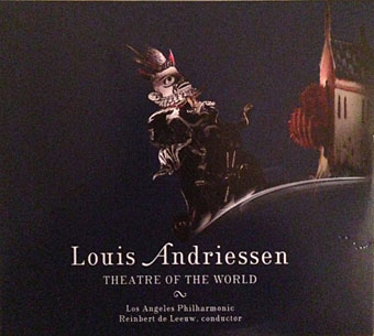
Louis Andriessen: Theatre Of The World (2017); Los Angeles Philharmonic, Reinbert de Leeuw.
An opera with the subtitle “A Grotesque Stagework In 9 Scenes”.
Elsewhere on { feuilleton }
• The album covers archive
• The Quay Brothers archive
Given your interests, John, have you ever written about, or have any thoughts or insights into the Moorcock/Quay Brothers ‘crossover’, the 1974 Doubleday first edition of “The Land Leviathan” which looks a little Paolozzi-esque?
They did a couple of other SF covers for Doubleday so any discussion along those lines would be about their book cover work in general. I’ve had something in mind for a while but the problems to do with credits are the same as with albums (“Brothers Quai” was also a credit on their book designs), and books are more difficult to find without an accurate list to use as a starting point. I’ll probably get to it eventually, these posts are often a challenge to see what can be discovered.
Love this post, inevitably many beautiful designs here. I’d be tempted to start a collection of these items in the flesh/paper/vinyl and probably would if I were still updating Hard Format. Speaking of which, more pics of the lovely Institute Benjamenta soundtrack here: http://www.hardformat.org/7289/lech-jankowski-institute-benjamenta/. Now there’s a release that would benefit from a vinyl edition. It might sit proudly alongside the similarly monochrome and lovely Caravaggio LP (http://www.hardformat.org/4140/simon-fisher-turner-caravaggio/).
A few of these designs remind me of the work of the late, lamented Vaughan Oliver who I met a few times as a former boss of mine was married to him.
I’m amazed that they provided the illustration for Blood, Sweat & Tears’ second album. I listened and enthusiastically, if rather embarrassingly, sang along to it for the first time in at least a couple of decades a few weeks ago.
I was lucky to get one of those Institute Benjamenta CDs for a tenner from eBay a few years ago. I think the seller said that Keith Griffiths had found a box of unsold copies somewhere. I think I also read that Lech Jankowski had fallen out with the Quays for some reason so a reissue seems unlikely.
Vaughan Oliver was definitely the closest to the Quays in graphic design terms. I liked the way they all went against the grain of design trends in the 80s and 90s by favouring Didot fonts and layouts that ignored the prevalent orthodoxies.
That Blood, Sweat and Tears album should probably be filed under “You have to start somewhere”. Can’t say I’ve ever heard anything by the band.
John, you may be familiar with this one which was played a lot on the radio when we were children: https://youtu.be/kK62tfoCmuQ
Ha, yes indeed! In fact I have that song on a 4-disc compilation bearing the title Pure…Psychedelic Rock. You may know that collection; it’s not bad but it veers all over the place, from Bitches Brew Miles Davis to the general pop music of the late 60s/early 70s.
I don’t own that particular one, but I do have a fair few of those slightlydelic ‘mingers and swingers’ compilations that one buys for the odd good track lurking down in the vaults.
Nice to see you highlighting The Mothmen a few posts back by the way, I’ve been ramming them down people’s ears since I bought the 7-inch of ‘Does It Matter Irene’ back in ‘81 and worn out two vinyl copies of the L.P. over the years (it was a bit of a favourite when one felt a bit ‘mysterious’ back then), so it was great to finally get a CD with the extra stuff including their version of ‘Vegetable Man’ which I’d read about in Sounds when the album came out but had remained unreleased, I believe, because The Soft Boys’ version had only recently been released.
You may have noticed a sly reference to Syd in the song ‘Please Let Go’ which contains the line; “No! I haven’t got it yet…”
Regarding Syd, If you haven’t seen them already, you might find these amusing:
https://youtu.be/2lLEaDTQiXg
https://youtu.be/SmSXXLY1IAg
As it happens, I couldn’t recall having heard The Mothmen songs until I made that post. A friend of mine had the album but if he ever played it too much time had passed for it to be memorable. Strange that it was an On-U release but then that was a real anything goes period.
That busker is ace, he’d have had all my spare change if I’d have been there. Better than the people who pollute Market Street in Manchester with their bad cover versions. And having filled in two US tax forms this week, I sympathise with Syd!