
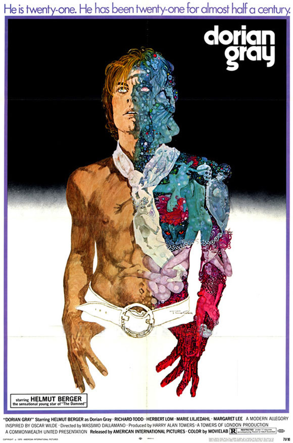
This poster for Massimo Dallamano’s 1970 updating of The Picture of Dorian Gray was featured here several years ago, and it’s taken me all this time to finally discover the name of the artist responsible, Ted Coconis. Better late than never. It could be argued that the illustrations below for Nabokov and Goldman tend more towards the artist’s own interests than representing the content of the books; I’ve not read Goldman’s novel (or seen the film) but online comments suggest that this was an unsuitable cover; Nabokov’s Ada is an erotic novel which presents its eros in a manner that’s a lot less direct than the painting implies. All I can say to this is that strict accuracy is for pedants; Aubrey Beardsley’s illustrations for Wilde’s Salomé aren’t in the least accurate yet they’re regarded as definitive. Sometimes illustrators are trying to convey in pictorial form an otherwise intangible impression of a book (or a film or play) which is what I see Ted Coconis doing here. There’s a lot more of his work at his website. It’s gorgeous stuff.
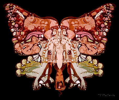
Cover illustration for Ada by Vladimir Nabokov.
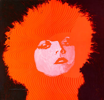
Pola Negri.
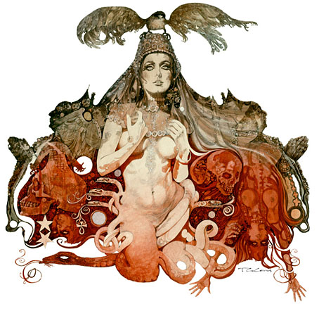
Cover illustration for The Princess Bride by William Goldman.
Elsewhere on { feuilleton }
• The illustrators archive
I can confirm the Princess Bride’s cover has not anything to do with the actual content of the story (either that or I missed A LOT of it), But it is still very pretty.
The Ada one is also fairly baffling from that point of view. Or maybe not. Possibly I should read it again.
Yet. Gorgeous stuff all, so who’s complaining?
Ada is a butterfly shape so it’s Nabokovian in that sense at least.
The Goofle informs me that “Man of La Mancha” was also Coconis. Also, Labyrinth. I also associated him with “The Illustrated Man” but no, that was someone else entirely.
You should read/ watch ‘Princess Bride’. I think you’d like it. And yes, that picture is unsuitable.
That cover of The Princess Bride is from the first run of the paperback edition; I still have my copy. Inside, the framing story (grandfather’s commentary) is printed in red ink. All later print runs use black ink italics. And the picture has absolutely nothing to do with the story. You should read the book and/or watch the movie, they’re both classics.
Imagine buying Ada expecting (on the cover’s strength) a saucy psychedelic romp and having to wade through… um… a rambling parody of the entire history of the novel?