A post for Record Store Day, and a slight return to the work of Hipgnosis and the late Storm Thorgerson. One of the many things which impressed about Hipgnosis album designs was the way they gradually came to approach each album as a distinct package for which every component deserved special attention. The very early Hipgnosis designs were little more than photos or photo-collage with some typography applied; a few years down the line and in addition to creating elaborate pictorial sleeves they were also designing logos or special typography for each release, with the design frequently extending to the labels of the vinyl records themselves.
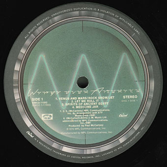
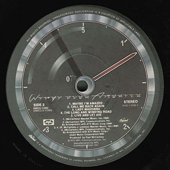
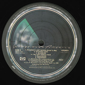
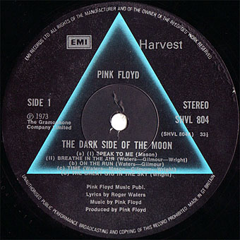
This last feature has since become so commonplace that it’s surprising now to find albums with a simple generic label. The Beatles Sgt. Pepper album is famous for its own elaborate package which included a special inner sleeve, but the label on the disc was the regular Parlophone design which had been used on all the earlier Beatles releases. Hipgnosis were in the vanguard of designing special labels, and I’m tempted to say they began the practice although it’s likely there were prior examples. The earliest Hipgnosis example seems to be the prism design for The Dark Side of the Moon (1973); prior to this Pink Floyd were using the same label as other artists on Harvest Records. A few more Hipgnosis examples follow below. I especially like the ones for Wings Over America (1976), a triple-live set which extended the passenger plane sleeve design by using artwork based on different aircraft instrument dials.