
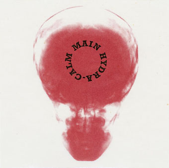
Hydra-Calm (1992).
It’s always good to find a group of musicians who not only make the kind of sounds you like but also package their work effectively. Having read the Quietus interview with Robert Hampson last week I was going back through the catalogue of Hampson’s 90s group Main and thinking again how well the design of their digipak singles and albums complemented their music. Main evolved out of an earlier rock outfit, Loop, and the earliest Main productions still bear some trace of the trancey Loop approach to rock structures. The first Main album, Hydra-Calm, was released on Situation Two, and comes packaged like the first album from Faust, with an X-ray of a skull on a transparent sheet replacing the X-ray fist of the German group.
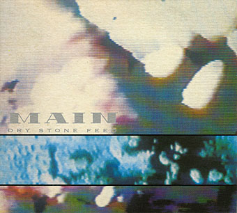
Dry Stone Feed (1993).
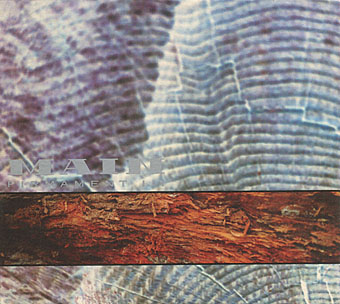
With a move to the Beggars Banquet label a year later, a different design approach was adopted which set the template for nearly all the Main releases during the 1990s. An outfit (or person) named Avida is credited with Main’s design, with the name being adjusted on various releases to Avida Design, Avida Formations, Avida Hydroforms and Avida Iceforms. The decision to dwell on varieties of texture matches the evolution of the group’s music from arrangements of guitar, bass and drums to abstract and increasingly minimal fields of sound; in this respect, Deliquescence was a perfect title. Hampson and co. created their sound fields by subjecting guitar noise to unspecified sampling and effects processes. When Simon Reynolds invented the term “Post-rock” to describe some of the musical developments happening in the 1990s, Main always seemed to be exemplars of the term, they really did go from being a bona fide rock band to a group pushing sound far beyond anything to do with rock music at all.
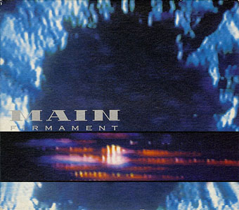
Firmament (1993).
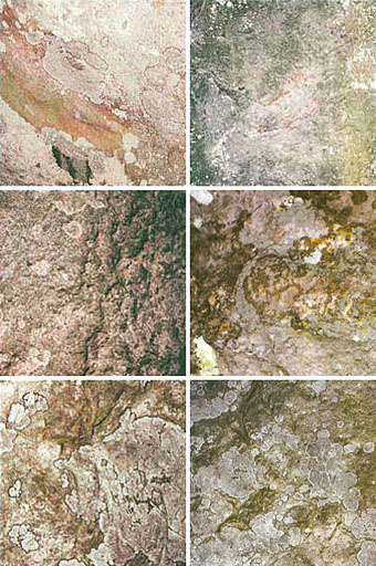
The photos used by Avida Design start out as shots of TV screens or computer monitors then range through the natural world with close-ups of rock formations, lichen, wood grain and underwater ice. The typography is nearly always Copperplate Gothic (or a sans serif variation) printed in metallic silver ink. The most satisfying release for me was the Hz set of six CD-singles released from mid-1995 to 1996, the last of which came with a box to place the singles in and a booklet containing symbols which relate to each disc. Hz is the peak of their output, and although it was later released as a double-disc set I prefer the box.
Anyone looking for these releases today can find copies for sale at Discogs.com. Robert Hampson is still active, his site is here. A few more Main covers follow.
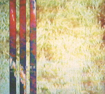
Motion Pool (1994).
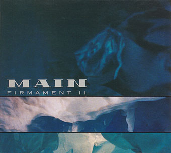
Firmament II (1994).
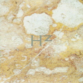
Hz (1995–6).
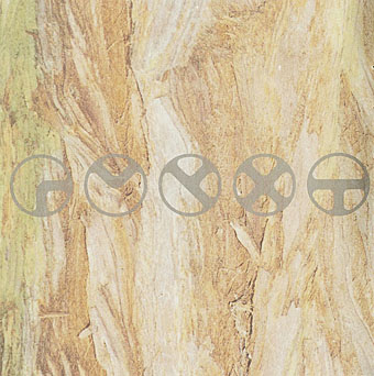
Hz booklet.
The Hz singles: Maser, Terminus, Haloform, Corona, Kaon, Neper.
Firmament III (1996).
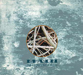
Deliquescence (1997).
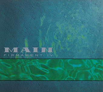
Firmament IV (1998).
Elsewhere on { feuilleton }
• The album covers archive
Previously on { feuilleton }
• Main
Another 4-star post, Mr. Coulthart. You know I’m loving it!
It’s all for you, baby. (Not quite but I guessed you’d appreciate this one.)
Those early sleeves – with the distorted video – make me think of
Cabaret Voltaire / Neville Brody, while the typography has a 23 Envelope influence.
I only say that, because the sleeves seem to parallel the journey away from the shadow of his influences.
Yes, and the Brody quality is a definite attraction. I nearly mentioned his sleeve for Red Mecca but didn’t want to stray from the point. Brody also used Copperplate Gothic typefaces a couple of times so there’s another connection.
All the Loop stuff has now been re-issued on CD (and vinyl versions are rumoured). Main are playing a few gigs at the moment (Montreal this month), and there may be re-releases of the back catalouge.
Facebook page here that deals with Robert Hampsons current activities/ work: http://www.facebook.com/?ref=home#!/pages/At-The-Surface/132794333424765
Hello… Many, many thanks for this little piece. I’m very happy to know that the artwork for Main was in some ways important to some as much as the music contained. Interesting to note that comments are made about Neville Brody and V23. Without wishing to sound like I am disappearing up my own behind, may I be so bold to comment on this.
Indeed, Neville Brody was indeed a hero to me for his exceptional artwork, especially the Fetish label period. Without a doubt, his aesthetic informed my own over the years, but I must add that I never consciously used this as a basis for Main art in itself.
Ironically, it was deliberately ‘lo-fi’ to not only adding to the blurry vision of what the music was about, but also to detach itself from the prominence of V23 and the ‘other’ artwork strongly influenced by that company used on other labels.
Don’t get me wrong, I liked a lot of V23, but somehow always never really connected it with the music contained within the package. It always seemed seperate. I might be wrong in other people’s eyes. But for me, the artwork had to resonate or amplify the music contained. It was an equal part… as important.
Anyway, I’m only here to say thanks and maybe reveal a little bit more in the puzzle. I’ve no wish to grate or split hairs. Thanks again, RH.
Hi Robert, and my thanks to you for the comment. I should emphasise I wouldn’t myself have said “these are Brody-influenced” since I’m wary of inferring influences from similarities. The TV close-ups remind me of that Cabs sleeve but Main’s use of that imagery seems a lot more pertinent to the music, and also connects to the imagery which follows. I’ve been subject to similar misapprehensions myself, not least with Vaughan Oliver’s work. A band I once showed some of my book designs to saw Bodoni typefaces mixed with some degraded graphics and said “Ah, 23 Envelope…” which hadn’t been my intention at all.
I made a post a while back about Brody’s Fetish designs. It’s always good to hear they’ve produced ripples somewhere.