
Amy Brenneman.
In which Neville Brody’s early record sleeves lurk in the midst of a Michael Mann crime drama…
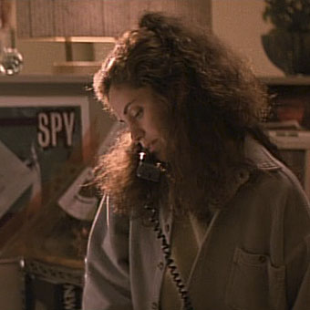
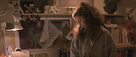
I picked up some cheap DVDs last week, among them a copy of Mann’s Heat (1995) which I hadn’t seen for over ten years. I like Mann best when he’s doing his high-tech thriller thing (although I also have a soft spot for The Keep), and enjoy this one despite its being too long for the thin story and characterisation. Something I’d completely forgotten when re-watching it was the scene where Eady (played by Amy Brenneman), a part-time graphic designer, is on the phone to her bank-robbing boyfriend, played by Robert De Niro. This is one of those cinematic moments where some stray cultural reference that no one is meant to notice leaps to your attention and for a few seconds upsets all interest in plot and dialogue. Offhand I can think of the moment in Alan Pakula’s Presumed Innocent where a copy of a Ramsey Campbell novel is seen on a bookshelf during a conversation. Much worse, since it’s an error as well as a distraction, is Picasso’s Les Demoiselles d’Avignon being shown onboard the Titanic in James Cameron’s fatuous disaster movie when the real painting has been hanging safe and sound for years in the Museum of Modern Art in New York.
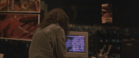
In Heat we have a scene in Eady’s apartment where the walls are covered with what I assume are meant to be examples of her design work. 99.9% of the audience will pay no attention to this but anyone with a copy of The Graphic Design of Neville Brody would recognise a number of familiar designs. Something I hadn’t spotted before was the word “FUSE” on the computer screen, Fuse being the name of the experimental typography magazine created in the 1990s by Brody and Jon Wozencroft. On the window to the left of the computer there’s pinned a copy of Brody’s design for Wipe Out, a single by Z’ev on the Fetish label. Brody designed nearly everything for Fetish during the label’s brief existence in the early 1980s, and the most visible Brody examples in this scene are all Fetish designs. This seems an odd choice for a film made in the mid-90s although in an earlier conversation Eady mentions having designed some music CDs. Brody’s later design work was very influential and overshadowed his work for Fetish which I’ve always liked a great deal.
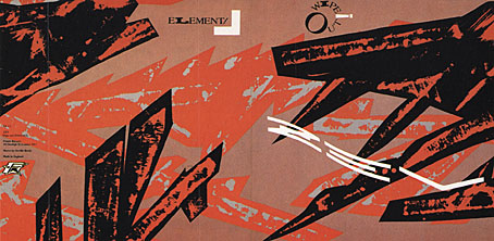
Wipe Out by Z’ev.
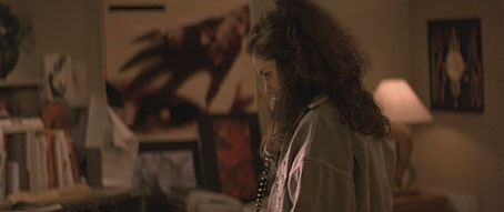
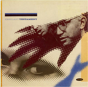
In another part of Eady’s apartment there’s a large reproduction of the sleeve for a Fetish compilation, The Last Testament.
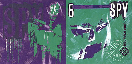
While further along the same wall there’s the sleeve for Diddy Wah Diddy by 8 Eyed Spy, yet another Fetish single. On the far right of the shot above there’s a face from one of Brody’s theatre posters which confirms that Mann’s set decorators must have plundered a copy of Brody’s book.
This isn’t a complaint, of course, I’d commend Mann and co. for their excellent taste, and for having used work by a real graphic designer rather than trying to fake something. It’s even possible to find a tenuous connection between the record sleeves and Mann’s eclectic soundtrack. Many of the Fetish artists—Throbbing Gristle, 23 Skidoo, Clock DVA, Stephen Mallinder—were in the first wave of Industrial music, and Mann briefly uses a great piece by Einstürzende Neubauten from their own Industrial phase. I’d have suggested he also use Blue Heat by Cabaret Voltaire (from an album with another Brody cover) but that’s just my obsessions showing.
Previously on { feuilleton }
• Neville Brody and Fetish Records
• Alex in the Chelsea Drug Store
Interesting. I don’t have a clue about Brody, but I didn’t get very far in before I thought of Micro-phonies, and bam! There it is at the end. I wish I could say that this makes me want to watch Heat again but, much as I enjoy it, I watched it three or four months ago and it’s one of those films that really needs a longer buffer than that.
i love this post guys! keep up the good work!
Brody designed a lot of stuff for the Cabs from their Red Mecca album on, including ads and posters. There’s some funny comment in his first book about how this was frowned on at the time by Rough Trade who preferred a shoddier aesthetic; they thought Brody’s work was too slick, and that the group were (in that dreadful phrase) “selling out”.
This film and Collateral have become slightly more interesting for me since I visited Los Angeles: being there gives you an idea of how particular his view is of that city, and of cities in general. His films are often flawed but his serious attitude is refreshing when it’s surrounded by so much jokey and ludicrous junk.
Had I the money I’d love to visit film location after film location, not purely to gawk but to attempt to absorb that kind of understanding. This is where living in Northampton and liking comics has served me very well.
LA would be a great destination from the Lynch angle alone. Prior to reading all this I’d probably be too excited by that aspect to give much consideration to Mann. The closest I’ve been is Vegas for two nights, but that experience did at least give me a greater understanding of Nicky Santoro’s violent psychosis.
My mind is pretty weird. When I just read the title of this post I thought it was going to be about a dog named “Graphic Design” who was sexually aroused. :-)
I was very aware of the double-entendre potential–it’s unavoidable with any phrase containing the words “in heat”. I decided to keep the title as it was. “Neville Brody in Heat” would have been going too far.
It appears that Margie Stone McShirley (Art Director on ‘Heat’ – it must have been her who would have been responsible for including Brody’s designs) and Neville Brody met four years later, they both worked on ‘The Insider’ (1999) where Brody was responsible for the title designs.
Having started my career in the early 1990s Brody was quite unavoidable, casting a very long shadow… I even had a Viennese friend who was so adamant that he wanted to meet his idol that he sat outside Brody’s studio in London until he was let in for a quick meeting (he was quite persuasive and a bit stalkey).
3lbFlax: I should have said earlier that LA is a fascinating place for the way it reminds you of hundreds of films, Mulholland Drive included: I got driven past those strange cottage buildings where the two leads find the body on the bed. Watching Heat this time round I was recognising bits of the downtown area where many of the banks are situated (also the location in Lynch’s film for the “This is the girl” argument) but you also get reminded of films from the 40s by the Art Deco lights in the older streets.
Martin: Thanks, I ought to have known that! I still haven’t seen The Insider, this should be a prompt to catch up.