
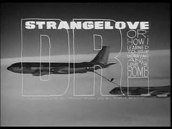
Dr. Strangelove titles (1964).
There’s less of his work around than there should be, unfortunately. Saul Bass is justly celebrated for his title sequences and poster designs yet Pablo Ferro—whose titles were equally innovative and memorable—is rarely heard of even though you’ll have seen a lot of his work.
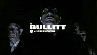
Bullitt titles (1968).
Ferro’s advertising films brought him to the attention of Stanley Kubrick for whom he created titles and trailers for Dr. Strangelove and A Clockwork Orange (1971). The hand-drawn quality of the Strangelove titles was revisited for Stop Making Sense (1984) and Men In Black (1997), while the frenetic pace of the Clockwork trailer still seems advanced over thirty years later. This collection lacks his titles for the original Thomas Crown Affair (1968) but you can see a mix of Ferro’s split-screen work (which includes parts of the titles) here.
By Pablo Ferro:
• Dr. Strangelove trailer
• Dr. Strangelove titles
• Bullitt titles
• A Clockwork Orange trailer
• Stop Making Sense titles
• To Die For titles
• LA Confidential titles
About Pablo Ferro:
• Pablo Ferro documentary clips: I | II
• Quick Cuts, Coarse Letters, Multiple Screens—an article by Steven Heller
• Free Ferro-derived fonts! Pablo Skinny | Major Kong
Previously on { feuilleton }
• Juice from A Clockwork Orange
• Clockwork Orange bubblegum cards
• Alex in the Chelsea Drug Store
Saul Bass was the industry’s pioneer. His methodology embraced the modernist tenet of reduction and enforced an acute attention to pace, rhythm and detail. Bass’s most remarkable work came through his early collaboration with director Alfred Hitchcock. Bass was a graphic artist and creative consultant for three of Hitchcock’s masterpieces: Vertigo (1958), North by Northwest (1959) and Psycho (1960). In each of these movies Bass designed the title sequence creating a smaller film within the entire work.
Since Saul Bass’s death in 1996, there is only one designer and one key film that can be linked to Bass genious : Kyle Cooper.
I like Kyle Cooper’s titles for Se7en and The Island of Doctor Moreau. The thing these days is that there’s a lot more opportunity to do this kind of thing in film (although directors don’t always take the opportunity) so title designers tend not to stand out so much the way they did in the Sixties.
Balsmeyer & Everett (husband and wife team who now seem to have split) have been more notable for me than Kyle Cooper. They’ve been around longer and done more, especially for David Cronenberg and the Coen Brothers. Randy Balsmeyer is still working as a title designer.
I would definitely recommend a closer look at Pablo’s work that spans from late 1950’s animated commercials and the pioneering use of quick cuts in American TV, to the first multiple-frame sequence ever used in Cinema with 1968’s The Thomas Crown Affair, to incredible work (over 100 films…) that spans five decades all the way to Napoleon Dynamite, which he did the logo for and consulted on the opening title sequence. A new movie coming out next year mixing animation and documentary celebrates his life and times.