
Such Cheek! Those Were the Days, Architects
by Nicolai Ouroussoff
New York Times, February 8th, 2007
IF YOU ARE revolted by today’s slick and fashion-obsessed architecture scene, hurry over to ‘Clip/Stamp/Fold: The Radical Architecture of Little Magazines‘ at the Storefront for Art and Architecture. You’ll feel even worse.
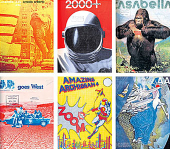
Organized by the architectural historian Beatriz Colomina, the show examines the world of those small magazines from the early 1960s to the end of the 1970s, when the field of architecture was still marked by a playful intellectual and political independence. It’s packed with gorgeous cover images, from copulating robots to an elephant attacking the Solomon R. Guggenheim Museum in Manhattan to a skyscraper made of Swiss cheese. Often thrown together on a shoestring budget, the magazines have an intoxicating freshness that should send a shudder down the spine of those who’ve spent the last decade bathed in the glow of the computer screen.
But this is not an exercise in nostalgia. It’s a piercing critique, intended or not, of the smoothness of our contemporary design culture. These magazine covers map out an era when architecture was simmering with new ideas. You’re bound to leave the show with a nagging sense of what was lost as well as gained during the electronic juggernaut of the last three decades.
Part of the magic of this show, which was recently extended for three more weeks, is in the works’ crude immediacy. One side of the gallery is wallpapered in hundreds of colorful magazine covers. On the opposite wall a more detailed timeline maps out the evolution of the culture of architectural magazines, from an obsession with politics and pop culture to a descent into increasingly abstruse and self-involved theoretical debates. The rarest magazines are encased in clear plastic bubbles (made of cheap plastic skylights that the show’s curators bought on Canal Street), evoking time capsules descended from outer space.
To many, the early magazines will be the most recognizable. A 1964 cover of the avant-garde pamphlet Archigram, for example, depicts the designer as comic-book superhero—a reflection of the architects’ desire to break with the ponderous dogmas of late Modernism and remake themselves as pop symbols. If their appeal was limited to the cult-status variety, their images, from mechanized walking cities to “plug in” buildings, continue to haunt the imaginations of young architects today.
Yet Archigram’s popularity also made it a tempting target in a lively debate waged in the pages of cheap, short-lived magazines often laid out in school basements or on an editor’s kitchen table.
One of the most biting of these is a 1970 issue of ARse, whose cover shows members of Archigram earnestly pitching their proposal for a leisure center in Monte Carlo, their first major commission. Titled ‘Archigoon Wins at Monte,’ the cover article attacks the firm for its focus on consumer culture at the expense of social issues. Inside, a story mocks Buckminster Fuller as the ‘ambassador-priest of United States technological imperialism.’
That cheeky defiance of sacred cows should give pause to students who seem more intent on emulating the professional success of their contemporary masters than challenging them. The Casabella cover on which an elephant charges Frank Lloyd Wright’s Guggenheim is a refreshing effort to topple the dead hero from his pedestal.
But this is hardly your stereotypical Oedipal conflict. It was part of a broader conversation rooted in genuine political conviction. French and Italian magazines in particular took the British to task for an embrace of advertising images and what they saw as a general political immaturity. An issue of the magazine Arquitectos de México from 1969—not long after the government gunned down university students at a demonstration in Mexico City—takes aim at the enduring influence of the French academy on Mexican architecture. The latter’s cover depicts a group of children meekly gazing up at an imposing Beaux-Arts structure with the words ‘Education and Ideology’ emblazoned across its facade. (The magazine closed after several of its editors were arrested and the government ordered a boycott of its advertisers.)
That sense of political immediacy infects mainstream publications as well. Even the normally staid Architectural Design becomes a forum for radical thought in the late ’60s under the guidance of editors like Peter Murray and Robin Middleton, introducing a generation of London architects to the groundbreaking works of the Soviet avant-garde.
A few years later a cover of the same magazine shows a group of long-haired British architecture students on the hood of a car in the desert outside Los Angeles, celebrating the radical freedom of California design at a time when Europeans and even New Yorkers still believed that culture there was centered on the bikini.
In that ever-shifting political climate, even pulling the plug on a magazine could be seen as an act of rebellion. Some of the most provocative magazines—like Harck, from Italy, which drew on architecture, film and theater—were designed to last only an issue or two, like little intellectual time bombs. Other editorial staffs spent long nights pondering whether their magazines had lost their freshness and should be shut down before they had been absorbed into the mainstream.
Of course all of this would be less interesting today if the magazines weren’t simply so alluring: you immediately want to pick them up and leaf through them, reveling in their graphics and textures. One of the oddest little magazines is covered in sandpaper; another is bound in kinky soft white fur.
Why did it end? By the mid-1970s architects were beginning to retreat back into the security of academia. Magazines were becoming less risqué, more uniformly bland. They had lost their humor. The 1973 start of Oppositions, which shifts the focus of architectural debate back to New York, signals the beginning of a more self-conscious discussion of architectural theory. Though its orange covers, designed by Massimo Vignelli, were intended to make them pop out on bookshelves, the cerebral font reflects the seriousness of the academy.
Part of the point here of course is that ideas matter. Even the flimsiest of these magazines were shaped by the crazy notion that design not only was important but could also change the world. And they were not too far off the mark, judging from the visceral impact of the works on view here.
That thought should give pause to architects who spend their days plotting their careers on a computer screen. In an era when architects seem wholly absorbed in landing big commissions, these magazines remind us how much can be achieved with seemingly so little.
• “Clip/Stamp/Fold: The Radical Architecture of Little Magazines 196x-197x” is at the Storefront for Art and Architecture, 97 Kenmare Street, Little Italy, through Feb. 24; (212) 431-5795 or storefrontnews.org.
Previously on { feuilleton }
• Underground History
• 100 Years of Magazine Covers
• Archigram