
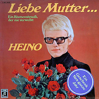
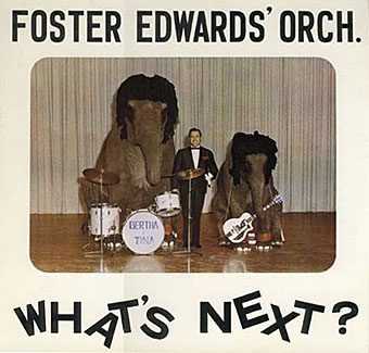
The world is over-stuffed with bad design, from food packaging to tv graphics and awful websites, but it’s fun to be reminded now and then just how bad things can get when all aesthetic considerations are thrown to the winds. The Museum of Bad Album Covers features some of the choicest examples from the music world, such as the sleeve above for Marty Feldman-eyed Heino, a classic of Easy Listening kitsch (Cooper Black is a favourite typeface for this kind of thing). Heino’s records don’t look that terrible compared to other German albums of the 70s which often managed to combine outrageous bad taste with abysmal graphics and illustration. God only knows what sounds Foster Edwards and his band of bewigged elephants produced. Next time someone tells you that you can get any album on CD, ask them about Foster and his jumbos.
The Museum site threatens to bring us a complementary Museum of Bad Single Covers soon. If you’re still not sated in the meantime, Dana Countryman’s Virtual Museum of Unusual Cover Art has further examples of graphic strangeness from the vanished vinyl wastelands.
Elsewhere on { feuilleton }
• The album covers archive
I wonder if those elephants went on to trample Foster Edwards for embarassing them so much?
Oh yeah, what a pin up Heino is. Dear help his mother is all I can say. I’m sure he was soon wearing those flowers! (Du bist nicht mein Sohn!) GCSE German sets in. (Mother disowns her son)