
A rather substantial fault in either the WordPress software or a problem at the server end has resulted in two folders of images being deleted today, hence the image-less posts. Not the end of the world but I’m not looking forward to restoring things I don’t have a backup for.
Day: 18 March 2006
The Apple logo
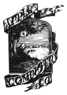
The original company logo from 1976 depicts Isaac Newton sitting under a tree with the fateful apple glowing above his head and looks about as far removed from a computer company logo as it’s possible to get. The picture frame contained Wordsworth’s description of Newton, “A mind forever voyaging through strange seas of thought, alone.”

Rob Janoff designed the more familiar Apple at about the same time. The typeface used was Motter Tektura.
According to the logo designer…the typeface was selected for its playful qualities and techno look, in line with Apple’s mission statement of making high-technology accessible to anyone.
As with many old typefaces, there doesn’t seem to be a font of Motter Textura available today apart from this Cyrillic clone.
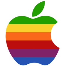
The original apple was streamlined and given coloured bars at
Steve Jobs’ behest in order to “humanise the company”.
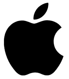
Ironically, it was Jobs who also decided to remove the colour bars in 1998. The current logo is now a typical piece of flexible contemporary branding, easily reproduced in any colour, at any size or shape.