[Walls of Fire was a music site for metal enthusiasts so the questions and answers are mostly music-related. —JC]
• Hi, John! To begin this interview, tell us please how and when you started your career as a visual artist.
Well, I've been drawing for as long as I can remember. I first got into print around 1981 after I'd met someone who knew Hawkwind, a group I liked a lot at the time; he showed them copies of pictures I'd done based on their songs and Dave Brock got in touch asking if I could do something for an album cover. The Hawkwind association lasted about four years from then on and was a lucky break at the time and a big encouragement for me.
• Do you have any "classical" painting education?
Nothing beyond the usual art class training at school; I didn't go to art college as I'd had enough of formal education by the time I was 17. You can teach yourself to paint just as you can teach yourself to play a musical instrument, there's no great mystery to it. After that it's all a case of whether you have any talent beyond the purely technical aspects.
• What does your working place look like?
A mess most of the time! I try to stay organised, but things always get confused when you have a deadline and several things on the go at once. Everything used to be centred around a large drawing table, but now the computer is the focus of my work—it's a G4 Power Mac—and all its attendant peripherals. I keep a lot of reference books close at hand; since switching to digital work I don't have to worry so much about spilling paint or ink over them.
• Where does the inspiration for your works come from?
I think most artists would tell you inspiration comes from all over the place and is often dictated by whatever you're working on at the time; quite often things you normally don't pay much attention to become suddenly important when they provide a solution to some creative problem in the back of your mind. Indirectly I get a lot of inspiration from music I listen to—it's good sometimes to try and set a mood for yourself before starting something fresh. I've always had a great interest in architecture and find leafing through a book of photographs of buildings, new or old, can immediately set off a train of associations that I want to follow. Living in Manchester has been a considerable inspiration for its abandoned Victorian warehouses and other detritus of its industrial past—I like ruined buildings of any variety, but industrial ones are especially fascinating, they're the gothic ruins of our time. I also have a fetish for old book illustrations of any period, especially woodcuts and steel engravings.
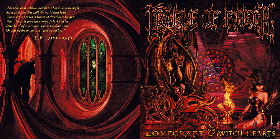
• How long does it usually take for you from the mere idea to the finished picture?
This depends on the given work, big pictures obviously involve more labour than smaller ones. The Lovecraft comic pages took two weeks each to draw, which is a hell of a long time for a single page of a story. These days I spend about the same time working on a single picture if it's the focus of something: the most recent CD cover, for Lovecraft and Witch Hearts (above) by Cradle of Filth, took about two weeks from start to finish. If I'd done it as a painting, it probably would have taken twice as long with the amount of detail a picture like that would require. The longest time I've spent on a single painting was seven weeks for the Red Night Rites picture.
• Which kind of "media" do you like the most—digital art, ink, oil, etc—and why?
I've never done much with oils, I prefer acrylics for painting as they're water-based and dry quicker. There are advantages and disadvantages on both sides of the digital divide: paints and inks, and pencil for that matter, have an immediacy and a fluency that you can't achieve with any of the digital processes we have at the moment. Drawing directly onto paper or canvas brings out far more of your personality as an artist than does using a graphics tablet or mouse, however clever the hardware. Various programs strive to imitate these techniques but it seems a fallacious approach to me, the computer has its own advantages and its far better to focus on those than use it to imitate something you can do better on paper. You can always photograph or scan the hand-done work and then use the computer to treat it further. The great advantage of digital work is the endless flexibility it gives you: the seamless collaging of real and unreal images, the way you can work in a series of layers that can be added or removed at will, the huge scope for adjusting colour and tone and the ability to save multiple variations of a single work. There's a totally new psychology at work here that people are still getting to grips with. To answer the question, I use the computer as my main tool now, but always bear in mind it has its limits.
• Your works include the comic book series Lord Horror. What attracted you in this character and the story?
Well, initially, this came about by my knowing David Britton and Michael Butterworth at Savoy Books in Manchester. I was working on my Lovecraft adaptations at the time they were publishing the first Lord Horror novel and the initial run of comics by Dave and artist Kris Guidio. Dave liked what I was doing with the Lovecraft work and asked me to do some backgrounds and additional work on Kris's pages. This culminated in our creating the final death camps issue of the Hard Core Horror series. After this Dave particularly wanted to do something outside the historical framework of the earlier comics; I'd also realised that his Lord Horror character could be a vehicle for a very radical and experimental approach to the comics medium. This was right at the time I was finishing with HP Lovecraft for the time being, so we went full ahead with the Reverbstorm series.
• By the way, is it true that this comic book has been banned in Great Britain?
It is true and, in light of Savoy's years of trouble with the Greater Manchester Police force, not particularly surprising. Without going into inordinate detail, Manchester had for about 15 years the most right-wing, authoritarian police chief in the country; he was also a religious psychotic, claiming in the press to speak personally with god. His moral fervour infected his force and this in turn had consequences for Savoy being publishers of challenging material in the same city. The police raided the Savoy offices countless times through the 1980s and early '90s; David Britton's Lord Horror novel was seized and became the first novel to be declared obscene in a British court since Hubert Selby Jr's Last Exit to Brooklyn in 1968—well, the ruling was overturned on appeal.
The comics fared less well, because comics in Britain are still considered a children's medium by people who don't read them. Our comics were violent, sexual, satirical and dealing with adult issues such as the Second World War and the Holocaust; the judges and magistrates thought we were deliberately trying to corrupt children, despite, as I say, having no knowledge of the medium. Kids want humour and superhero comics, not the weird and unpleasant stuff we create; this was explained in court in great detail but once their minds are made up there's very little you can do. To date the comics are still "obscene"—not that this means anything in the real world, they're still being sold and we're still here doing what we were doing before, so the whole episode was a colossal waste of time, energy and taxpayer's money.
• You have also designed and illustrated books of various authors working in the fantasy/horror genre. Is this the kind of books you usually read?
I read all kinds of books and all kinds of fiction, but I've always had an interest in fantasy and horror. Finding new, interesting works in these genres has become increasingly difficult in recent years as publishing has become incredibly commercialised, which means that interesting writers are being shunted to the margins. The books I've been designing for Savoy come out of a particular agenda of either publishing real obscurities, such as Zenith the Albino and The Exploits of Engelbrecht or masterpieces of their field such as A Voyage to Arcturus and The House on the Borderland, a novel of cosmic horror which pre-dates HP Lovecraft and which we'll be doing next year.
[A Savoy edition of The House on the Borderland never materialised but I did illustrate the novel eventually for Swan River Press —JC]
• What is the most important aspect of your work, when you translate the text to images?
Probably the old maxim that "form follows content". I don't have a set style that I impose on whatever I'm working on—this is a bad approach for any designer or illustrator, since you're working to complement somebody else's creation. It's like a collaboration at a distance, the challenge is to let enough of your own character come through without it being overbearing. Doing the line of Savoy books has been interesting because each book has been substantially different from the last; what we've tried to do is create a look where each book seems distinctive in itself yet there's a consistency to the line as a whole.
• What is, according to you, the difference between illustrating a book and an album?
There's a number of differences: with a book you're either doing the cover alone or doing the opening pages and chapter headings, etc. Even if you choose the font that the book is set in, you're still only providing the frame around the writer's words. With an album you're responsible for the entire visual presentation of the object—excluding band photos—to a degree that can substantially alter how people perceive the music. Also books are packaged and repackaged countless times down through the years, the packaging varies from country to country. Once you've designed an album or CD, that IS the way people see it from then on, across the world, even if it's re-issued years later by a different label. This means there's an even greater responsibility to get things right—any mistakes are going to be around for a long time!
• Among the CD-artworks you've done, there are many of Cradle of Filth. Do you personally like their music?
I do, yes. Growing up in the '70s I was listening to a lot of old-skool metal like Led Zeppelin, Deep Purple, AC/DC and Motörhead—who grew out of Hawkwind, of course—so it's not exactly foreign territory. The thing that appeals about the Filth boys is the horror/gothic angle, naturally, plus their music is a lot richer than many of their contemporaries, especially Nu-metal crap; Martin's keyboards and Sara's vocals really add to the drama of the arrangements. They also happen to have recorded the best song anyone has done based on HP Lovecraft's writing with Cthulhu Dawn on Midian (2000). It pisses all over Metallica's Call of Ktulu and The Thing That Should Not Be.
• How did it actually happen that you started working with them?
I had a call from their manager round about the time they were doing Midian to say that Dani (Filth, vocals) had bought a copy of my Lovecraft book, The Haunter of the Dark, and would I be interested in doing something for the band. JK Potter was already hired to do the Midian artwork, so I had to wait until Bitter Suites to Succubi (2001) was being recorded before actually doing anything.
• And isn't it hard to work for such a famous band?
Not particularly, I've approached these projects the same as I would any other. There are certain things you have to bear in mind, such as maintaining a continuity with the band's previous releases. Things are more likely to be difficult if you have no interest in the thing you're working on, so that you may have to force yourself to maintain your enthusiasm.
• When you start working, do you have some kind of "draft" or idea given beforehand, or everything is left to your own interpretation?
Each project is different: with the Savoy books we tend to talk about basic ideas of presentation, then I go away and come up with some suggestions. Dave and I also worked on the comic series like this, it's a very loose collaboration but it's worked well. Much of the Cradle of Filth stuff has involved talking general ideas over with Dani first, then roughing something out, then following this up with further conversations. Dani and Paul (Allender, guitars) have a lot of input into the overall look of everything the band does—Paul did all of the interface design for the DVD, for instance. For most things I don't like to plan anything too much if I don't have to, since I often work best creating the thing as I go along. The trouble with doing more commercial work is that you tend to lose this freedom as people like to know what they're getting before you start work; this usually means submitting sketches and layout ideas which need approval before you begin.
• How do you choose whom to work with?
It's usually the other way around, people ask to work with me. Most of the time I've been fortunate that I'm well-matched in this respect.
• What other works in the musical sphere do you have? Perhaps a word or two as to how it was working for these bands?
There's Hawkwind, for a start, as I've mentioned before. They were great to be involved with at the time, it was exciting to suddenly be working with people I'd previously known solely through their works and getting to meet other people connected with the band such as Michael Moorcock and Mike Butterworth of Savoy. It became frustrating after a while, partly because I was trying to present the band with designs rather than just illustration for the record sleeves. This is what their original designer, Barney Bubbles, was able to do, which is why all the early Hawkwind sleeves look as striking as they do. Design in pre-computer days was impossible to control at a distance—I was in Manchester, the record companies were in London—so I eventually parted company to concentrate on comics work.
All the work I've done since then that's been post-computer has been very enjoyable, as I now have the opportunity to produce integrated design and illustration work that I couldn't achieve before. The CDs I've done for comics writer Alan Moore (Watchmen, From Hell) and musician Tim Perkins are probably the most enjoyable as I have considerable freedom to do whatever I think is most suitable for each release—we've done two so far with a third on its way. These have appeared on RE:, the label run by Steven Severin from Siouxsie and the Banshees. Steve is also very easy to work with, as his attitude tends to be "Can you do this? Tell me when it's finished." I designed his last solo release, a soundtrack for a stage performance based on the Japanese novel, The Woman in the Dunes. And earlier this year I helped design—but not program—the new official web site for Doves.
• By the way, what kind of music do you usually listen to at home?
It'd be easier to answer the question "What don't you listen to?" I have a couple of thousand CDs that range across most areas of the musical spectrum. I love electronic music of any sort with a particular affection for music produced on analogue synthesizers. These days a huge percentage of music you hear is electronic—it just doesn't sound it; I like the stuff that sounds completely artificial. I've been listening for years to the German music that people term "Krautrock": Can, Faust, Neu!, Amon Düül II, etc. It was great that this became slightly fashionable again a few years ago, as I've been able to replace a lot of worn albums with CD copies, as well as get hold of some very rare recordings. Other favourite areas: some contemporary classical, especially Bartók and Toru Takemitsu; jazz from the early '60s to the mid '70s; Arabian music of just about any variety; Japanese music of just about any variety. Some cult heroes would include: Acid Mothers Temple, Captain Beefheart, Coil—we keep talking about an album collaboration at some point—Robert Fripp, Jon Hassell, Bill Laswell, Lustmord, Ennio Morricone, Paul Schütze. I tend to favour things that are experimental or hybrid in some way, anything where genres get mixed is usually interesting.
• Among the works of your colleagues making artwork for audio-products, which has made the greatest impression to you so far?
I think the greatest impression is usually made when you're young; when you're older you become more judgmental. The most striking work around in the '70s, prior to punk, was that done by the Hipgnosis group. Everyone knows them for their Pink Floyd sleeves, but they did masses of other designs for a wide variety of artists and they really changed the sense of what was possible in this area. Roger Dean was a big thing at the time as well, but he was only ever doing one style—his cover for a Motown compilation is the same as his covers for Yes—Hipgnosis were more about finding the right approach for each project. What made their work stand out, first of all, was the often use of photo-montage and hand-colouring to create surreal or hyper-real effects. They would also attend very carefully to all the details of type design and layout, very often designing special labels for each release, as well as the cover art.
I used to see all this stuff appearing each week in our local record shop—very often I had no interest in the music. I've been thinking of their approach a lot recently, partly because the techniques they pioneered using photographs are very similar to the kind of things you can do today with computer montage, though now it's a lot easier, of course. In the '80s the main people who made an impression are Neville Brody and Russell Mills. Brody is probably the most important designer of that decade, so there's very little I can add to what's been said about him already; he did a lot of sleeves for bands I was interested in at the time, such as Cabaret Voltaire and 23 Skidoo. Looking at Brody's approach to layouts has taught me a lot about how to use type effectively. Russell Mills divides his time as a fine artist and designer and very often incorporates details from his paintings or 3D work into the design. Neville Brody used to incorporate his own painted work as well, especially in his early sleeves, this is probably one reason why they've both made an impression. I like people who put something of themselves into the work this way; design that's just about typography and layout can become impersonal very quickly.
• What do you think about airbrush art?
If you mean paintings produced solely with an airbrush, I'm indifferent to the medium used, the only thing that counts is whether the picture is good or not. HR Giger's paintings are good for the same reason that work by generic fantasy artists often isn't: with Giger you're seeing his very individual imagination brought to life; this is what counts. The airbrush seems pretty redundant as a painting tool now. I should say I've very rarely used them. Computers can do everything an airbrush achieves quicker and with less messing.
• What is next on your working schedule?
I'm just finishing another CD, although I won't say what that is, as it hasn't been officially announced yet. I have another Alan Moore and Tim Perkins release scheduled and I'm halfway through designing a new Savoy book, a heavily illustrated collection of polemical essays by Robert Meadley called A Tea Dance at Savoy. I've had a Lovecraftian collaboration planned for some time with comics writer Grant Morrison and it looks like this might be getting started later this year, possibly for DC Comics.
• Finally, what kind of person is John Coulthart? And what is your greatest dream for the future?
What kind of person am I? The same as everyone else, I think: a bad judge of my own character, so I'll leave that for others to decide. For the future I'd be quite happy to continue as I am, being as creative as I can in different areas and being paid for doing something I enjoy.