
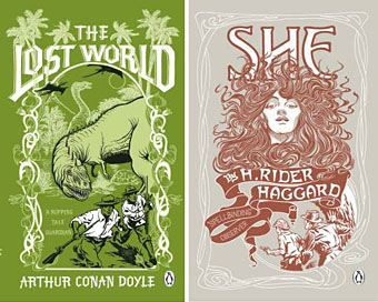
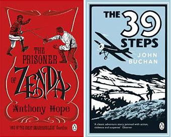
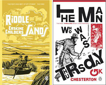
More pulp revenants come blinking back into the light. The runaway success of The Dangerous Book for Boys among fathers as well as sons has set British publishers casting about for new ways to exploit masculine nostalgia. Repackaging a few old warhorses is Penguin’s solution and a cheap one since most (all?) of these titles are out of copyright. I like these covers (and can’t find a design credit unfortunately), they’re well done, capture the right tone and look great as a set.
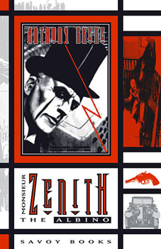 The Man Who Was Thursday seems to be the odd man out (as it were) story-wise. All the other books are typical adventure fare but in Chesterton’s novel what appears at first to be a pot-boiler turns out to be a metaphysical allegory closer to Charles Williams than John Buchan. One of Sax Rohmer‘s Fu Manchu volumes would have been more suited to this series but I suspect their “Yellow Peril” racism makes that less easy today. The Chesterton cover is curiously out-of-synch too, a pastiche of El Lissitzky/Bauhaus styles rather than the Edwardian designs the others are imitating. This isn’t a mistake, however, the fractured lettering suits a tale of anarchists with a plot full of twists and surprises. I tried a similar Modernist approach in 2001 with my jacket for Savoy’s edition of Zenith the Albino. In that instance the style was derived from Mondrian, with the colours coming from the initial description of the albino’s black clothes, white skin and red eyes. I’d venture to suggest that Anthony Skene’s thriller is a far better book than all of the above, Chesterton included, but then I am rather biased.
Update: Coralie from Penguin has the credits in the comments.
Elsewhere on { feuilleton }
• The book covers archive
I’ve already read all of those titles except for the Lost World.
For my long holiday coming up soon I’m hoping to get through Dumas 3 Musketeers and The Count of Monte Cristo. Appropriate reading since I’ll be in France for a week or so.
:-)
PS
What do you think of the new Red Classics cover for Suskind’s Perfume
http://www.penguin.com.au/lookinside/spotlight.cfm?SBN=9780141023595
Nice green eyes
The Lost World was pretty dull, as I recall, compared to the delights of Sherlock Holmes.
I included that Penguin cover in my post about the book and the film. Cover looks good although I pointed out then that the novel is concerned with Grenouille’s sense of smell, not that of his victims, so it’s a bit odd to have Laure sniffing up the letters.
sorry I tried to search for the Perfume entry in your archives using Perfume and Suskind but for some reason they didn’t work. I should have just clicked on the {design} category.
Still haven’t read Perfume but I did like the movie.
Great to see you are spot on with regards to the anarchy feel of the type for The man Who Was Thursday. That was the exact approach I was aiming for when designing the cover. Its nice to see these covers have caught peoples attention.
Thanks for stopping to make a comment, Coralie. Did you do all of these? I don’t like leaving work uncredited if I can help it.
Hi John,
I did indeed work on all of these books.
I commissioned four illustrators:
Michael Topping (Prisoner of Zenda)
Neil Gower (39 Steps)
Mark Thomas (She, lost World)
Mick Brownfield (The Man Who Was Thursday, Riddle of the Sands)
I also used a lettering artist, Stephen Raw.
I am currently working on repacking Sherlock Holmes for next year.
Cheers
Thanks Coralie. I know Mick Brownfield’s work from other books. I’ll look forward now to seeing what you do with the Sherlock Holmes!