Frazetta and Poe

frazetta.jpg

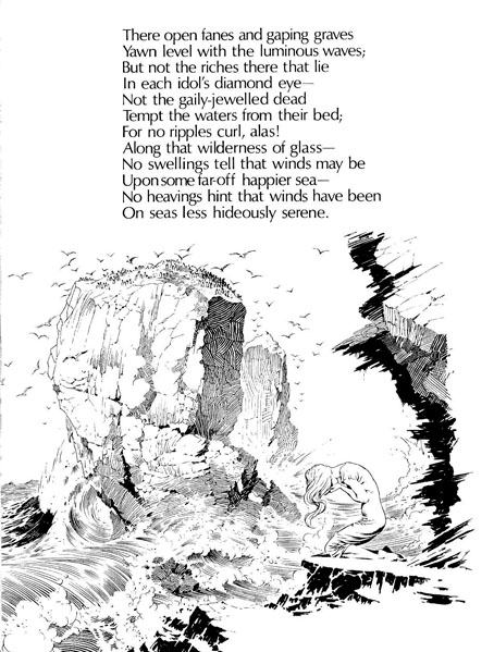
Art by Frank Frazetta, lettering by Gail Smith.

Frank Frazetta wasn’t an artist you’d usually associate with a literary master like Edgar Allan Poe. With the exception of an idiosyncratic Lord of the Rings portfolio most of the books that Frazetta illustrated were by Robert E. Howard or Edgar Rice Burroughs. The page above is from a series of drawings in issue 8 of Witzend magazine that accompany the text of Poe’s The City in the Sea. There’s no editorial comment to explain the origin of this piece but Frazetta’s drawings, which depict the sole survivor of a plane crash, look like they may have been intended for something else entirely, there’s no connection with the poem apart from the coastal setting. Witzend was an odd and interesting magazine that was founded by Wallace Wood to accommodate pieces like this one which might not have an outlet elsewhere. Frazetta had a drawing in the first issue in 1966; issue 8 appeared in 1972 by which time the magazine had a different publisher and editor but continued to feature work by Wood and his friends. The whole run is very worthwhile, even issue 9 which departed from the usual form to devote the entire number to the films of WC Fields.

Previously on { feuilleton }
Frank Frazetta, 1928–2010
Frazetta: Painting with Fire
Fantastic art from Pan Books

The art of Mike Hinge, 1931–2003

hinge06.jpg

Amazing Science Fiction, May 1972.

Back in March I ended my post on the psychedelia-derived art style that I think of as “the groovy look” with the words “there’s a lot more to be found.” There is indeed, and I’d neglected to include anything in the post by Mike Hinge, a New Zealand-born illustrator whose covers for American SF magazines in the 1970s brought a splash of vivid colour to the groove-deprived world of science fiction. This was a rather belated development for staid titles like Amazing and Analog whose covers in the previous decade wouldn’t have looked out of place in the Gernsback era. Opening the door to someone like Mike Hinge, a graphic designer as well as a general illustrator, was probably a result of both magazines having undergone recent changes of editorship. Hinge approached SF art in the same way that Jim Steranko approached comic-book art in the late 1960s, importing trends that had been flourishing outside the medium. (And Steranko liked Hinge’s art enough to publish a portfolio of black-and-white drawings, The Mike Hinge Experience, in 1973.) This kind of graphic style was increasingly outmoded by the mid-70s but some of Hinge’s compositions are audacious in context: the Algol cover with one of his robots seen in a water reflection (and those ripples that defy perspective), the Analog cover that works both vertically and horizontally.

For this post I’ve favoured Hinge’s groovy look over other covers, especially those from the late 70s when his cover art shifted to a painted style which is less distinctive, and less interesting as a result. It’s the distinctive style that people still prefer today. There’s more to be seen at Tenth Letter of the Alphabet and Onyx Cube.

hinge21.jpg

Undated drawing (probably mid-60s).

Something else you can always find more of is Aubrey Beardsley borrowings. Via Tenth Letter of the Alphabet which has a couple more pieces in this style.

hinge19.jpg

Wraparound cover for Witzend #6, Spring 1969.

Witzend was a magazine of comics, fantasy stories and related art published by Wallace Wood, a complete run of which may be found here.

hinge01.jpg

Amazing Science Fiction, November 1970.

hinge02.jpg

The Leaves of Time (1971).

Continue reading “The art of Mike Hinge, 1931–2003”