Weekend links 115

vandamme.jpg

Untitled painting by Suzanne Van Damme (1901–1986).

Eric Berkowitz, author of Sex and Punishment: 4000 Years of Judging Desire, chooses five books for The Browser.
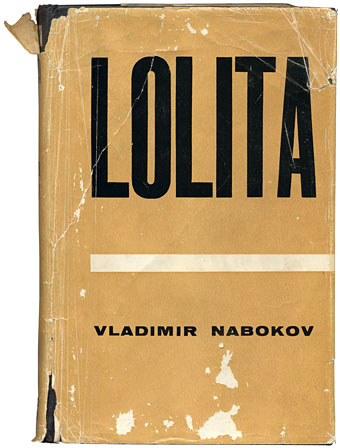
Venus febriculosa is running another competition: Design a new cover for Brian Eno’s Music For Films.

• Paul Mayersberg and Tony Richmond on making The Man Who Fell to Earth.

When a good idea occurs, it has been prepared by a long time of reflection. But you have to be patient. We all have what I call the invisible worker inside ourselves; we don’t have to feed him or pay him, and he works even when we are sleeping. We must be aware of his presence, and from time to time stop thinking about what we are trying to do, stop being obsessed about answers, and just give him the room, the possibility, to do his work. He is tenacious, you see. He never loses hope.

Screenwriter Jean-Claude Carrière discusses his remarkable career. Related: The Discreet Charm of the Bourgeoisie revisited.

Tragic Time Capsules: Capturing the Decay of Forgotten Olympic Venues.

Louis Menand on “The Puns and Detritus in James Joyce’s Ulysses“.

• Saul Bass’s original ending for Phase IV unearthed in Los Angeles.

Katherine Lanpher uses witchcraft to find a New York apartment.

Italo Calvino’s adolescence – that in-between time.

• The early film posters of Waldemar Swierzy.

Psychedelic nano-art in oils and ferrofluids.

David Toop has a blog.

Callum James Paper.

Bodies of Water (1995) by David Toop

Nabokov book covers

nabokov1.jpg

Flowers are the sexual organs of plants, which may have been what designer David Pelham had in mind when he created this cover for the Penguin debut of Nabokov’s densely-written and erotic novel, Ada in 1970. (Butterfly orchids also feature in the text, of course.) The Russian maestro has been unavoidable lately on account of the publication this week of his final, unfinished work, The Original of Laura. The design of the new book by Chip Kidd is slightly more daring than I’d have expected from something which the publisher will be hoping to sell in large quantities, and I’d love to know how much argument was required to push the cover through the marketing department. The contrast between boards and dust jacket is very satisfying and adds value to the book as artefact, a feature impossible to replicate in ebook terms even if this was an ordinary novel rather than sketches on index cards. If people want books to stay physical then smart design needs to be applied a lot more often.

nabokov2.jpg

The ragged item above is my battered second edition of the original UK (Weidenfeld & Nicolson) printing of Lolita, now fifty years old and with a cover designed by Eric Ayers. There’s a more pristine copy on display at this comprehensive gallery of Lolita covers, fascinating viewing if you’re interested in seeing how the same book can be presented over 150 editions. From a drab beginning things quickly degenerate into outright salaciousness, a development which would no doubt have dismayed the author. That gallery link comes via Venus febriculosa who recently held a competition to redesign the cover; you can see the results here, many of which are a lot more inventive than the published editions.

Meanwhile, the advent of Nabokov’s final novel has meant that all of his works are being reissued by Vintage. Ace cover designer and art director John Gall was tasked with redesigning the corpus for which he assembled a team of designers and requested that they each fill a butterfly specimen box with material to suit their allotted title. You can see the gorgeous results here. And if that’s not enough Nabokov, you can read Martin Amis taking his favourite author to task over The Original of Laura here.

The inside story of Nabokov’s last work

Elsewhere on { feuilleton }
The book covers archive