Weekend links 368

nerly.jpg

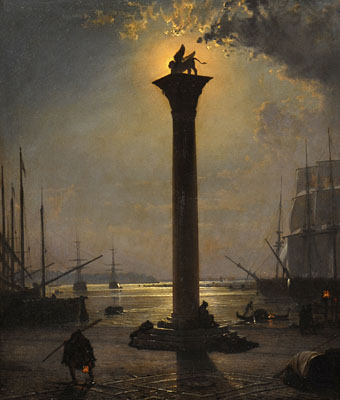
Piazzetta San Marco by Moonlight (no date) by Friedrich Paul Nerly.

• RIP Heathcote Williams (Guardian obit, NYT obit): poet, playwright, actor, artist, anarchist, stage magician, and no doubt many other things besides. Being a product of the counter-culture, and one of Britain’s foremost anti-establishment writers (his polemics against the Royal Family were unceasing), Williams was a regular in the early publications produced by my colleagues at Savoy Books; in fact there’s a piece by him in The Savoy Book itself. Consequently, Williams always felt like a distant relative even though we never met. Of his many film appearances, which ranged from low-budget independent productions to Hollywood junk, he was ideally cast as Prospero in Derek Jarman’s film of The Tempest, and he audaciously steals a scene from Tilda Swinton in Sally Potter’s wonderful Orlando. Elsewhere: Jeremy Harding on Williams’ run-ins with the gatekeepers, and Why D’Ya Do It?, a song by Marianne Faithfull with lyrics by Williams.

• Mixes of the week: Secret Thirteen Mix 226 by Chihei Hatakeyama, and SydArthur Festival 2: Summer of Love Edition by Head Heritage.

Geeta Dayal on composer and musique concrète pioneer Pierre Henry whose death was also announced this week.

Jonathan Meades reviews Vinyl.Album.Cover.Art: The Complete Hipgnosis Catalogue by Aubrey Powell.

• “Brutal! Vulgar! Dirty!” Polly Stenham on Mae West and the gay comedy that shocked 1920s America.

Hannah Devlin on religious leaders getting high on psilocybin for science.

• At Dennis Cooper’s: Spotlight on…In Transit (1969) by Brigid Brophy.

• At Bibliothèque Gay: Matelots (1935) by Gregorio Prieto.

SD Sykes on reconsidering Venice, crumbling city.

Letters and Liquor

This Ain’t The Summer Of Love (1976) by Blue Öyster Cult | Orlando (1996) by Trans Am | Transit (2004) by Fennesz

L’outrageant Lord Horror

shoah1.jpg

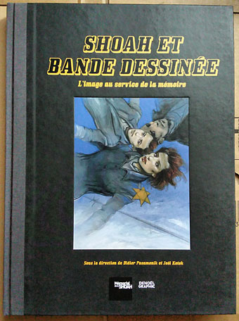
Cover art by Enki Bilal.

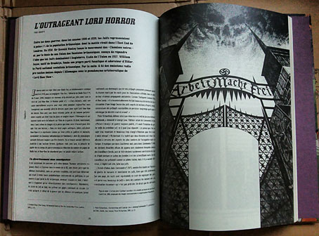
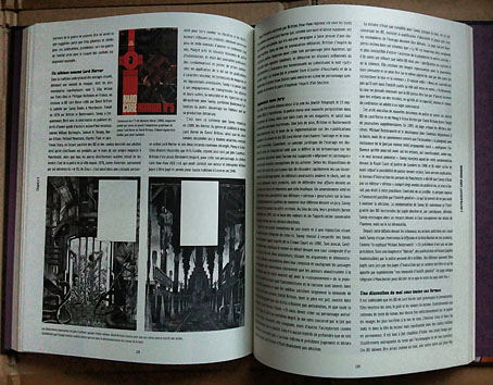
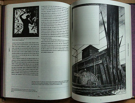
Arriving in the post this week was the catalogue for the Shoah et bande dessinée exhibition which is currently running in Paris at Mémorial de la Shoah. I’ve mentioned previously that the exhibition includes some of my pages from my first collaboration with David Britton/Savoy, the death-camp issue of the first Lord Horror series, Hard Core Horror, but until the catalogue arrived I wasn’t sure how that work would be presented. Consequently, I’m surprised to find the comic and Britton’s wider Lord Horror project given a section of its own in the catalogue, with a lengthy appraisal by British comics historian Paul Gravett. The text is French throughout so I can’t follow Gravett’s piece very well but it looks to be an expansion of earlier pieces he’s written about the Savoy comics and their troubled history.

shoah2.jpg

The book itself is a solid production that I’m pleased to find following the hardback “album” format used by Continental comics. Denoël Graphic, a publisher of bandes dessinées, is the publisher. Among the other artists represented are Will Eisner and Art Spiegelman (of course), plus many French artists whose work I hadn’t seen before. The exhibition runs throughout the year to 30th October, 2017.

shoah3.jpg

shoah4.jpg

Previously on { feuilleton }
Exhibitionism

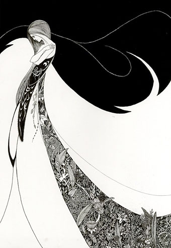
After Beardsley by Ryan Cho

cho.jpg

One of the posts last week concerned a swipe from Harry Clarke by an unknown illustrator. This Beardsley pastiche came to my attention shortly after the Clarke discovery, not a swipe but a deliberate exercise by American illustrator Ryan Cho in adopting the Beardsley style. It took some effort to trace the origin of Cho’s drawing since this is one of many similar works proliferating via Tumblr and Pinterest in which the credit goes to Beardsley himself. Cho’s exercise was one of a series following the styles of different artists and illustrators. In addition to another Beardsley drawing there’s also a couple of less successful attempts to pastiche Harry Clarke; having attempted a Clarke pastiche myself I can testify to the scale of the challenge. More of Ryan Cho’s work may be seen here.

Elsewhere on { feuilleton }
The Aubrey Beardsley archive
The illustrators archive

The case of the fin de siècle fleuron

artnouveau.jpg

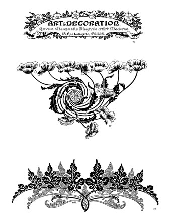
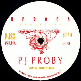
I said yesterday that poppies are a common feature of the fin de siècle magazines for the convenient way they combine long-stemmed flowers—ideal for all those Art Nouveau flourishes—with narcotic connotations that signal Decadence. The spiralling fleuron above is one example that readers of Savoy books may recognise, an occasional company logo which has been in use since the mid-1980s. David Britton chose the design from one of the Dover Pictorial Archive books, Carol Belanger Grafton’s Treasury of Art Nouveau Design and Ornament, and I later made a digital version from this page scan.

heroes.jpg

One of the earliest Savoy uses, a label design for Heroes (1986) by PJ Proby.

Having spent a great deal of time in recent years trawling through Art Nouveau magazines I was sure I was going to run into the original printing of the fleuron eventually. Some of the page decorations in Jugend are very similar but it wasn’t there or in Pan, Deutsche Kunst und Dekoration or The Studio. I don’t have a copy of the Grafton book, and Dave says his copy is lost, so I’ve no idea whether there’s a credit for the source of the designs; not all Dover books credit their source material in any detail. Earlier this week I decided to look in Art et Décoration, a magazine that was the French equivalent of The Studio, since the header at the top of the scanned page implied that the other designs might be from the same magazine. Aside from a couple of copies at the Internet Archive this means looking through the poor-quality scans at Gallica; by a fluke—because they don’t seem to have a complete run of the early issues—the January 1898 edition contained the page below showing the Savoy fleuron, an endpiece for an article devoted to another French art magazine, L’Image.

Continue reading “The case of the fin de siècle fleuron”

Aubrey Beardsley’s Keynotes

keynotes1.jpg

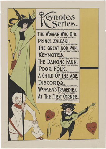
Promotional poster.

Keynotes was a series of 34 novels and short story collections published by John Lane from 1893. Aubrey Beardsley produced cover designs and embellishments for 22 of the titles in 1895 while he was working on The Yellow Book which John Lane was also publishing. Beardsley’s designs comprised a title frame with illustration or decoration which was blocked in gold on the cover and also used as a title page. For 15 of the titles he also created a series of key-shaped monograms for the authors, designs which were used on the spines and the backs of the books. Collections of Beardsley’s art often show one or two of these pieces but you seldom see them all, and even when the title frames are reproduced the type is often omitted.

keynotes4.jpg

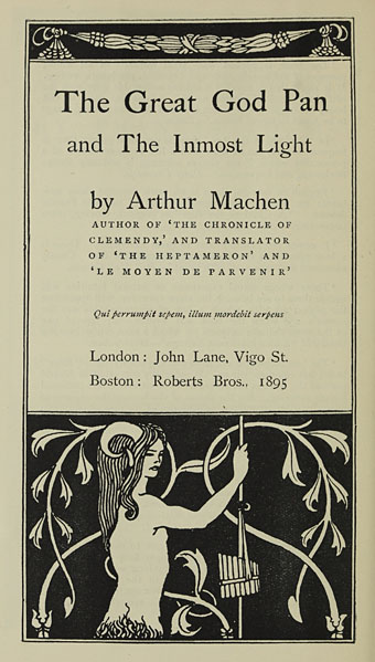
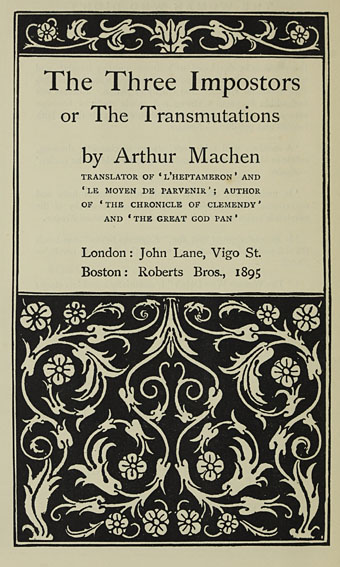
Keynotes Series of Novels and Short Stories was a small book published in 1896 intended to gather all the Beardsley designs in one place and also promote the series in general. Two of the most celebrated works to receive the Beardsley treatment are those by Arthur Machen: The Great God Pan and The Inmost Light, and The Three Imposters. The decoration for the latter gives no indication of the horrors lurking inside that volume, while the faun on The Great God Pan is a world away from the amorphous nightmare in a story that caused considerable outrage at the time. According to Stanley Weintraub’s biography, the Keynotes series was very popular despite (or because of) the stir it caused, and helped keep Beardsley’s work visible when many of his other illustrations were out of circulation.

keynotes5.jpg

Continue reading “Aubrey Beardsley’s Keynotes”