Philip José Farmer book covers

feast.jpg

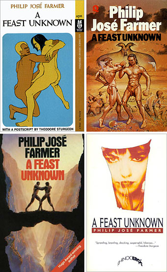
top left: artist unknown (1969); top right: Patrick Woodroffe (1975)
bottom left: Peter Elson (1988); bottom right: artist unknown (1995)

The Men with snakes post at the weekend finished on a note of Freudian melodrama with a picture of Doc Savage battling a giant python. Lester Dent’s brazen hero has appeared a number of times in the work of Philip José Farmer, a writer who’s spent much of his career laying bare the psychosexual forces which give us stories of pulp heroes struggling with (among other things) enormous snakes.

Farmer is famous—notorious, even—for being the first writer to place sex centre stage in science fiction with his story of a human/alien encounter, The Lovers, in 1952. While subsequent writers have broadened the field in their own way, Farmer is somewhat unique in being equally adept at writing solidly successful sf adventure such as the World of Tiers or Riverworld books, yet with a mischievous and intellectual facility that could be upsetting to what used to be a very conservative sf establishment. Farmer was writing about sex at a time when few genre writers wanted to deal with the subject. He also loves pulp fiction in all its manifestations yet isn’t afraid of examining its characters with the objectivity of an anthropologist. Both these impulses came together (so to speak) in the late Sixties with the outrageous pulp pornography of Image of the Beast and A Feast Unknown. More about these in a minute.

Farmer has a particular enthusiasm for Tarzan and Doc Savage and eventually wrote “official biographies” of the pair with Tarzan Alive (1972) and the splendidly-titled Doc Savage: His Apocalyptic Life (1973). These books saw the beginning of his Wold Newton Universe which sought to connect all the heroes and villains of the late 19th and early 20th century into a vast, incestuous family tree, a scheme which predates similar exercises such as Alan Moore and Kevin O’Neill’s League of Extraordinary Gentlemen by three decades or more. His versatility and delight in pastiche was demonstrated in Jungle Rot Kid on the Nod (1968) which rewrote Edgar Rice Burroughs’ Tarzan in the style of William Burroughs. There aren’t many writers with a full-enough appreciation of both these authors to pull off such a challenge.

farmer2.jpg

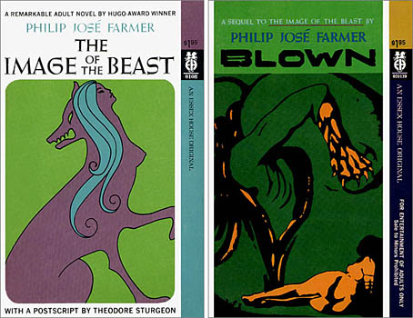
Original Essex House editions, 1968 & 1969. Artist/designer unknown although the cover of Blown is based on Geopoliticus Child Watching the Birth of the New Man by Salvador Dalí.

Image of the Beast (1968), its sequel, Blown (1969), and A Feast Unknown (1969) were all written for sf-porn publisher Essex House, an opportunity which unleashed Farmer’s already fertile imagination. These took a while to be reprinted but are now considered among his best works; they’re certainly favourites of mine and I love the simple graphics of the original covers, such a change from the usual airbrushed sf fare. I produced a cover illustration for the Creation Books edition of Image/Blown in 2001 which, while okay, I now feel could have been better. A Feast Unknown is Farmer’s most gloriously excessive novel, and still surprises when read today. Illustrator Patrick Woodroffe, who painted the cover for the first UK printing, thought the book “dangerous” and complained in his Mythopoeikon collection that there was little he could safely illustrate. The story has a thinly-disguised Tarzan (Lord Grandrith) and Doc Savage (Doc Caliban) set against each other by a group of mysterious immortals. The pair discover that violence gives them erections and killing provokes an orgasm, the cue for a couple of hundred pages of eye-popping, ball-busting mayhem. It’s ironic that during the Seventies when general readers were looking for racy thrills in books by Harold Robbins or Jackie Collins, the real hardcore stuff was over on the science fiction shelves with Farmer’s work, Ballard’s Crash, Samuel Delany’s Equinox, aka The Tides of Lust, Charles Platt’s The Gas, and others.

Farmer wrote two equally crazy sequels to Feast in 1970, Lord of the Trees and The Mad Goblin but unfortunately stripped out the excesses of the former book. I’ve always been disappointed by this and continue to hope that one day the original versions of the sequels will see print. Science fiction may have calmed down a bit (or grown conservative again) since the Seventies but Farmer’s work still exerts an influence. His unveiling of the weird psychosis at the heart of pulp fiction certainly affected the approach I took with the Lord Horror series Reverbstorm, created with David Britton in the 1990s, a series I’ve referred to more than once as a psychopathology of heroic fantasy.

The covers above all come from the official PJF website which also includes my Image/Blown cover design. (And where they also spell my name wrong.)

Previously on { feuilleton }
Men with snakes
The book covers archive

Zeppelin vs. Pterodactyls

zeppelins.jpg

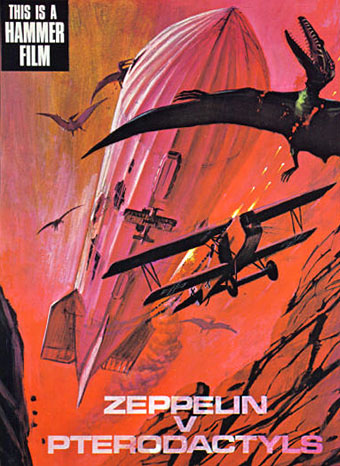
An unmade high-concept from Hammer Films’ early Seventies dalliance with pulp adventure, if you must know. Via Boing Boing via Jess Nevins via Airminded where we learn:

The story was along the lines of THE LAND THAT TIME FORGOT, with a German Zeppelin being blown off-course during a bombing raid on London and winding up at a “lost continent”-type place.

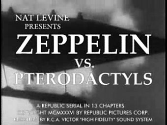
Rather like the Civil War balloon that’s blown off-course in Jules Verne’s Mysterious Island then, which ends up on Captain Nemo’s volcanic island of giant birds and insects. Of course, the mere fact that a film was never made is no obstacle for YouTube’s army of diligent mash-up artists and you can see Zeppelin v. Pterodactyls re-imagined as a 1936 Republic Serial here. (And on a pedantic professional note, an older font should have been used for the titles since Hermann Zapf didn’t design Palatino until the 1940s.)

zeppelins2.jpg

It was another horror company, Amicus Productions, that produced The Land that Time Forgot (1975) (and its ER Burroughs-derived sequels, At the Earth’s Core [1976] and People that Time Forgot [1977]) so this Hammer concept may have been an attempt to follow Amicus’s lead and exploit the momentary flush of enthusiasm for ERB and co. Or perhaps they thought that Zeppelin movies were the next big thing after Michael York’s First World War adventure, Zeppelin, in 1971. No one in Hollywood these days would dare finance a film with a title like this. The same dumbing-down imperative that gave us Harry Potter and the Sorceror’s Stone (because Americans can’t be trusted to know what the Philosopher’s Stone is) would no doubt want “pterodactyls” replaced by “dinosaurs” or the wording of the whole thing reduced to ZvP.

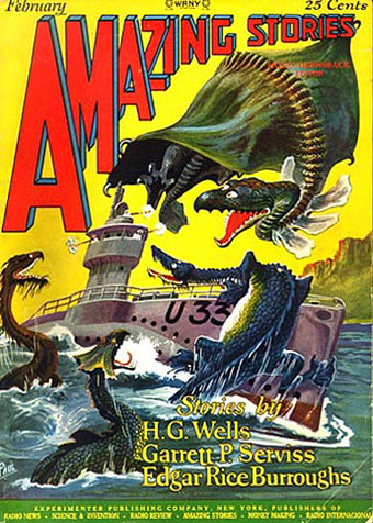
amazing.jpg

U-boat vs. dinosaurs! Illustration by Frank R Paul for a 1927 reprint of The Land that Time Forgot.

The Land that Time Forgot was scripted by Michael Moorcock and New Worlds‘ (and Savoy Books) illustrator James Cawthorn. The pair did a decent job with the story although the film as a whole is let-down by silly monster effects, the pterodactyl (or is it a pteranodon?) in this instance being a lifeless thing swinging from a crane. Moorcock and Cawthorn worked together on Tarzan Adventures which Moorcock was editing as a teenager so they appreciated the material at least. This wasn’t the only connection New Worlds had with pulp cinema, more surprisingly JG Ballard had provided a story for Hammer in 1970 with When Dinosaurs Ruled the Earth. Hammer missed an opportunity in not hiring Moorcock for something seeing as he’d just written one of the first retro-dirigible (and pre-Steampunk) novels, The Warlord of the Air, in 1971. UK film producers had some of the best writers in the world under their noses yet could only offer them trash to work on. No wonder the British film industry went down the tubes in the Seventies after the American funding dried up.

My favourite pulp adaptation from Hammer is The Lost Continent based on Uncharted Seas by Dennis Wheatley. A typical Hammer product in the way the story is frequently preposterous yet the whole thing is made with the utmost seriousness. Amazon summarises the plot, such as it is:

This film starts out like The Love Boat on acid, as a cast of unpleasant characters, all with horrible secrets, take a chartered cargo ship to escape their troubles. Unfortunately, the leaky ship is carrying an explosive that can be set off by sea water and it sinks, stranding many characters in a Sargasso Sea populated by man-eating seaweed, giant monster crabs and turtles, and some Spanish conquistadors who think the Inquisition is still on.

Eric Porter is the ship’s captain, a very good actor who was superbly sinister and convincing as Professor Moriarty in Granada TV’s Sherlock Holmes adaptations. The Lost Continent was Wheatley’s shameless plundering of William Hope Hodgson’s Sargasso Sea tales, the book being originally written in 1938 when Hodgson was less well-known than he is today. Until the Pirates of the Caribbean films this was about the closest thing on screen to Hodgson’s world of drifting weed, lost galleons and man-eating monsters, so there you have its cult value. Just be ready with the fast forward button if you try and watch it.

Previously on { feuilleton }
Moorcock on Ballard
Coming soon: Sea Monsters and Cannibals!
Revenant volumes: Bob Haberfield, New Worlds and others
Druillet meets Hodgson
Davy Jones
The Absolute Elsewhere

My pastiches

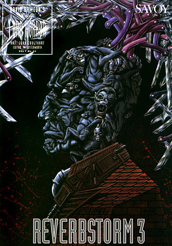
rev3cov.jpg

Lord Horror: Reverbstorm #3 (1992).

Following from the post about an art forgery exhibition (and Eddie Campbell discussing his American Gothic cover for Bacchus), I thought I’d post some of my own forgeries, or pastiches as we call them when no deception is intended.

Reverbstorm was the Lord Horror comic series I was creating with David Britton for Savoy in the 1990s. The Modernist techniques of collage (as in the work of Picasso and others) and quotation (as in TS Eliot’s The Waste Land) became themes in themselves as the series developed, so it seemed natural to imitate the styles of various artists as we went along. Pastiche is also a chance to flagrantly show off, of course, and I can’t deny that this was also one of my impulses here.

Issue #3 of Reverbstorm had marauding apes as its theme, from the Rue Morgue to Tarzan and King Kong, so I had the idea of doing an ape cover in the style of the celebrated paintings by Giuseppe Arcimboldo (1527–1593) which make human heads out of fruit, flowers or animals. Easy enough to have the idea but making it work took a lot of effort and required careful sketching beforehand, something I rarely do. The painting was gouache on board, a medium I’d been using for years and this was about the last gouache work I did before switching to acrylics.

Continue reading “My pastiches”

A premonition of Premonition

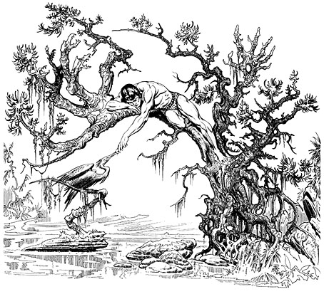
hogarth.jpg

Jungle Tales of Tarzan by Burne Hogarth (Watson-Guptill, 1976).

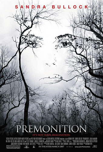
premonition.jpg

Premonition (Sony Pictures, 2007).

And multiple works by Salvador Dalí

Previously on { feuilleton }
L’Amour Fou: Surrealism and Design
Perfume: the art of scent
Metropolis posters
Film noir posters

Watchmen

watchmen.jpg

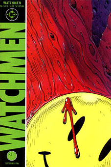
This year sees the 20th anniversary of the publication of Watchmen by Alan Moore and Dave Gibbons. The landmark comic book, one of the few to deserve the designation “graphic novel”, remains a particular favourite of mine, and one that still excites for its consummate command of the comics medium. The following is a very long round table discussion with Watchmen‘s creators from issue 100 of Fantasy Advertiser, first published in March 1988. It’s surprising that this doesn’t seem to have been posted anywhere else on the web as it’s an excellent discussion about this great book.

Spoiler warning: this piece discusses in depth just about every revelation in the story so you’d be advised to skip it if you haven’t read the book.

MARTIN SKIDMORE: Alright, let’s have a starting point… just what is it about Watchmen that distinguishes it from other…
STEVE WHITAKER: Cream cheeses?
MS: …superhero comics on the market?
DAVE GIBBONS: Is this in the form of direct questions to us, or…
FIONA JEROME: No, we’re all gonna talk.
DG: Well, I’ll have a schnoozle then…
SW: The thing that I think distinguishes Watchmen from other comics is that the series holds together more like a novel. Your climax isn’t in the last 3 panels in Watchmen 12. There are long quiet tracts with exciting bits or…moderately exciting bits (LAUGHTER) In terms of Jack Kirby Wham! Smash! Pow! it’s all very quiet. There’s a lot of suffering but…
MS: …it’s all emotional rather than physical suffering.
ALAN MOORE: It’s a difficult question for me and Dave to answer, probably one that you could answer better, but if I had to say anything then it’s the degree of structure that me and Dave have applied to it—I can’t think of many examples of that degree of structure, that degree of layering.
FJ: I was going to say: especially visually you don’t get such a use of motif certainly not in American comics.
MS: Doug Moench has used it occasionally.
FJ: But not with the same complexity and not filling-in with written structure as well.
PETER HOGAN: The thing is: you’re given a world. The characters, alright, they’re based on the Charlton Characters but they’re new as of page 1. Even so, they’re characters with a history that comes out over the course of the thing… Their world has a history… it has a cohesion to it.
SW: Something that quite interests me now we’re talking about structure and stuff, is the symmetry—there is a real symmetry to Watchmen and the way the characters are set up.
DG: Two arms… two legs. (LAUGHTER)
MS: Perhaps the Comedian and Rorschach…
SW: I was thinking more of Osterman and Ozymandias.
MS: That’s right—the intellectual and physical, chaos and law…
AM: It’s difficult pinning down what’s symmetrical to what—I mean to me, at least to some extent, there’s an equally good case for contrasting Nite Owl and Rorschach.

Continue reading “Watchmen”