Weekend links: 2012 edition

life1912.jpg

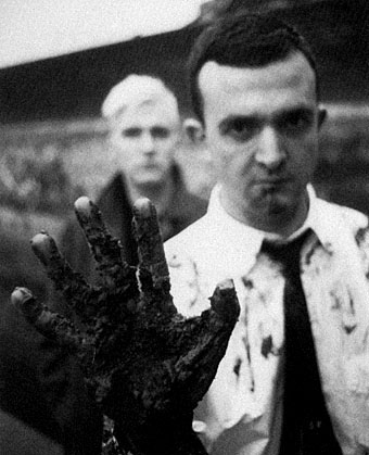
The Hand of Fate, Life magazine, October, 1912. Artist unknown.
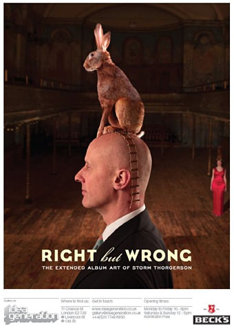
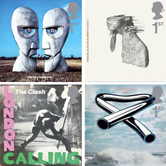
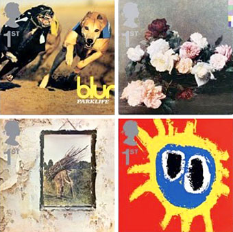
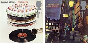
In Search of Barney Bubbles: the great graphic designer is profiled on BBC Radio 4, Monday, 2nd January. And speaking of album cover designers, Cool Hunting talked to Storm Thorgerson about his work.

• FACT mix 310 is a hugely eclectic two-parter from Moon Wiring Club. Grab it while it’s still available. And there’s also Solstmas 2011/2: The Final Countdown, a mix by El Minko Misterioso.

• One of the music events of the new year will be the release of Captain Beefheart’s Bat Chain Puller album. Pre-order it here.

In 1972, at the age of thirty-one, [Fred] Halsted released L.A. Plays Itself, a film which drew upon Kenneth Anger’s surrealist eroto-expressionism, and went way beyond Anger’s sublimated homoeroticism to explicitly portray gay male S/M sex. In 1969, when Halsted first decided to make a sexually explicit film, he decided to create a part for himself, and then be that part.

Halsted Plays Himself by William E. Jones reviewed at Lambda Literary

• Lunar Rover: An interview with Steve Moore and extract from Somnium.

Battersea Power Station, a graveyard of architectural schemes.

Editors might admire a fine book, but are overridden by marketing and accounting departments who now have the final say. I know of a novel that wasn’t accepted by one publisher after the manuscript was first submitted to W.H. Smith, who said that it wouldn’t sell enough.

Jenny Diski on the state of fiction publishing in the UK

• EU copyright on James Joyce‘s works ended at midnight.

Dressed to Kill: Dispelling the Myths of Men in Drag.

The Geology of the Mountains of Madness

Mandala of the Day

Chomeography

The Floppy Boot Stomp (1978 mix) by Captain Beefheart and the Magic Band.

Weekend links 81

wittkamp.jpg

Black Cat on a Chair (1850–1860) by Andrew L Von Wittkamp.

• “A little bit of acid, lots of weed, and too much Castaneda and I was ready to move from the magical realm of Middle Earth into a world that was much stranger than any involving hairy dwarves and white wizards…” Too Much to Dream by Peter Bebergal, “a psychedelic American boyhood”.

This year’s Booker prize isn’t about the power of the new – there’s no experiment with form or strangeness of imagination. The winner may get on the bedside tables of middle England, but that’s not as important as changing the way that even one person dreams.

Jeanette Winterson throws the cat among the pigeons.

• 50 Watts continues to show us things you’d be hard-pressed to find elsewhere: illustrations by TagliaMani from a new edition of Les Chants de Maldoror, and War Is a Verb, collages by Allan Kausch.

• Don’t go in the swimming pool! Coilhouse directs us to Fantasy: music by French outfit DyE with a weird and nasty animation by Jérémie Périn.

• Ace album cover designer and photographic Surrealist Storm Thorgerson is having another exhibition at IG Gallery, London.

The Art of Leo and Diane Dillon, an art and illustration archive.

John Turturro reads a short story by Italo Calvino.

Spaceport America by Foster + Partners.

Your Body of Work by Olafur Eliasson.

Wonder-Cat cures all ailments.

Blogging Moby-Dick.

Krazy Kat (1927) by Frankie Trumbauer & His Orchestra with Bix and Lang | Pussy Cat Dues (1959) by Charles Mingus | Katzenmusik 5 (1979) by Michael Rother | Big Electric Cat (1982) by Adrian Belew | Purrfect (1996) by Funki Porcini.

Peter Christopherson, 1955–2010

coil.jpg

Coil, circa 1984. John Balance (left) & Peter Christopherson (right). Photo by Lawrence Watson.

The depths of the night sky
Reflects in his eye
He says “Everything changes
And everyone dies.”

Coil, Blood From The Air (1986)

Yes, everyone dies but you don’t always expect it this soon, six years after the sudden loss of John Balance. Coil and Throbbing Gristle were refreshingly direct about the transience of existence so we should no doubt regard these moments with the necessary degree of philosophy. And yet… I’ve said for years that we lack an adequate complement of innovators, genuine creators, rare minds, and what Robert Anton Wilson used to call Intelligence Agents; such people always seem too few, especially in a world where hatred and ignorance are encouraged by those eager to keep us unfulfilled, the easier to manipulate and control. There’s a natural desire each time you discover a like-minded soul to want them to stay around for as long as possible, to help shine a thousand lights in a darkened room.

I never met Peter Christopherson but I saw him on stage with Psychic TV in Manchester in 1983, and as part of Coil for their thrilling performance at the Royal Festival Hall, London, in 2000. We corresponded sporadically via letter and email throughout the 1990s, and spoke on the phone a couple of times. Coil wanted me to create a cover for one of their releases and we talked about this on and off for several years but nothing ever came of the plans, something I regret to this day. Peter bought a drawing off me ten years ago (this one), and he remains one of the few people I’ve sold any artwork to. I broke my usual rule on that occasion out of respect for his work. That work is mostly acknowledged as being musical, and it’s the music—as a member of Throbbing Gristle, Psychic TV, Coil, and TG again—that other obituaries will rightly celebrate. But he was also a talented photographer and graphic designer whose earliest public works were for the design group Hipgnosis in the 1970s. He joined Storm Thorgerson and Aubrey Powell as an assistant in the mid-70s and became a full partner in 1980. As a freelance photographer he shot the first promo pictures of the Sex Pistols in 1976, photos which (if I remember correctly) Malcolm McLaren decided not to use because they looked too heavy. Or maybe too queer…see this appraisal by John Gill from his book Queer Noises. It was Peter Christopherson’s design authority that gave the Throbbing Gristle releases a quality many other independent productions lacked in the post-punk era. He brought the same visual finesse to Psychic TV in 1982 and it was painfully obvious when that finesse was withdrawn after he and John Balance left PTV in 1983 to form Coil. I owe Coil more than I can easily articulate. I’ve spent hours and hours listening to their music whilst working; the full range of their interests probably matched mine more completely than any other group I’ve encountered. It was a real shock when everything crashed to an end in 2004. It’s good to know that the Coil site at Brainwashed has a wealth of interviews and articles going back through the years. And there’s still the music, of course.

Fellow TG members Cosey Fanni Tutti and Chris Carter issued some words of remembrance a few hours ago which they end by saying: “Peter was a kind and beautiful soul. No words can express how much he will be missed.” A few examples of his photography and design work follow.

Update: Full Guardian obituary by Alexis Petridis | Genesis P-Orridge Pays Tribute To Sleazy.

Continue reading “Peter Christopherson, 1955–2010”

Storm Thorgerson: Right But Wrong

storm.jpg

Storm Thorgerson, he of the great design partnership Hipgnosis, has some of his album covers and other work in exhibition this month at the Idea Generation Gallery, London. The exhibition runs to May 2nd. This Sunday (April 11th) he’ll be signing copies of his books at the gallery from 2pm.

Alongside some of the most iconic images from his seminal career, the exhibition will include previously unseen sculptures, sketches and writings from the artist. Right But Wrong will provide an in-depth account of the artist and the processes behind some of the artist’s most acclaimed works. Especially for Idea Generation Gallery, Storm will also present a number of brand new site-specific installations, including ambitious reinterpretations of a few his most renowned pieces. (More.)

xtc.jpg

Go 2 by XTC (1978).

News of the exhibition inspired the BBC news site to create a slideshow featuring Hipgnosis covers and examples of Thorgerson’s post-Hipgnosis work. Everyone invariably throws up a Pink Floyd cover when discussing Hipgnosis. Rather than do that, allow me to point you to XTC’s Go 2 album from 1978, the last word (so to speak) in self-referential album design.

Elsewhere on { feuilleton }
The album covers archive

Album cover postage stamps

albums1.jpg

top row: The Division Bell by Pink Floyd; A Rush of Blood to the Head by Coldplay.
bottom row: London Calling by The Clash; Tubular Bells by Mike Oldfield.

The Royal Mail follows its series of British Design Classics postage stamps with a series dedicated to what they call “classic” album covers. The design classics in the earlier series deserved the term—a  Mini motor car, a Penguin book cover, the London Underground map, etc—whereas here we have the word “classic” being used in its lazy journalist sense where it becomes a synonym for “popular” and “familiar”, two attributes which often diminish with time.

albums2.jpg

top row: Parklife by Blur; Power, Corruption and Lies by New Order.
bottom row: IV by Led Zeppelin; Screamadelica by Primal Scream.

It should be noted that the choice of cover art was limited to releases by UK artists, and the designs had to be readable at the very small size of a postage stamp. Even so, I can’t help but regard this as a missed opportunity. There was no need to feature the Beatles since they’d been given their own set of stamps in 2006, but I’ve never thought of the cover of Let It Bleed (below) as a classic, even though musically it’s one of the best Stones albums. I’d rather choose Andy Warhol’s cover for Sticky Fingers but you can imagine the upset at stamp users being forced to lick a picture of a bulging pair of jeans. As for Pink Floyd’s Division Bell, it’s a typically striking design from Storm Thorgerson but does anyone really think it’s more classic than earlier Floyd covers, not least the Dark Side of the Moon prism which even people who hate the band can instantly recognise? Nearly all these choices seem confused or compromised; the Clash cover is the token punk offering—Royal Mail wouldn’t dare choose Never Mind the Bollocks—but Ray Lowry’s design was copied from an Elvis Presley sleeve; Led Zeppelin’s IV is a great album but other releases had far better covers; Primal Scream, another great album but the whole sleeve design is perfunctory; the Blur choice is merely bewildering.

albums3.jpg

left: Let It Bleed by The Rolling Stones; right: The Rise and Fall of Ziggy Stardust and the Spiders from Mars by David Bowie.

As far as designers go, Hipgnosis (via Storm T), Peter Saville (New Order), and Stylorouge (Blur) are included here but there’s nothing from Barney Bubbles, Malcolm Garrett, 23 Envelope, Neville Brody, Designer’s Republic or any of the other pioneering British designers of the past 30 years. The trouble with those names, of course, is that many of the artists they worked for aren’t popular or familiar enough to the average British stamp purchaser so their work can’t be deemed “classic”. A best of British, then, which could have been a lot better.

Classic Album Covers will be issued on January 10th, 2010.

Elsewhere on { feuilleton }
The album covers archive

Previously on { feuilleton }
British Design Classics
Stamps of horror
Endangered insects postage stamps
James Bond postage stamps
Please Mr. Postman