Recovering Bond

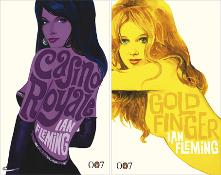
new_bonds.jpg

Penguin is really coming up with the goods these days, living up to their reputation as a house with high standards of cover design, unlike Picador and the shabby way they treated Cormac McCarthy recently.

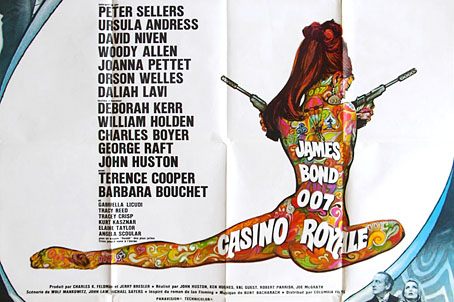
Ian Fleming’s Bond novels are the latest to receive a makeover with some fabulous art from illustrator Michael Gillette. 2008 is Fleming’s centenary so the books have been republished as demi-format hardbacks with these new designs adorning the jackets. Each cover features a different girl matched to the theme of the book (yes, I know they’re women but in Bond’s world women are always girls unless they’re Miss Moneypenny); each cover also features groovy period type which alludes to the hand-drawn elaborations of the Sixties and Seventies. The effect is reminiscent of the poster art for the 1967 film of Casino Royale (below) which used a naked girl as the focal point; all Bond posters before and after this place oo7 himself centre stage. Penguin even dare to push the level of pastiche by making On Her Majesty’s Secret Service look rather like an old romance novel, not such a surprising decision since this is the book where Bond gets married.

casino.jpg

My favourite Bond covers remain the old Pan paperbacks from 1963 but that’s just me; these look great. There’s been a persistent moan recently from authors and publishers worrying about file sharing as they foresee the publishing world going the same way as the music business. The solution is obvious: you can’t stop texts being copied and distributed but you can make the books themselves desirable objects so make them worth buying and owning. Penguin has numbered the spines of the new Bond books as they did with their recent Sherlock Holmes reprints, a smart appeal to book collectors as well as a tip to read them in the order they were written. “Smart” is the key word here; Picador take note.

Update: The Pan covers mentioned above were designed by Raymond Hawkey. Bond site MI6.co.uk has some details about the designer.

Elsewhere on { feuilleton }
The book covers archive

Previously on { feuilleton }
Repackaging Cormac
The World’s Greatest Detective
James Bond postage stamps
Boys Own Books

The World’s Greatest Detective

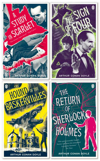
sh1.jpg

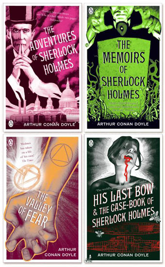
Coralie at Penguin Books sent through these cover designs today, a splendid “collect the set” republication of the Sherlock Holmes stories which should be on the shelves early next month. This follows last year’s collection of similarly repackaged Edwardian thrillers which included Conan Doyle’s dinosaur tale, The Lost World. Having recently watched the Granada TV adaptations of the Holmes stories now would be a good time to go back to the books, especially since I only recall ever having read The Sign of Four and a couple of the stories.

sh2.jpg

And on the technical side, I’ll note that my typeface mania identifies the font used for the titles of these books as Gable Antique Condensed, a contemporary design by Jim Spiece based on a Bauer typeface from around 1900. Unless it’s one of the variants mentioned by Identifont….

Elsewhere on { feuilleton }
The book covers archive

Previously on { feuilleton }
“The game is afoot!”
Boys Own Books

“The game is afoot!”

holmes.jpg

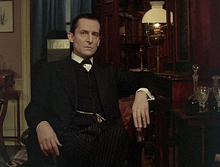
Jeremy Brett in The Adventure of the Blue Carbuncle.

A few words of praise for Jeremy Brett is his role as the world’s greatest detective, for my money the definitive screen Sherlock Holmes. I’ve spent the past few weeks working my way through the complete run of TV adaptations that Granada Television produced from 1984 to 1993, being bowled over again by Brett’s mastery of the role. It took me a while to notice these when they were first screened, British television was churning out a lot of costume drama at the time and the sight of more Hansom cabs and gas lamps paled beside the audacity and excitement of contemporary thrillers such as the BBC’s Edge of Darkness. I think I caught on during the second season that Brett’s performance was something special, and that these adaptations were treating the Holmes stories with a veracity rarely seen before.

Continue reading ““The game is afoot!””

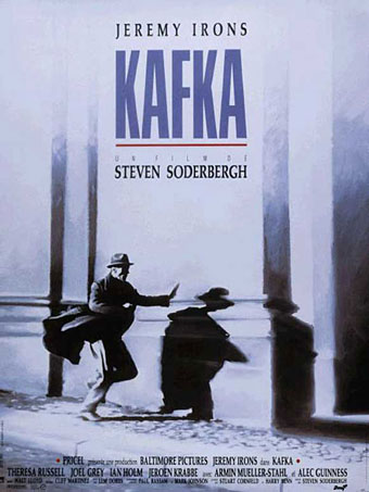
Steven Soderbergh’s Kafka

kafka_poster.jpg

Do you detect a theme this week? The recent Pragueness had me watching this favourite film again. I unfairly dismissed Soderbergh after his debut, Sex, Lies and Videotape (1989), which I found to be two hours of yuppie tedium despite its winning the Palme D’Or at Cannes. The prize did enable him to make Kafka (1991), however, so I shouldn’t complain although I didn’t get to see this until it turned up on TV years after its release. The film was a major flop and put Soderbergh in the wilderness until Out of Sight (1998), his first outing with George Clooney.

Kafka is one of a small group of works wherein well-known writers become embroiled in stories which parallel their fiction. Joe Gores’ Hammett (filmed by Wim Wenders in 1982) did this with Dashiell Hammett while Mark Frost in his novel, The List of Seven, had a pre-Sherlock Holmes Arthur Conan Doyle becoming involved in a Holmesian mystery. The screenplay for Kafka by Lem Dobbs has the author falling in with anarchist revolutionaries in order to solve the death of a co-worker and a bureaucratic conspiracy. This was obviously too clever for a general audience, being littered with references to Kafka’s life and work and also to German Expressionist cinema with names like “Orlac” and “Murnau” comprising key plot elements. Dobbs wrote a couple of other noteworthy screenplays after this, Dark City, a noirish fantasy that does what The Matrix did only with greater imagination, and The Limey (1999), another Soderbergh film with a great performance by Terence Stamp as a vengeful Cockney gangster on the loose in Los Angeles.

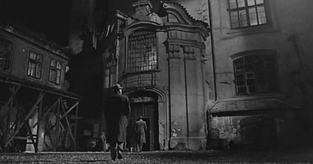
kafka.jpg

Alan Bennett had already written something similar to Kafka in his 1986 TV film for the BBC, The Insurance Man, which concerns a dye worker becoming enmeshed in the labyrinthine bureaucracy of the Worker’s Accident Insurance Institute where Kafka worked as a clerk. Daniel Day-Lewis made a marvellous Franz Kafka in Bennett’s play, and was much more suited to the role than Jeremy Irons is in Soderbergh’s film. This is a shame since everything else about Kafka is excellent, from Walt Lloyd’s moody photography, and the fabulous cymbalom-inflected score by Cliff Martinez, to the cast which includes the wonderful Theresa Russell, Joel Grey, Ian Holm and, in one of his last performances, Alec Guinness.

Kafka is also the Prague film par excellence, making great use of the city’s Old Town and landmarks such as the Charles Bridge and Prague Castle, a building which dominates the story as well as many of the outdoor scenes. In fact I find myself watching it as much for the settings than anything else. Soderbergh enjoys cinematic pastiche and Kafka owes a great deal to The Third Man (which did for post-war Vienna what Kafka does for Prague) and—inevitably—Orson Welles’ Kafka adaptation, The Trial. Theresa Russell brings Vienna with her via Nicolas Roeg’s Bad Timing, Joel Grey was in Cabaret, of course, and Alec Guinness isn’t so far removed from his role as retired spy George Smiley in the BBC’s John le Carré films. And halfway through the film there’s a great surprise which I won’t spoil here.

Kafka is available on DVD finally, although if you’re in the US you’ll have to import it. Soderbergh has talked about reworking the film in a longer version which I’d like to see if he ever gets round to it. Not an easy film to find but it’s worthy of your attention.

Previously on { feuilleton }
Kafka and Kupka
Alexander Hammid
How to disappear completely
Karel Plicka’s views of Prague
Giant mantis invades Prague
Nosferatu
Barta’s Golem

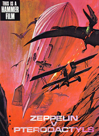
Zeppelin vs. Pterodactyls

zeppelins.jpg

An unmade high-concept from Hammer Films’ early Seventies dalliance with pulp adventure, if you must know. Via Boing Boing via Jess Nevins via Airminded where we learn:

The story was along the lines of THE LAND THAT TIME FORGOT, with a German Zeppelin being blown off-course during a bombing raid on London and winding up at a “lost continent”-type place.

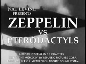
Rather like the Civil War balloon that’s blown off-course in Jules Verne’s Mysterious Island then, which ends up on Captain Nemo’s volcanic island of giant birds and insects. Of course, the mere fact that a film was never made is no obstacle for YouTube’s army of diligent mash-up artists and you can see Zeppelin v. Pterodactyls re-imagined as a 1936 Republic Serial here. (And on a pedantic professional note, an older font should have been used for the titles since Hermann Zapf didn’t design Palatino until the 1940s.)
zeppelins2.jpg

It was another horror company, Amicus Productions, that produced The Land that Time Forgot (1975) (and its ER Burroughs-derived sequels, At the Earth’s Core [1976] and People that Time Forgot [1977]) so this Hammer concept may have been an attempt to follow Amicus’s lead and exploit the momentary flush of enthusiasm for ERB and co. Or perhaps they thought that Zeppelin movies were the next big thing after Michael York’s First World War adventure, Zeppelin, in 1971. No one in Hollywood these days would dare finance a film with a title like this. The same dumbing-down imperative that gave us Harry Potter and the Sorceror’s Stone (because Americans can’t be trusted to know what the Philosopher’s Stone is) would no doubt want “pterodactyls” replaced by “dinosaurs” or the wording of the whole thing reduced to ZvP.
amazing.jpg

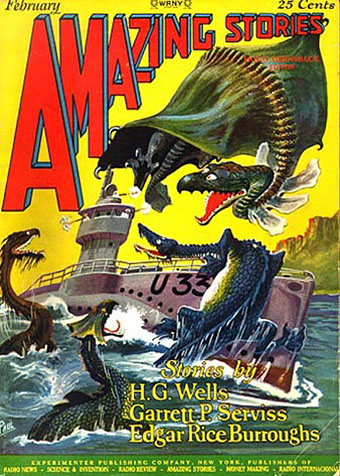
U-boat vs. dinosaurs! Illustration by Frank R Paul for a 1927 reprint of The Land that Time Forgot.

The Land that Time Forgot was scripted by Michael Moorcock and New Worlds‘ (and Savoy Books) illustrator James Cawthorn. The pair did a decent job with the story although the film as a whole is let-down by silly monster effects, the pterodactyl (or is it a pteranodon?) in this instance being a lifeless thing swinging from a crane. Moorcock and Cawthorn worked together on Tarzan Adventures which Moorcock was editing as a teenager so they appreciated the material at least. This wasn’t the only connection New Worlds had with pulp cinema, more surprisingly JG Ballard had provided a story for Hammer in 1970 with When Dinosaurs Ruled the Earth. Hammer missed an opportunity in not hiring Moorcock for something seeing as he’d just written one of the first retro-dirigible (and pre-Steampunk) novels, The Warlord of the Air, in 1971. UK film producers had some of the best writers in the world under their noses yet could only offer them trash to work on. No wonder the British film industry went down the tubes in the Seventies after the American funding dried up.

My favourite pulp adaptation from Hammer is The Lost Continent based on Uncharted Seas by Dennis Wheatley. A typical Hammer product in the way the story is frequently preposterous yet the whole thing is made with the utmost seriousness. Amazon summarises the plot, such as it is:

This film starts out like The Love Boat on acid, as a cast of unpleasant characters, all with horrible secrets, take a chartered cargo ship to escape their troubles. Unfortunately, the leaky ship is carrying an explosive that can be set off by sea water and it sinks, stranding many characters in a Sargasso Sea populated by man-eating seaweed, giant monster crabs and turtles, and some Spanish conquistadors who think the Inquisition is still on.

Eric Porter is the ship’s captain, a very good actor who was superbly sinister and convincing as Professor Moriarty in Granada TV’s Sherlock Holmes adaptations. The Lost Continent was Wheatley’s shameless plundering of William Hope Hodgson’s Sargasso Sea tales, the book being originally written in 1938 when Hodgson was less well-known than he is today. Until the Pirates of the Caribbean films this was about the closest thing on screen to Hodgson’s world of drifting weed, lost galleons and man-eating monsters, so there you have its cult value. Just be ready with the fast forward button if you try and watch it.

Previously on { feuilleton }
Moorcock on Ballard
Coming soon: Sea Monsters and Cannibals!
Revenant volumes: Bob Haberfield, New Worlds and others
Druillet meets Hodgson
Davy Jones
The Absolute Elsewhere