The art of Ralph Koltai

koltai.jpg

Ralph Koltai‘s contrasting of panels of corroded metal with smooth objects makes for some attractive combinations, reminding me of similar rough and smooth juxtapositions by artist and designer Russell Mills, notably on one of his Samuel Beckett covers and his design for Harold Budd and Brian Eno’s The Pearl. Koltai’s site also includes a gallery of his designs for theatre. Digital rust infiltrates my own work now and then via some photos I took of a Manchester railway bridge, the most recent use being in the background of the cover for Finch.

Previously on { feuilleton }
Finch posters
Samuel Beckett and Russell Mills
The art of Jo Whaley

Samuel Beckett and Russell Mills

beckett1.jpg

This 1979 Picador edition of The Beckett Trilogy is one of my favourite paperback cover designs. The “illustration” (as it’s described on the back) is a photograph of an artwork by artist/designer Russell Mills and the minimal credit gives no indication as to whether it was Mills who was responsible for the striking type layout. I’ve noted previously the equally striking Picador designs by the Quay Brothers who were responsible for both art and layout on their covers. Mills extended his work into graphic design later with album cover designs (and some book design) for Brian Eno, David Sylvian, David Toop and others so I’ll give him the benefit of the doubt in this case.

beckett2.jpg

The Picador edition of Murphy was published in 1983 and comprises part of this week’s book haul. The three small Mills paintings suit the novel but I prefer his sculptural and collage works. I’ve taken to collecting more of these older Picador editions in recent years since they don’t turn up secondhand as often as they used to. As with the Quay Brothers and Italo Calvino, I wonder now how many Beckett covers Mills produced for Picador. The books list More Pricks than Kicks and Company in addition to these titles. He was still working for them up to 1986 when he and Brian Eno collaborated on the graphics for Don DeLillo’s White Noise. Unlike the world of Penguin collecting, this area lacks adequate documentation; further investigation is required.

Elsewhere on { feuilleton }
The book covers archive

Previously on { feuilleton }
Thursday Afternoon by Brian Eno
Crossed destinies revisted
Beckett directs Beckett
Crossed destinies: when the Quays met Calvino
The art of Shinro Ohtake
Not I by Samuel Beckett
Film by Samuel Beckett

Thursday Afternoon by Brian Eno

thursday.jpg

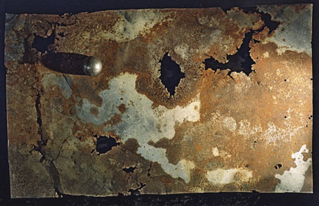
Cover painting by Tom Phillips, design by Russell Mills.

A post for a Thursday.

Brian Eno’s ambient music receives a lot of playing time here, especially Music for Airports, On Land, The Shutov Assembly and, when something really minimal is required, Neroli. But it’s Thursday Afternoon that receives the most attention. Recorded at the request of Sony Japan in 1984, Thursday Afternoon is a single piece that originally accompanied seven of Eno’s “video paintings”, each of them showing Christine Alicino warped and blurred by ultra-slow motion and video noise. Like his earlier static views of the New York skyline, Mistaken Memories of Medieval Manhattan, filming vertically means that proper viewing can only be achieved by turning the TV on its side. The soundtrack is a beautifully rendered composition which uses Eno’s customary process of letting a number of looped phrases form a shifting musical moiré.

Compositionally, Thursday Afternoon belongs to the family of works which also includes Discreet Music and Music for Airports. Like them it is an even-textured, spacious and contemplative piece in which several musical events appear and recur more or less regularly. Each event, however, recurs with a different cyclic frequency and thus the whole piece becomes an unfolding display of unique sonic clusters. Eno has characterised this style of composition as “holographic”, by which he means that any brief section of the music is representative of the whole piece, in the same way that any fragment of a hologram shows the whole of the holographic image but with a lower resolution. (From the album notes.)

Daniel Lanois, Roger Eno and Michael Brook were all involved in the creation and production of Thursday Afternoon and the piece works as well played very quietly as it does at louder volume. When played louder more of the background detail becomes apparent, including some very faint birdsong which is most discernible at the end when much of the music has faded away. Perfect for colouring the atmosphere of a room whilst reading, working or talking with friends. It’s also a favourite of mine for playing in the bedroom with someone special.

Thursday Afternoon was released on video cassette then appeared on CD in 1985. As a single track of 61 minutes, this was one of the first original recordings which made specific use of the extended running time of the CD format. The cover painting was by {feuilleton} favourite, artist Tom Phillips, with design by artist and designer Russell Mills. Ten years earlier, Eno had used a detail of Phillips’ painting After Raphael on the cover of Another Green World.

eno.jpg

All of which is a long-winded way of saying that you can now see the original sound and vision version of Thursday Afternoon at Ubuweb. Not ideal by any means but it gives you an idea of the complete work rather than the trunctated versions on YouTube. Eno’s video paintings, Thursday Afternoon included, are now available on DVD should you require them in higher quality. Just be prepared to turn your TV on its side.

Update: Eno’s ambient processes have now reached the iPhone with the Brian Eno and Peter Chilvers app, Bloom.

Elsewhere on { feuilleton }
The album covers archive

Previously on { feuilleton }
Tiger Mountain Strategies
20 Sites n Years by Tom Phillips
Generative culture
Exposure by Robert Fripp
My Life in the Bush of Ghosts

The art of Shinro Ohtake

queer.jpg

Shinro Ohtake is always on the attack. Whether it’s against misguided art education, against the cold treatment and economic constraints Japan puts on anyone who could dare to live differently, against the contemporary art establishment that can’t be bothered to even disguise its own incomprehension—his fight as an artist continues. Ohtake is prodigious, original, and a trouble-maker—in the sense that the work of the artist is always to create difference.

William Burroughs

Two disparate things had me looking for Shinro Ohtake‘s work this week: I’ve been doing a short interview about album cover design (more about that at a later date) in which I mentioned his collage for the cover of Seven Souls by Material (1989), then an editorial in the latest Wire describes his current retrospective exhibition at the Museum of Contemporary Art in Tokyo.

seven_souls.jpg

The Material cover is one I picked as a favourite design. It’s difficult trying to pin-point why I think this works so well without it being at all illustrational. (I’m guessing, but it’s likely that Bill Laswell picked it out of one of Ohtake’s collage books, rather than it being specially commissioned.) It may be the collage aspect that works here. The album features readings by William Burroughs set to music and for me is the best of all the Burroughs recordings (Dead City Radio being a close second). Burroughs’ work, of course, involved literary collage via his own cut-up process, and the musical content can also be seen as a collage in the way it mixes different styles and musicians—Simon Shaheen, Shankar, Rammellzee, Foday Musa Suso, Fahiem Dandan and samples of the famous Brian Jones recordings of the Jajouka pipers. It’s a shame that when the CD was reissued in 1997 (in a superior mastering, it should be noted), the original artwork was largely junked in favour of a lot of muddy Photoshop work from the usually excellent Russell Mills. I’ve a huge respect for Mills but this treatment was a serious mistake.

Elsewhere on { feuilleton }
The album covers archive

Previously on { feuilleton }
William Burroughs book covers